Affiliate links on Android Authority may earn us a commission. Learn more.
Google Assistant redesign introduces new curved UI from Search and Feed

Google is apparently fully committed to purging all of the sharp edges and hints of gray from its apps and services in favour of curvy corners and bright whites. First it was Feed in Google’s flagship app, then the search giant’s mobile homepage, and now it’s Google Assistant’s turn to receive a fresh makeover.
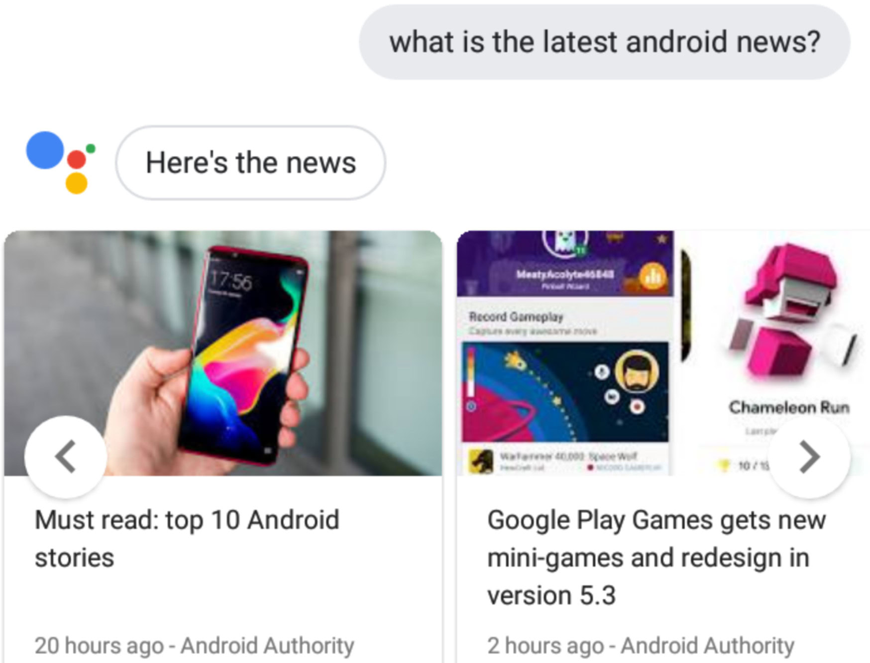
If you boot up Google’s digital companion on a compatible device today you should be able to see the changes for yourself. The first thing you might notice is the stark white background which now matches the color of each dialogue box. This replaces the light gray palette from before, although your own voice commands will still show in a mildly darker shade of gray.
Other changes are far more subtle, especially when compared to the Search and Feed overhauls. The reason for this is that Google Assistant’s speech bubbles always carried a slightly rounded design. After the changes, this is more pronounced as the bubbles now have a pill-shaped look to them and Assistant responses are emphasized by a thin black outline.
The changes also apply to any category tabs and cards that Assistant shares in response to your queries. This includes weather reports, news stories, sport results, maps and navigation cards, and many more. Google Assistant suggestions also now come with a minor shadow effect.
What do you think of the changes? Is Google going overboard with its cull of all rectangles? Let us know in the comments.