Affiliate links on Android Authority may earn us a commission. Learn more.
Google is making the Android logo more dynamic and playful
- Google has officially announced the new Bugdroid logo and the Android wordmark.
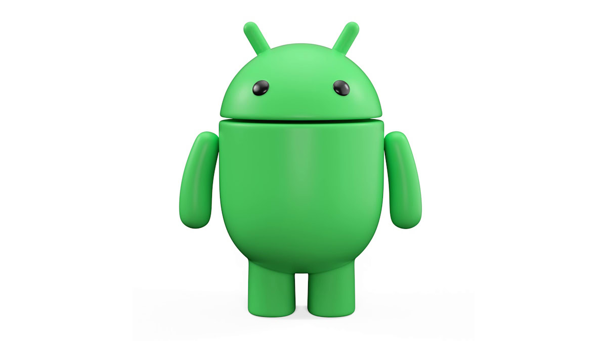
- The Bugdroid logo returns to its complete robot physique in a rounded and 3D avatar.
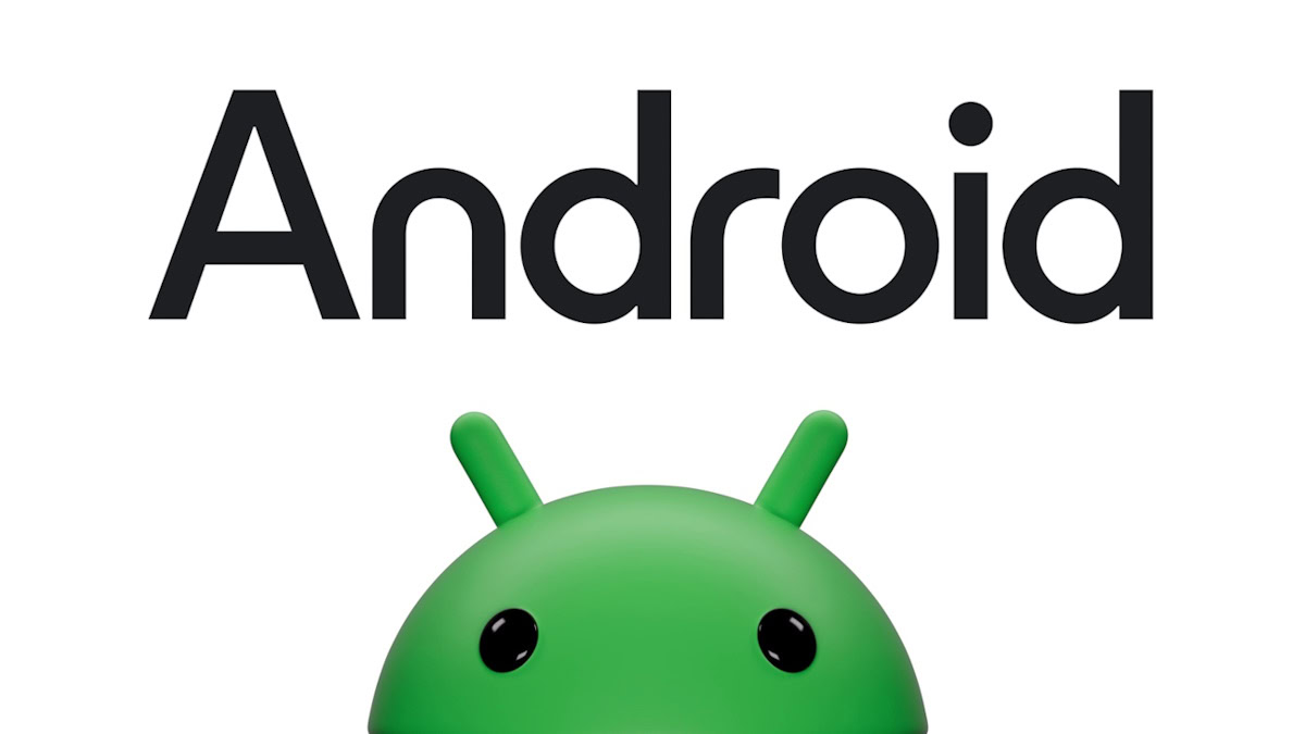
- The wordmark has also been switched to sentence-case, with a rounder “n” and “r.”
Android as an operating system is not shy of changes. The OS has always been known to be open to experimentation, giving people an excellent base to build from and then letting them run full speed with it. Google is refreshing the same ideals with the new Android logo, finally putting its stamp on the new Bugdroid we’ve been seeing over the past few months.

The Bugdroid logo has an important place in the history of Android. What started off as the full-bodied logo got a slight color refresh at first and then had a more significant redesign in 2019 that restricted it to the Bugdroid “head.” Now, Google has formally announced the new 3D avatar of Bugdroid that brings back the rest of the robot’s physique.

Google says the new logo “draws inspiration from Material design to complement the Google brand palette, as well as be adaptable.” The robot’s full body appearance is focused on allowing it to transition between digital and real-life environments easily. The new logo will appear in more places, specifically where Android connects with people, communities, and cultural moments.
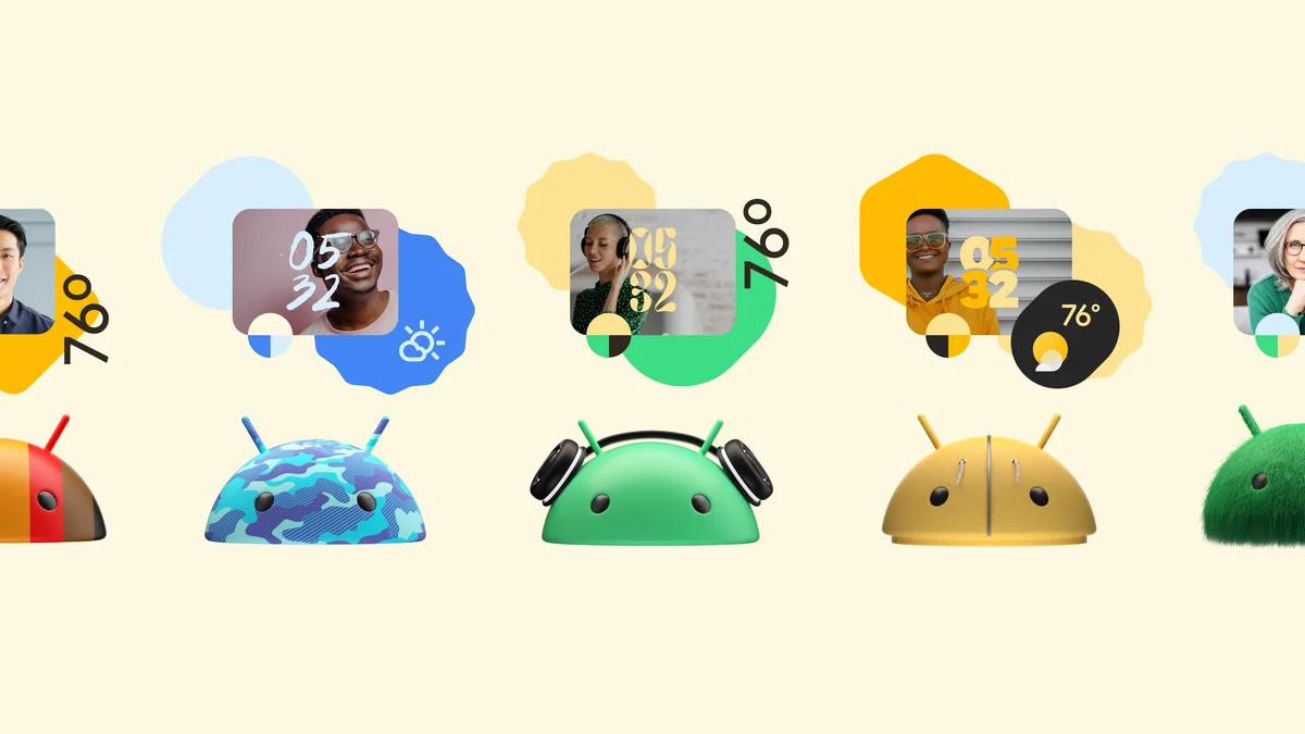
As we have seen, the new Bugdroid Android logo is also dynamic, taking on different skins just like the platform does. We’ve seen some avatars in previous announcements, and we can’t wait to see how others work their magic on this new logo.

Google has also confirmed the new wordmark. Previously, “android” as a wordmark would always be lowercase. Now, Google is capitalizing the “A” and rounding the “n” and “r,” giving us a new wordmark that complements the Google logo and wordmark better.
Alongside all of this, Google has also reiterated the simpler Android branding. Android 14 is just “Android 14,” and removing the publicly used dessert nickname is meant to make the releases and branding easier to understand globally. The dessert codenames are still used internally, and in some cases, they add flavor to the Android easter egg for that release.
What are your thoughts on the new logo and wordmark? Let us know your thoughts in the comments below!
Thank you for being part of our community. Read our Comment Policy before posting.