Affiliate links on Android Authority may earn us a commission. Learn more.
These are my favorite Nothing OS 2.5 features

Publicity stunts like the Nothing Chats drama aren’t a guaranteed success every single time, but I still feel like Nothing’s and Carl Pei’s shenanigans shouldn’t stand in the way of their — surprisingly — excellent products. I’ve been a fan of the Ear 1 and Ear 2 for a couple of years and I finally managed to get my hands on the Nothing Phone 2 ($239.99 at Amazon). I didn’t expect to be as impressed by the phone and Nothing OS as I am, nor did I expect Nothing OS 2.5 to push things even further. But the latest software really takes Nothing’s experience to another level. Here are my favorite Nothing OS 2.5 features.
Have you installed Nothing OS 2.5 on your phone?
How can I get Nothing OS 2.5?
Nothing OS 2.5 builds on everything we’ve seen with Nothing OS 2.0 and Android 14, but it’s still currently in beta. Nothing is testing it publicly on the Phone 2. You can join the beta by following the steps below or on Nothing’s community forum:
- Ensure you have the latest stable Nothing OS running on your phone.
- Download this APK provided by Nothing and install it.
- Go to Settings > System > Update to Beta version
- Tap Check for new version and follow the steps to download and install the beta firmware.
Hidden app icons in the launcher
Nothing OS 2.5 adds a new hidden app shelf to the left of your app drawer. Just swipe right and you’ll reveal the new hidden space where you can tuck away apps you rarely use, those you want to obfuscate from people who might grab your phone, or, in my case, apps with unthemed icons.
I’m a monochrome theme convert and I just don’t want to see colorful icons spoiling the greyscale aesthetic I’ve got going with the phone. So I’ve decided to hide the unthemed app icons away from view. It helps that these aren’t apps I use every day.
An iPhone Action Button-like feature
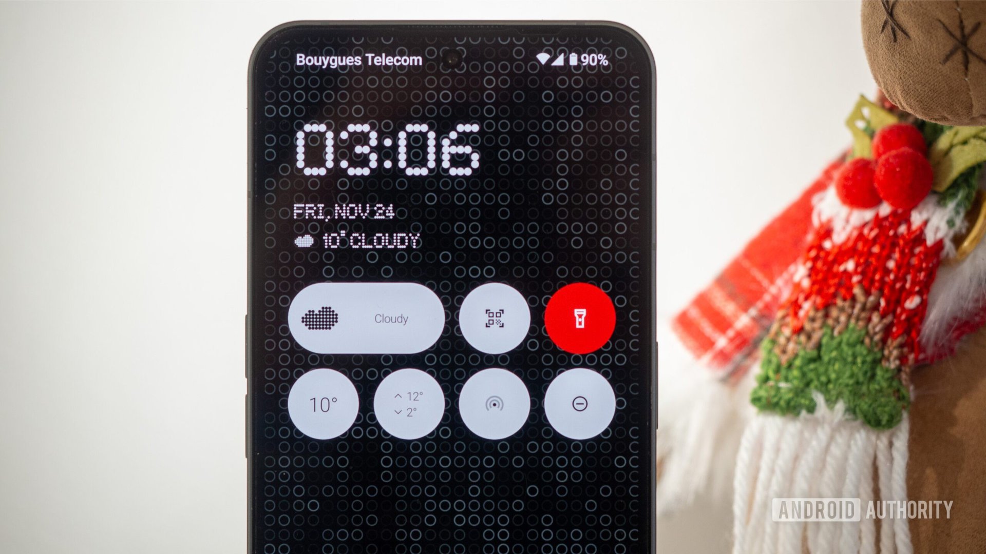
So the Phone 2 doesn’t have an extra button to act like the iPhone 15’s Action Button, but Nothing did the closest thing by allowing you to customize the double-tap gesture on the power button. By default, most Android phones let you open the camera with this shortcut, and that was the case on the Phone 2. Now you can just assign it to any app on your phone, the Glyph timer, torch, QR code scanner, enable Do Not Disturb, or mute your phone.
I keep hopping between different options, but I think I’ve finally settled on the video camera. Since I love taking random videos, this saves me from opening the camera and then switching to the video mode before starting to shoot.
Glyph timer and progress improvements
I think the Glyph lights on the back of the Phone 2 can be much more useful than they currently are. Integrations with third-party apps aren’t easy, though, so we get a few cool use cases every now and then. Nothing OS 2.5 brings two cool improvements. Glyph timers are much easier to use now and support timer presets, while Glyph progress has added Google Calendar compatibility.
The latter is handy when I’m approaching meetings or events. The Nothing Phone 2 lights up about five minutes before to remind me that I need to get ready. Enough leeway to jump into the bathroom, fill my water bottle, or pause my current task at a logical juncture point.
A full monochrome theme
A proper greyscale theme made its way to Android 14’s Material homescreen customizations and, by extension, to Nothing OS 2.5. Now, when I want to take the monochrome approach to the max, I can go to the home screen options and pick the first greyscale option under Basic colors.
This turns the entire interface into proper greyscale, without any hints of blue’ish, green’ish, yellow’ish, or any other color shades. The notification drop-down follows suit, and so does every app that has adopted Material You colors like the Google Calculator, Calendar, Photos, Contacts, Keep, and more.
Granted, this isn’t an aesthetic I want every day, but when I do, I’d rather have something uniform, and this new theme color fits Nothing OS 2.5 and the Nothing icon pack to perfection.
The wallpaper glass filter
Speaking of the Nothing aesthetic, the new wallpaper glass filter is quite cool. It lets me emulate the look of some of Nothing’s default wallpapers with my own images. Just pick a wallpaper (my favorite app and the one I got all these wallpapers from is Backdrops) and tap the sparkling button on the bottom and ta-da! Glass effect. It can turn some regular wallpapers intro intriguing designs, like peering through glass at a beautiful scene.
Regional settings, screenshot editor, and more
Nothing made an interesting addition in OS 2.5: A regional settings menu lets you pick the default temperature and first day of the week. As someone who sets their phone to US English, but uses metric units and considers Monday the first day of the week, this saves me from digging into random app settings to change the defaults. It’s not compatible with all third-party apps, though.
It’s also easier to spot Nothing’s own themed widgets among all the other widgets available to add. A new Photos widget is available too. And lock screen widget options have been expanded with a QR code scanner and Do Not Disturb — two features I personally use a lot and immediately assigned to my own lock screen.
Volume controls for ringing and notifications are separate now too. Plus, there’s a new gesture that captures screenshots when you swipe down with three fingers, while the screenshot editor itself has seen improvements. Among them is a pixelated effect that lets me draw on top of any personal info before sharing the screenshot.
Other minor additions include a new back gesture arrow design, solid-color wallpapers, and a new Glyph animation for NFC.
Nothing OS is slowly becoming a sleek and powerful Android skin, with all of the simplicity of stock Android and some neat extras that elevate the experience. I’m starting to appreciate its quirky design language and affinity for dot-matrix fonts and icons; they look much better in person than in screenshots and photos. Plus, they tie well together with the Phone 2’s hardware design.
I’d still love to see more customization and features to make the most of the Glyphs, but after putting software on the backseat for a year with the Phone 1, Nothing is finally giving software the focus it deserves. Nothing OS 2 was a good step forward; 2.5 is even better.
Thank you for being part of our community. Read our Comment Policy before posting.
