Affiliate links on Android Authority may earn us a commission. Learn more.
ES File Explorer updated with Material Design UI

File managers are necessary, even if we may not use them all the times. You need to keep those files organized and move them around from time to time; might as well do it in a nice Material Design interface. Popular ES File Explorer File Manager has been updated with Matias Duarte’s design language for Android.
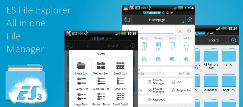
The UI now offers a clean and simple perspective of what used to be a cluttered experience. The black and gray hues have been replaced with white and blue colors, and a floating action button has been added to the lower-right corner. In addition, the developer has removed the lower bar and placed all options on top.
The latest update brings the app to version 4.0, but design seems to be the main improvement. There’s likely your usual set of bug fixes and performance improvements, as well. As it goes with all updates, this one is now showing up for everyone just yet. But keep it tuned to the Google Play Store and your update should come in due time. If you want it now, you can get the APK file here.
For now, let us know what you think of this upgrade? Are you a fan? Do you prefer the older interface?
Thank you for being part of our community. Read our Comment Policy before posting.