Affiliate links on Android Authority may earn us a commission. Learn more.
Designing More Effective UI Navigation
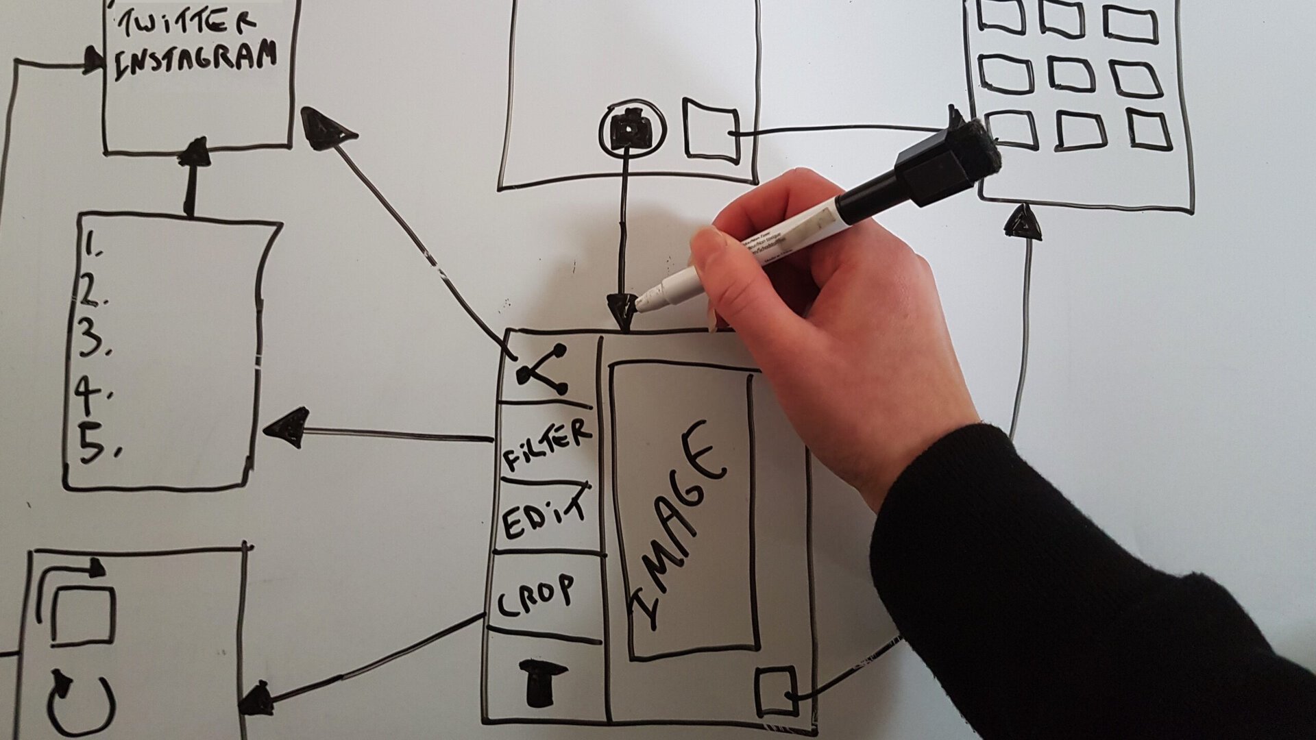
Effective navigation is an essential part of any great Android app. Get your navigation right, and users will have no problems finding their way around your app’s screens, completing tasks, and generally having an all-round positive user experience. If your app’s navigation is clunky or confusing, then doing anything in your app is going to feel like an uphill struggle, and ultimately the only place your users are going to navigate is out of your app.
In this article, I’ll show you how to plan, structure and implement navigation that feels so intuitive and effortless, even new users will have no problems finding their way around your app.
Planning your app’s navigation
In order to plan the perfect navigation, you need to consider the following:
-
The structure of your app’s screen hierarchy. What’s the first screen users see when they launch your app? What’s the second? How many screens will they have to navigate, in order to complete each task?
-
The navigational relationship between each screen. What screens can the user reach directly from Screen B? Can they jump straight from Screen A, to Screen E?
Screen hierarchy: Prioritizing your app’s most important destinations
Every feature should add some value to your app (if it doesn’t, then what’s it even doing in your app?) but not all features are created equally.
If you think about your favorite Android app, there will probably be some features you use time and time again, and others you rarely use. There may even be some features you’ve never really explored in much detail. Chances are your users will have a similar experience with your Android app.
Your app may have some high priority features that are the main reason why someone would choose to download your app, and lower priority features that are nice to have, but aren’t your app’s main draw.
To provide the best possible user experience, the screens that deliver your app’s highest priority features should be the easiest to access. You need to identify these screens and then place them high in your app’s screen hierarchy, for example by making a particularly important screen the first thing a user sees when they launch your app, or creating a main navigation menu that includes direct links to all of your app’s most important destinations. For example, if I was designing a camera app, the most important task would be taking a photo, so I’d place all of my app’s photo-taking functionality on the very first screen.
If you’re unsure about how important a task is, then consider your target audience – what are they hoping to achieve, when they download your app? If I was designing a camera app for professional photographers, then I might prioritize advanced editing features over fun, social features such as adding filters or posting photos to Facebook. In contrast, if I was targeting more casual photographers then I might place all the screens relating to fun, social features higher in my app’s screen hierarchy.

Grouping related screens together
Most apps include at least one series of tasks that users will typically complete one after the other in quick succession. In our camera app example, this might be snapping a photo, editing that photo and then posting the finished product to their favorite social network.
When there’s a natural flow between tasks, you should make it easy for users to progress from one task to another, by creating some form of navigational relationship between these screens. For example, you might make these screens accessible from the same navigation drawer, embed all their content in the same parent screen via a series of tabs, or place these screens one after the other in your app’s screen hierarchy.
Designing your app’s high-level flow
Once you’ve identified your app’s highest priority screens and the screens the user should be able to move between with ease, the next step is bringing all this information together in the form of a flowchart. A flowchart is perfect for getting an overview of how your app’s navigation is shaping up – plus it’ll also serve as a useful blueprint further down the line, when you start developing your app.
This flowchart should include every screen in your app, and the navigational relationships between these screens. You should also identify the first screen users will see, when they launch your app.
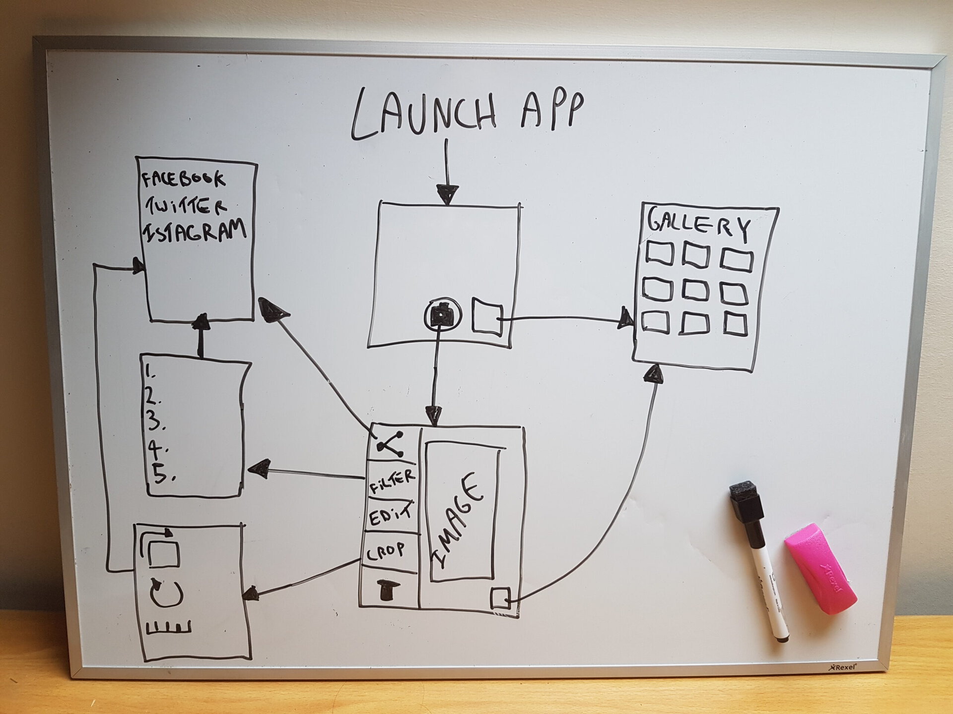
Once you’ve created your flowchart, take a critical look at whether there’s any areas where you could improve the user experience. In particular, look at how many screens the user has to navigate in order to complete each task.
Fewer screens is always better, so you should look for any opportunity to reduce this number. Some useful techniques you may want to try, include:
-
Adding navigational shortcuts to important destinations within your app, for example menus and navigation drawers.
-
Tweaking your screen hierarchy, such as moving important screens up the screen hierarchy, so they’re among the first screens the user sees.
-
Physically reducing the number of screens that make up your app, either by removing screens entirely or using fragments to combine several screens into multi-pane layouts. Don’t forget that on smaller devices these fragments will be displayed separately, so even if you do decide to use fragments you shouldn’t rely on fragments to deliver a good user experience.
Keep refining your flowchart until you’re confident that the user can complete any task in your app, in as few screens as possible.
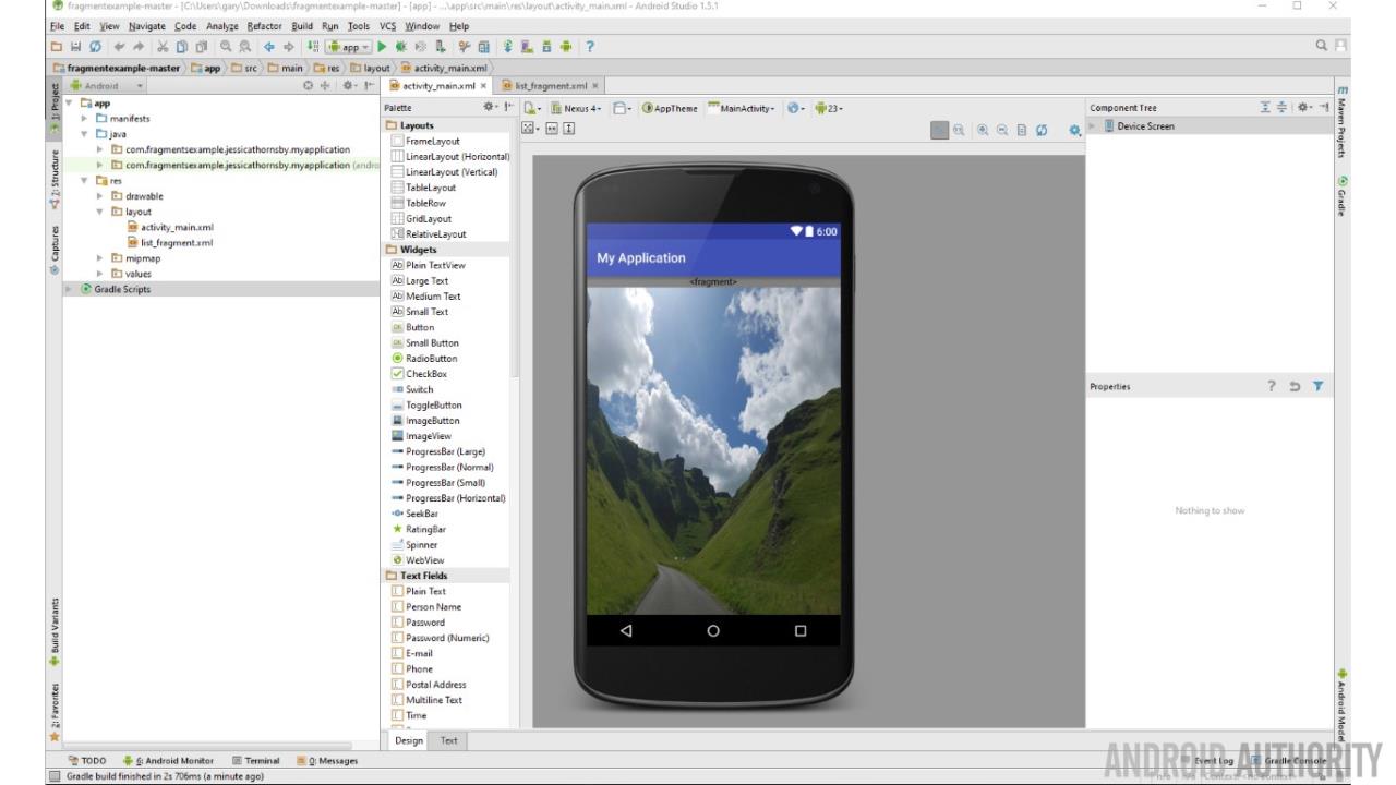
Common navigation patterns
At this point you’ve planned your navigation – but only at a very high level. Your flowchart may show that the user can move from Screen A to Screen B and F, but how exactly will they move between these screens? A menu? Tabs?
In the next section, we’re going to look at some common navigation patterns that you can use in your Android apps. Along the way, I’ll be sharing the pros and cons of each approach, so you can decide which navigation pattern is perfectly suited to your particular app.
Buttons
Effective navigation doesn’t have to be complex – case in point, button-based navigation. In some instances, it’s possible that a series of ‘Next’ buttons may be all you need to deliver your app’s navigation.
The major drawback of button-based navigation is that users will typically have to tap a button every time they want to move to a different screen. This isn’t ideal if your app has a deep navigational hierarchy, as it may result in the user having to tap multiple buttons (and move through multiple screens) in order to reach their desired destination.
You should also take a look at your flowchart and consider what’s the maximum number of buttons you’ll need to place on any one screen, in order to deliver your planned navigation. Since most Android smartphones and tablets have relatively small screens, placing multiple touchable targets on a single screen can quickly make your app difficult to interact with.
Lists
Vertically-scrolling lists, such as the classic text menu, provide a straightforward and flexible way of navigating your app. Lists are particularly useful when you need to provide the user with direct access to a large number of child screens.
Just be cautious of lists that lead to more lists, as this can quickly cause the number of screens the user has to navigate to spiral out of control. Your users won’t appreciate having to interact with multiple menus in order to reach their desired destination!
One kind of list-based navigation that deserves special mention, is the navigation drawer.
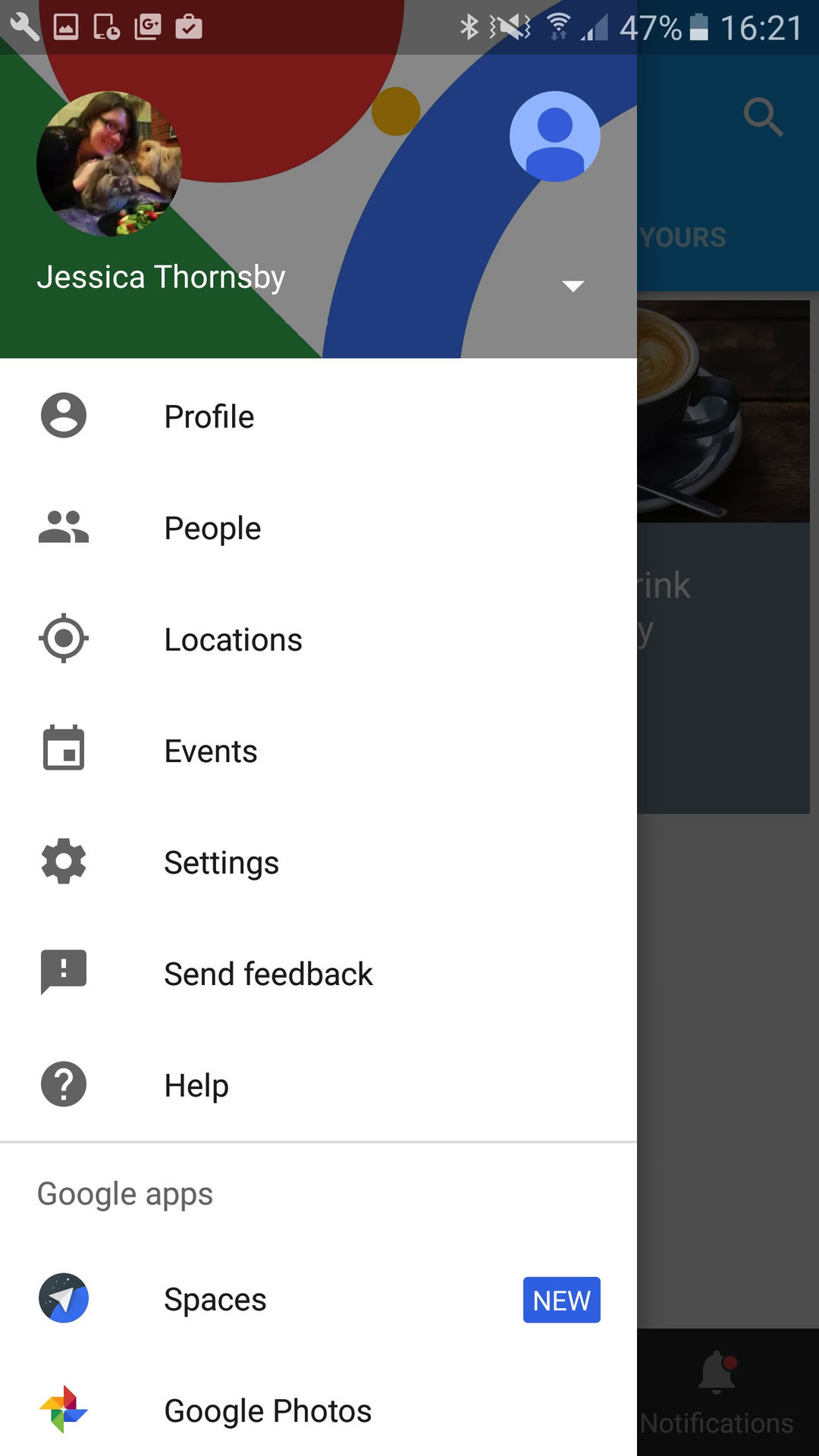
You implement a navigation drawer using the DrawerLayout API that’s available in the Support Library. To create a drawer, add a DrawerLayout object as the root view of your layout resource file:
<android.support.v4.widget.DrawerLayout

xmlns:android="http://schemas.android.com/apk/res/android"

android:id="@+id/drawer_layout"

android:layout_width="match_parent"

android:layout_height="match_parent">
Note, when creating drawers that contain options for navigating around your application, you should always place this drawer along the left of the screen (the right side of the screen is reserved for drawers that contain actions relating to the current screen).
Horizontal navigation
Most of the time, users will navigate your app in a hierarchical fashion (moving from parent to child screen) however occasionally you may need to include some form of horizontal navigation. You’ll typically use horizontal navigation when your app includes a large number of sibling screens, or content that’s of equal importance.
If you do need to include horizontal navigation, there’s a few common navigational patterns you can use:
-
Screen slides. Sometimes known as a carousel, this is where the user navigates between screens using a swipe gesture. You’ll typically create a screen slide interaction using fragments and a PageViewer, which has a built-in swipe feature that allows the user to flip left and right through pages of data.
-
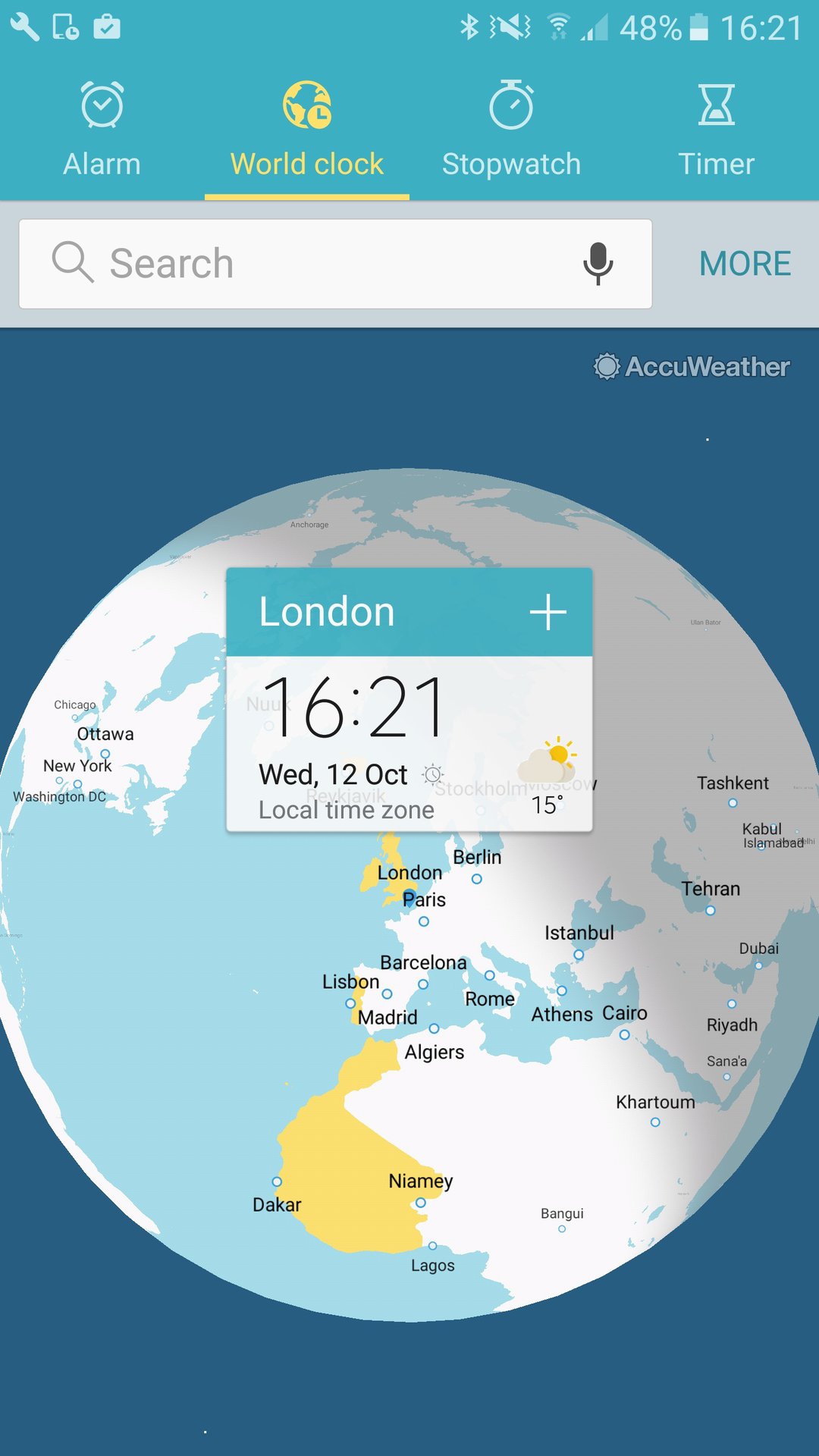
Tabs. Embedding content in the same parent screen allows the user to move between equal, related content directly, without having to keep navigating back to the parent screen. Due to the smaller size of your typical Android device, it’s generally a good idea to limit yourself to a maximum of 4 tabs per parent screen, which means tabs may not be the best navigational choice if you need to display a large number of sibling screens.
-
Horizontal paging. Sometimes known as swipe view navigation, this is a navigational pattern where the user swipes horizontally to move between sibling screens. Horizontal paging is the most effective when it’s used to display a small number of sibling screens that have some similarity in content, and when there’s a clear, ordered relationship between this content, for example a diary app where each screen represents a consecutive day.
Providing ancestral and temporal navigation
Up until now we’ve focused on navigating down your app’s screen hierarchy, moving from parent to child screen, but the user also needs to be able to move up, from child to parent screen, and through the history of screens they’ve visited. In this section, we’re going to look at two forms of navigation that allow the user to do just that: ancestral and temporal navigation.
Temporal navigation
Temporal navigation is where the user moves through the history of screens they’ve visited. Most of this functionality is handled automatically: all Android devices provide a ‘Back’ button, and the system maintains a list of every screen the user has previously visited, known as a ‘back stack.’
When a new activity is launched, that activity is placed at the top of the stack. When the user presses their device’s ‘Back’ button, the current activity is removed from the top of the stack, and the previous activity reclaims the number one spot.
Although this functionality is handled automatically, there are a few instances where you may want to tweak this default behaviour, in the interests of providing a better user experience.
Firstly, although the system automatically preserves the state of an activity when it’s removed from the top of the stack, if the system starts running low on memory then the system may destroy an activity in order to reclaim memory. You should actively retain the state of your activities using the onSaveInstanceState() callback method, so that your app can always restore an activity’s previous state, even if the system destroys that activity.
Occasionally you may also need to override the system’s default back stack, for example if you’re developing a web browser app then you may want the ‘Back’ button to return the user to the previous webpage, rather than the previous activity. Another instance where you may need to tweak the system’s default back stack behaviour, is when the user enters your app via a deep link. In this instance, you may want to create a “fake” back stack so that pressing the ‘Back’ button takes the user up your app’s screen hierarchy in a logical fashion, rather than immediately exiting your app via the deep link. You can synthesize a back stack using TaskStackBuilder.
Ancestral navigation
In Android 3.0 and upwards, the Action Bar includes an ‘Up’ icon that allows the user to navigate up your app’s screen hierarchy, moving from child to parent screen.
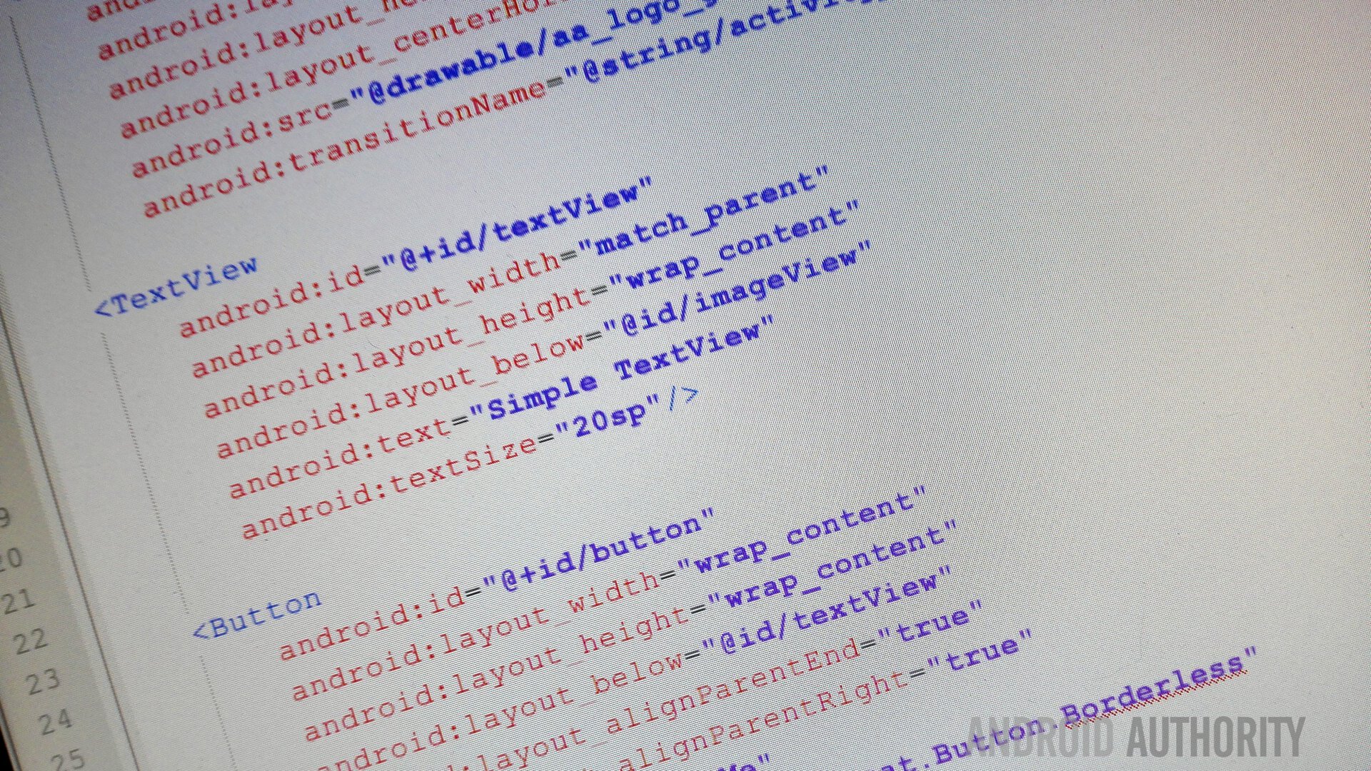
To provide the best possible user experience, you should clarify which screen is the logical parent of each Activity, by adding the android:parentActivityName attribute to each Activity in your project’s Manifest:
<activity

android:name="com.jessicathornsby.myapplication.GalleryActivity"

android:label="@string/galleryActivity"

android:parentActivityName="com.jessicathornsby.myapplication.MainActivity" >
If your app supports Android 4.0 and lower, you’ll also need to add a <meta-data> element inside each <activity> tag and then specify the parent activity using android.support.PARENT_ACTIVITY:
<meta-data

android:name="android.support.PARENT_ACTIVITY"

android:value="com.jessicathornsby.myapplication.MainActivity" />

</activity>
Note, the Android system will also use this information to synthesize a back stack, where appropriate.
Once you’ve declared the parent activity, you can activate ‘Up’ navigation in your app by adding a left-facing caret alongside your application icon. You do this, by calling
getActionBar().setDisplayHomeAsUpEnabled(true)
Wrapping Up
In this article, we looked at how to design effective navigation, by carefully considering exactly where each screen should appear in our app’s screen hierarchy, and identifying screens the user would appreciate being able to move between easily. After creating a flowchart showing all this information, we looked at how to turn this high-level plan into actual, physical navigation, by weighing up the pros and cons of Android’s different navigational patterns.
Are there any other navigational patterns you use in your Android apps? Let us know in the comments below!
Thank you for being part of our community. Read our Comment Policy before posting.