Affiliate links on Android Authority may earn us a commission. Learn more.
Drivemode app review
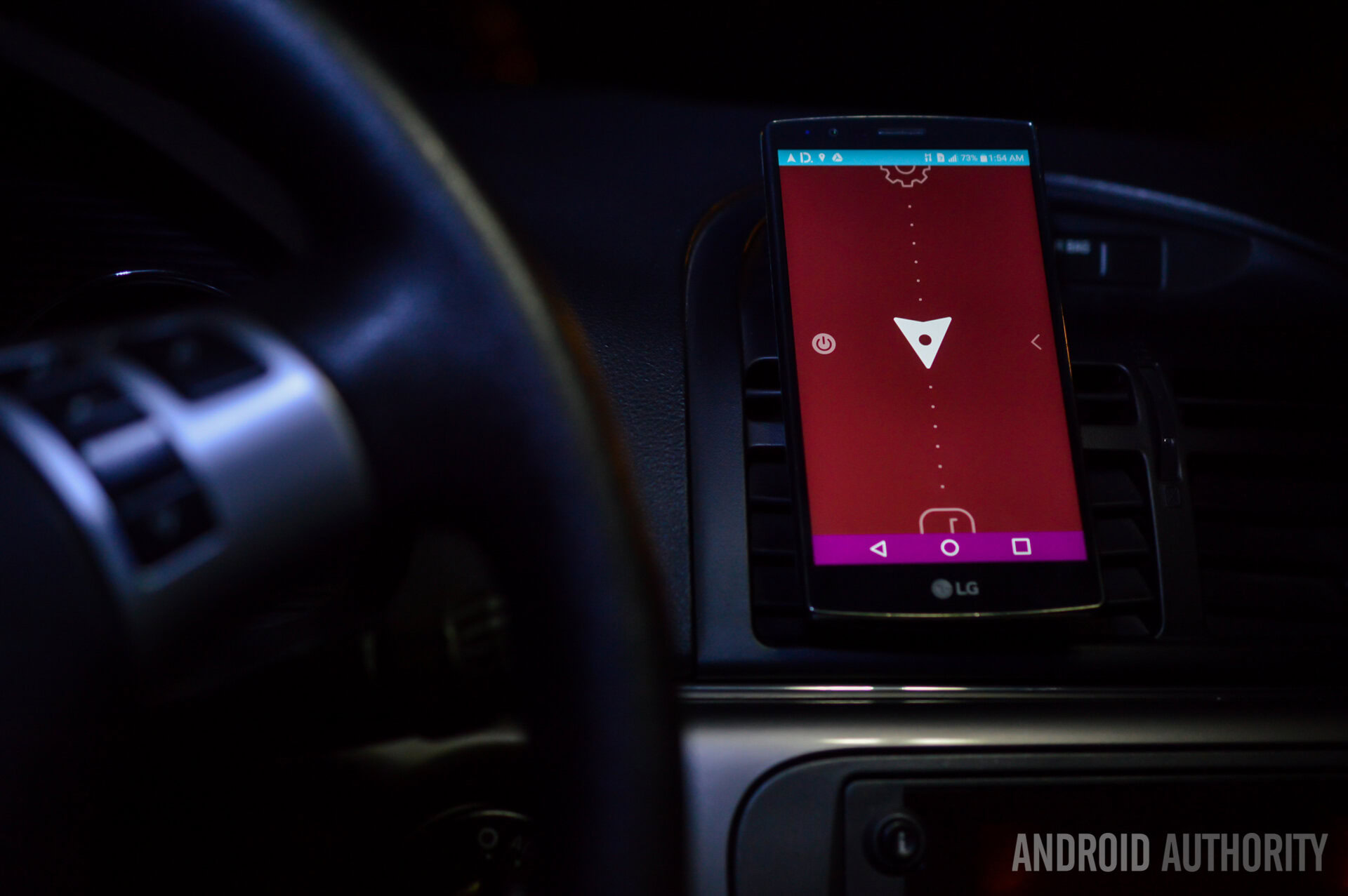
In an ideal world, we would probably just pocket our smartphones and not even touch them while driving, but we all know a handset is very necessary for some essential road needs, such as navigation, music and a few other things. At the end of the day, though, driving safely involves looking at your smartphone as little as possible. That’s it – there’s no way around it.
How do you find the balance between safety and usability? In order to answer the question, we must tackle the real issue first. The problem with using a smart device while driving is that mobile interfaces were designed to be immersive. They embrace you with a full array of services, apps, settings, notifications and flashy features that will pop at you at once. This is great for your daily tasks, but it can prove to be dangerous (and even fatal) when operating a vehicle that weighs multiple tons.
Welcome screen
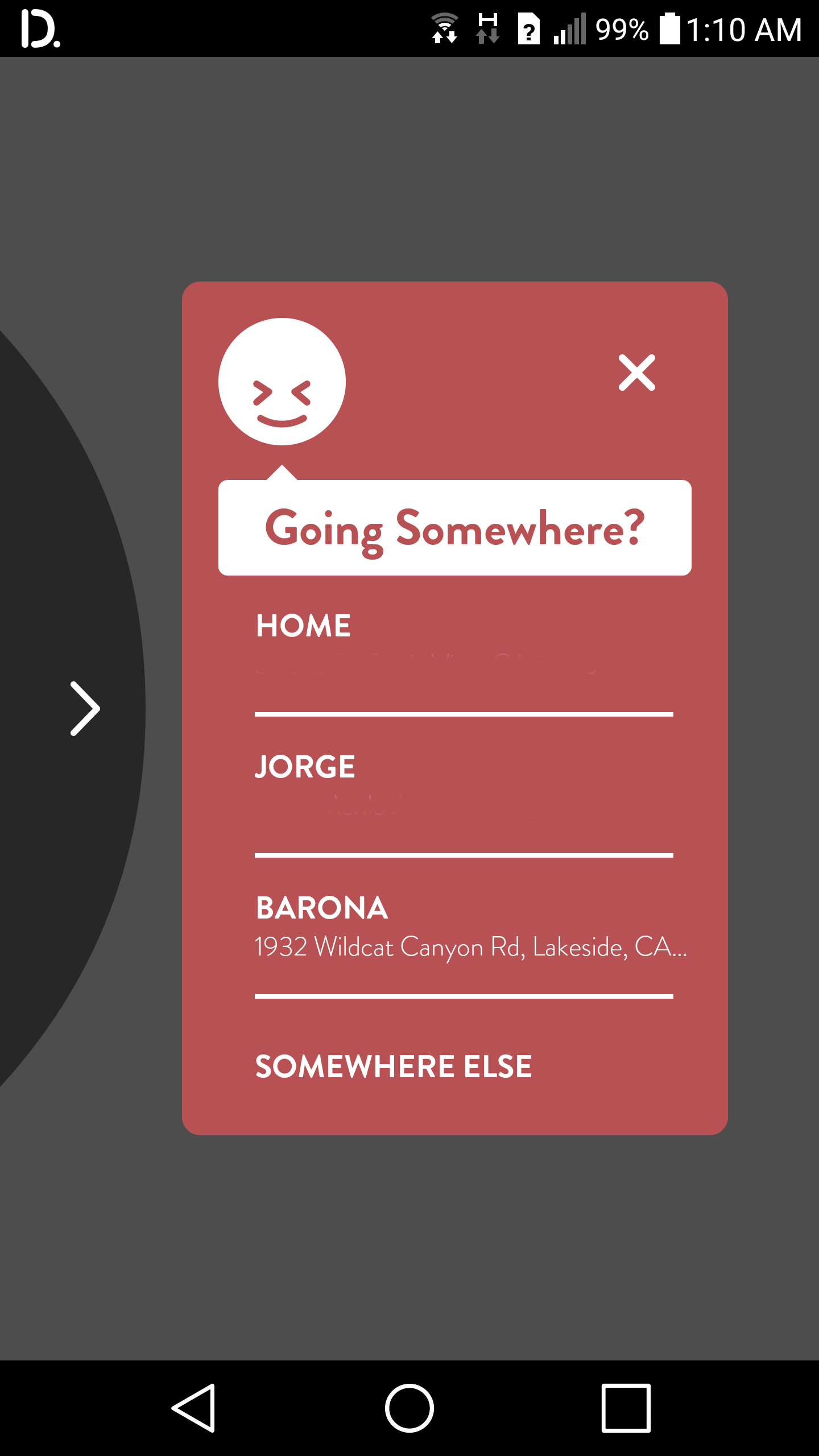
The main reason why we use our phones while driving is likely to navigate somewhere, so Drivemode welcomes you with a screen that facilitates grabbing directions to anywhere you need to go. Your favorite locations are saved, and you can enter new ones manually at any time. To do this, just hit the “SOMEWHERE ELSE” option.
This section will open a new window that will allow you to search new destinations, use recent ones, grab location details from calendar entries and access your favorite spots. Simple and clean, but this is only the beginning of the fun.
The “Tab”
You will notice that once you open Drivemode, a round tab will take over the left side of your screen. This is the main point of interaction between Drivemode and the driver, as it it used to call upon the vehicle-centric interface. Even if you press the home button and head to your regular home screens, that tab will be there. It’s a constant portal to your driving mode, so to speak.
My only problem with it is that it gets too much on the way. Not that you should be using your phone, anyways, but sometimes you just might need to. And let’s hope whatever you need to do with your phone is not on the left edge of the screen, because you won’t be able to access it (that is, if what you need to tap is behind this tab).
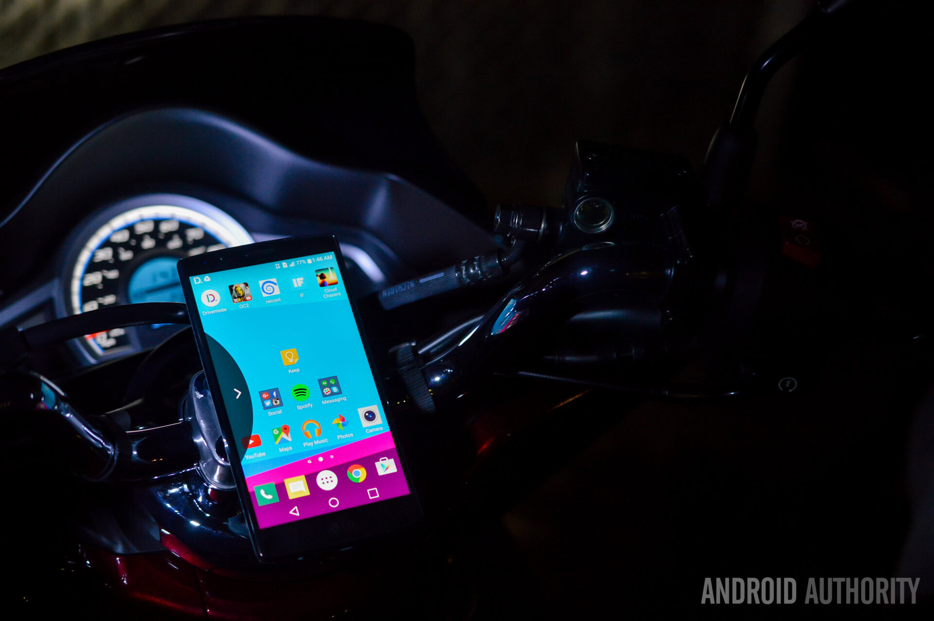
I would usually have to fumble around just to try to access certain things. And this is not good while driving, as it proved to keep my eyes off the road for a little longer. The trick was to turn off the tab, do what I was planning to do and then turn it back on. But even then, that was a lot of time and effort. I would appreciate if the tab was a little more discrete or didn’t take over most of the side of the screen. Something more like a Facebook Chat Head.
Maybe a nice gesture option to bring up Drivemode would be better? You can always call me for more ideas, developers!
The main UI
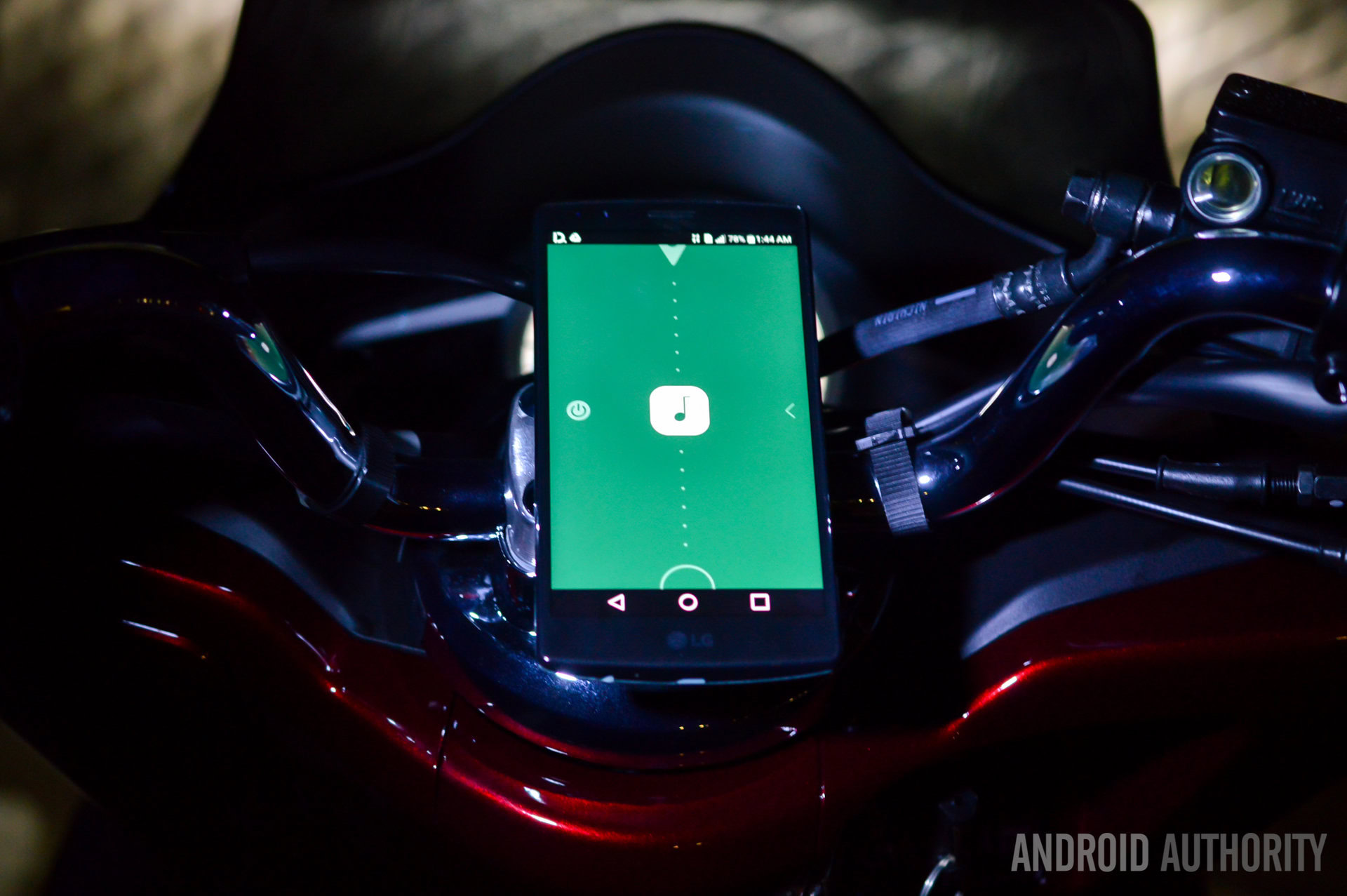
So here is where things really get interesting. I would say the user interface and the way you interact with it are the best parts about Drivemode. The application’s main lure is its “no look” experience, which is amazingly simple and manages to look very good. Press on that overwhelming tab and you will be able to start interacting with very little attention.
You can swipe up and down between Settings, Navigation, Music and Contacts. The app uses the vast majority of the touchscreen for this section. You just have to make sure you don’t press the “Power off” button (which shuts down Drivemode) on the left or the minimize button on the right. Otherwise, the rest of the screen is fair game! The application also reads everything out for you, so you will always know where you are. Tap on the middle of the screen to select whichever of the actions you prefer.
Accessing each of the functions
Settings
Accessing settings will present you with a full list of customization options you can rearrange. Because the app is very simple, there are not many things you can do (that’s a good thing!). Setting the default navigation app, selecting favorite places, choosing your favorite music players and more.
Safety is key, so the Settings menu also includes plenty of options to avoid distractions. You can select whether calls go through or not while driving. The same applies for messages, which you can also have read out to you. And one can even include preset text messages to quickly send something to your contacts.
Here’s the real kicker. My favorite options are under “Advanced Settings”. From here, you can allow Drivemode to automatically start when it connects to your car’s Bluetooth, or when the app detects that you are driving (using distance, speed and integrated sensors). There’s actually some fun stuff in here – you just have to dig around.
Navigation
You will likely be using this one the most. Navigation is important for driving, and Drivemode keeps it very handy. Access this section and you will be presented with big circles showcasing your favorite spots. Swipe from side to side to switch them. Of course, the app will continue reading everything out to you, so you don’t need to take a look at the screen, at all.
Press the sandwich menu button (three lines) and you can switch between your destinations, which proves to be rather convenient. It’s very simple to single out your favorites, or your calendar entries. It’s also possible to add a new place by selecting the last bubble to the right. Just enter a keyword, location or address. The app will simply send the search term to the desired navigation app when you need to travel to this destination.
By the way, that is the way Navigation works here. It pretty much simplifies the most intensive actions and then sends you over to Google Maps (or whichever navigation app you prefer). The rest of the work will be done from there.
I happen to love the way this system works. It’s super simple. I only have two gripes with this section. The first is that there is no way to go directly to the main UI. And this is not only for the Navigation section, this is an issue with all other actions, except Settings.
If you are within the Navigation, Music or Contacts sections, pressing the “X” button will close out the app and you will have to press on the Tab to re-access it. Annoying, but definitely something you get used to with enough time.
My second complaint is that searching for new location or adding a new favorite address requires you actually knowing where you need to go. Drivemode can’t simply access your contacts or access other sources. In this case, I would need to go over to my Contacts app, find my desired contact, copy the address, and ultimately, paste it on Drivemode. Not fun, right?
Music
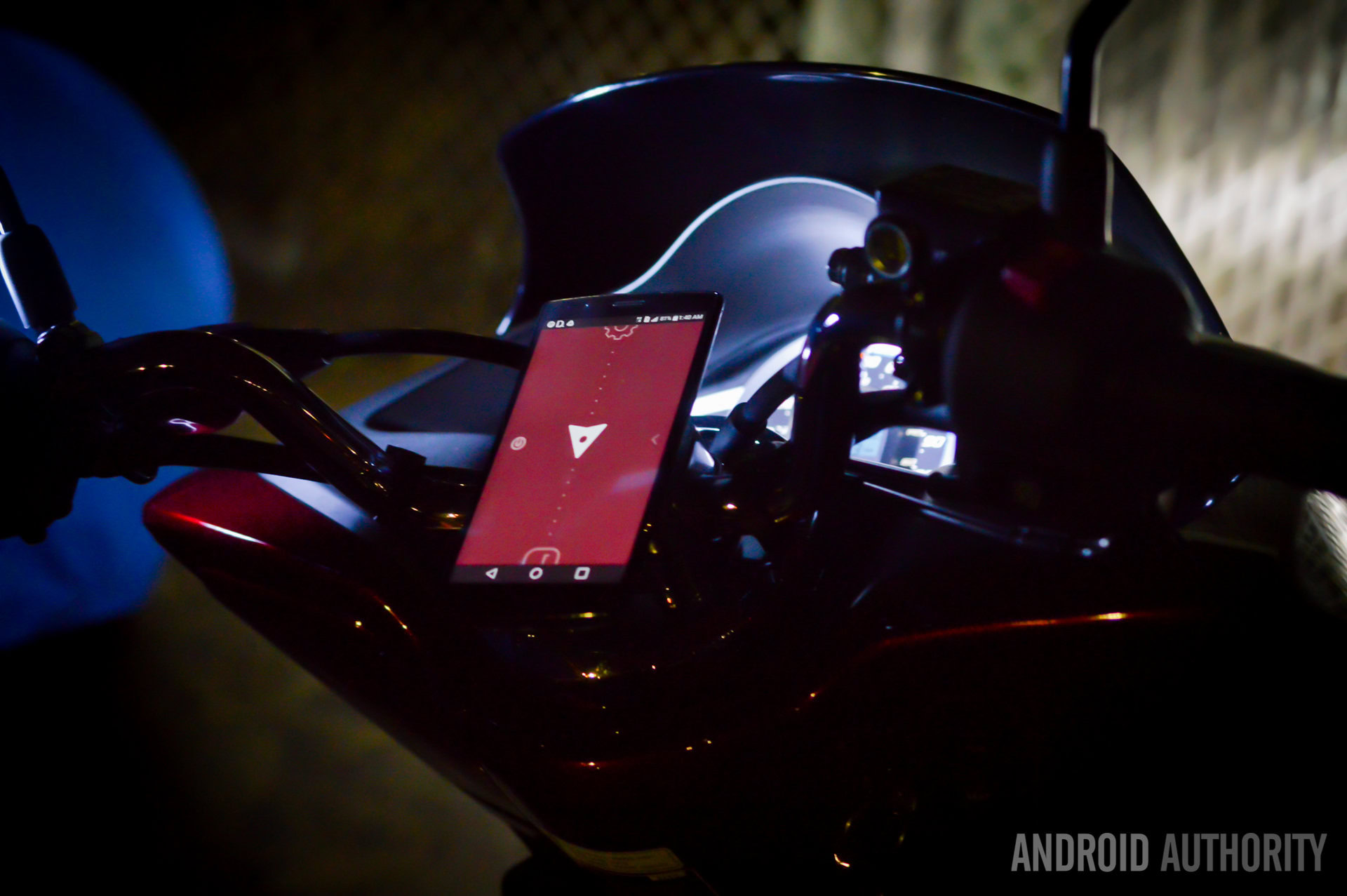
Music works the same, pretty much, with the only difference being that choosing a music service won’t send you directly to another app. Instead, you will be presented with another interface that pretty much controls the music service you opted for. Tap on the middle and you can play/pause. Swipe right or left to switch songs. Also, dragging your finger up or down the screen will manipulate the button. And of course, there is also a huge bubble at the bottom; pressing it will minimize the UI and send you back to your home screen.
Contacts
As you would expect, Contacts works the same way. Everything is uniform here, which is what makes the application awesome. One can easily do a voice search or scroll through favorite, recent and recommended contacts. Selecting one of your contacts will allow you to call him or send him a preset text message. Simple as pie!
Conclusion
Overall, I happen to love the app. I am not very good at multi-tasking when driving, which makes me one of those who don’t even touch their phones while on the road. While I still tried to avoid using the phone as much as possible, the little I did interact with it was made very simple with this app. I mean, I barely even looked at the screen! It’s just so easy once you get used to it.
Of course, the application is not perfect. It needs some polishing, that’s for sure. I find that getting in and out of the main UI can get confusing when you are first getting used to the app. I would also like it if the app could tap into your contacts for adding favorite locations. That proved to be an annoyance, as I had to go to the Contacts app, copy the addresses and then paste them in Drivemode.
Aside from small nuisances like those, the app has great potential. It just needs to be polished, which I am sure the app’s makers are working on. All in all, I say this is the best dashboard app for drivers who focus on safety and ease of use. You can go ahead and download it to test it yourself. Just give it a try and come complain to me if you don’t like it. Trust me, that probably won’t be the case.