Affiliate links on Android Authority may earn us a commission. Learn more.
ASUS ZenFone 3 Zoom review - is it worthy of its name?
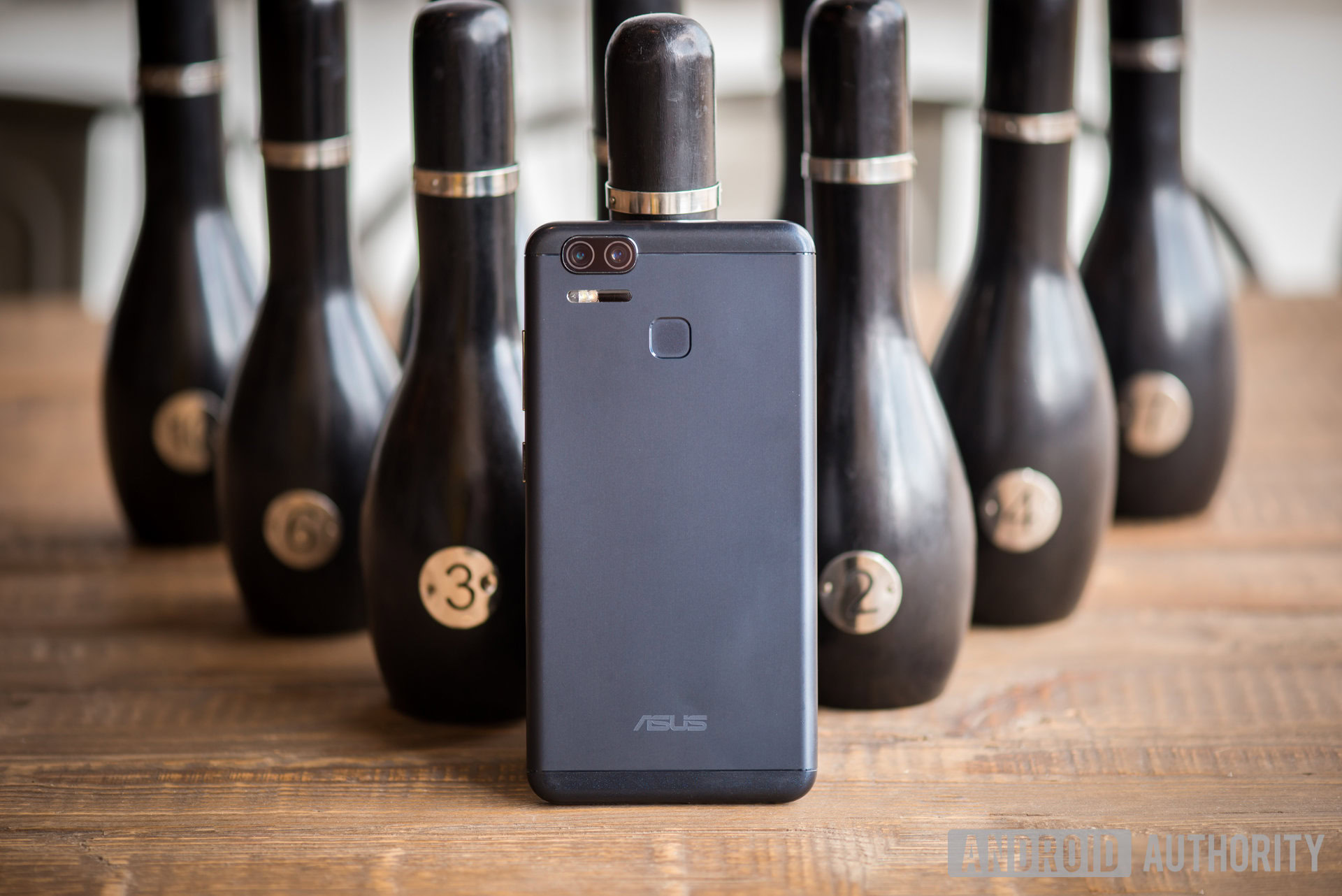
Every device has a main selling point, and the ASUS ZenFone 3 Zoom is all about its optical zoom capabilities, something we don’t often find in smartphones. Things have changed since the launch of the original ZenFone Zoom, though. From design to specs and features, this is a whole other beast.
At $329, the ZenFone 3 Zoom is cheaper than its predecessor too. It’s got great battery life and using it is pleasant, but the main selling point with this phone series is undoubtedly the camera. So how does it stack up? I’ve been using the ZenFone 3 Zoom as my primary device for a couple weeks, so let’s dive in; this is the ASUS ZenFone 3 Zoom review.
Design & build quality
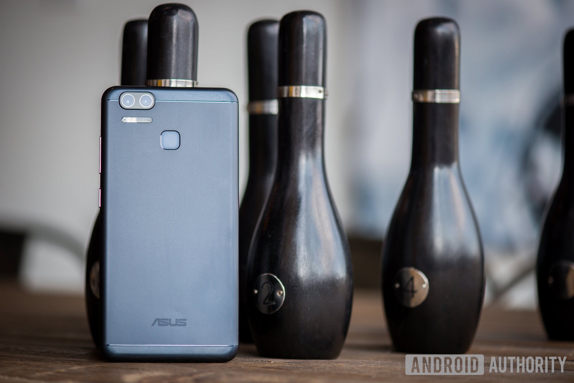
With the ZenFone 3 Zoom, ASUS has changed that ugly protruding back camera area and turned this phone into something that looks like a modern smartphone. It is thin and nice to look at, but this slimmer design comes at the cost of camera quality.
The ZenFone 3 Zoom looks just like many other devices out there.
The phone’s aluminum body makes it both look and feel as good as most premium handsets out there. But because the design has been streamlined, the phone is less distinct and now looks just like many other devices out there (including the one we don’t speak of around here).
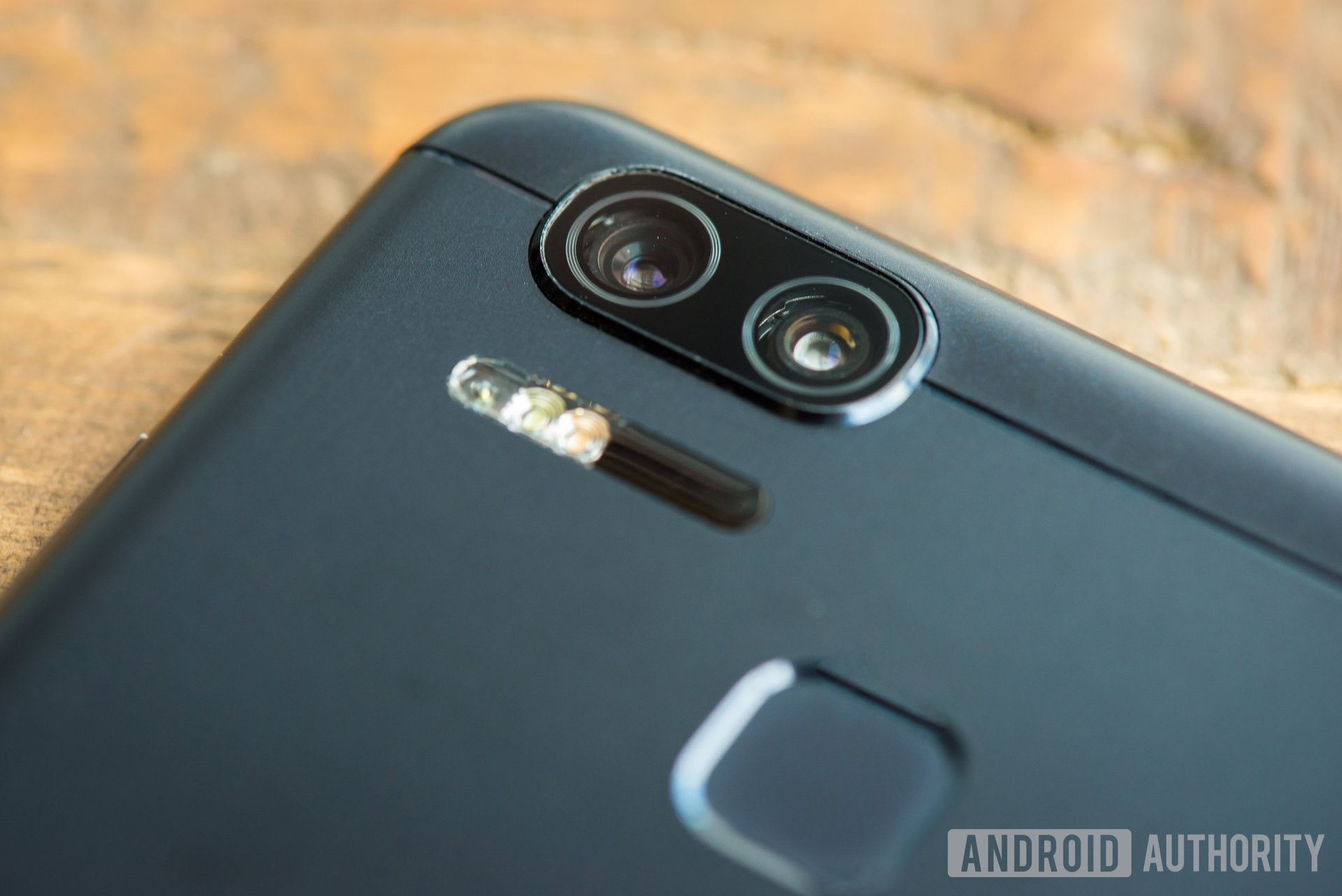
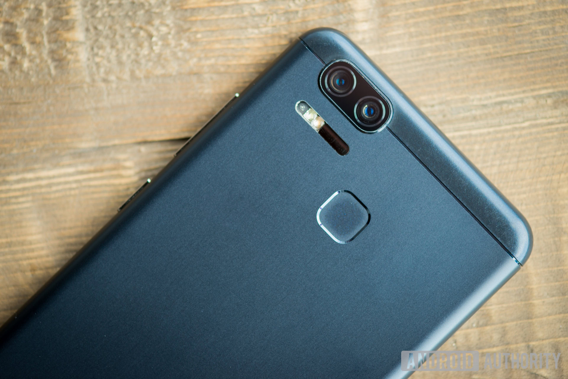
The back is adorned by antenna lines at the top and bottom, with a fingerprint reader in the upper middle section. The upper-left area houses all the camera components, which include dual cameras, a dual-LED flash and an RGB sensor for improved white balance control.
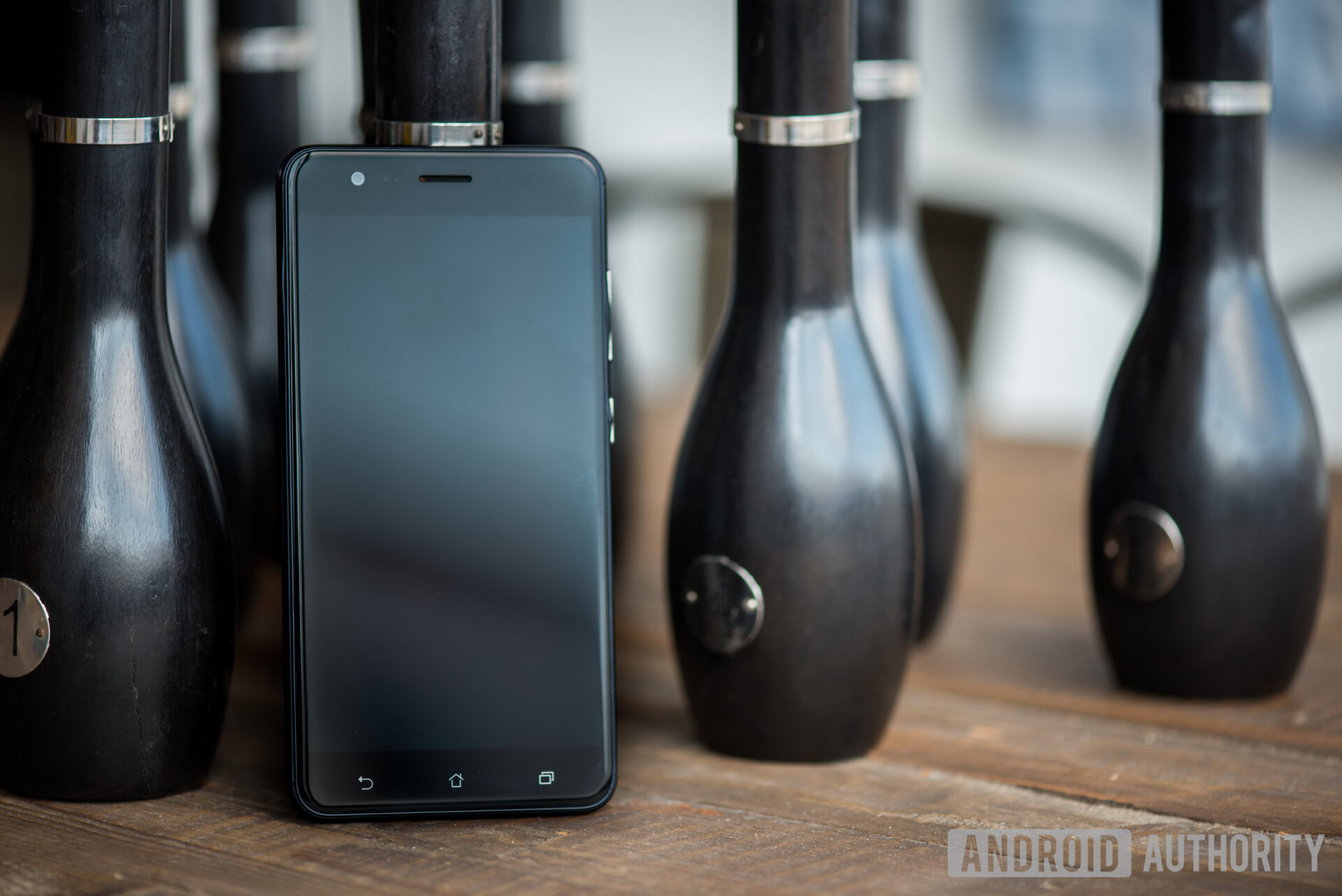
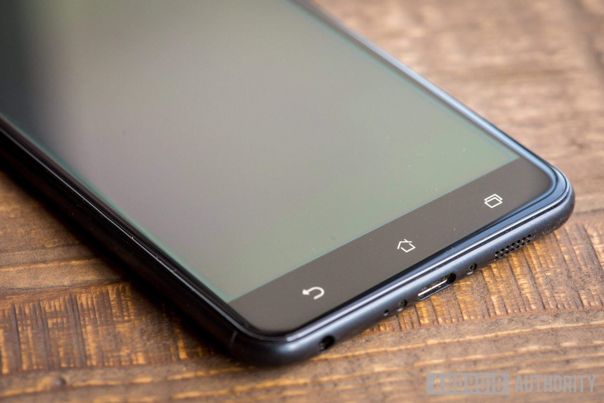
The front looks like your typical glass slab. It has a 5.5-inch AMOLED display, a front-facing camera, a speaker, and the usual navigation buttons at the bottom in the bezel. The volume and power buttons are on the right side of the device. The buttons have a slight wobble to them, but provide very nice feedback and feel solid enough.
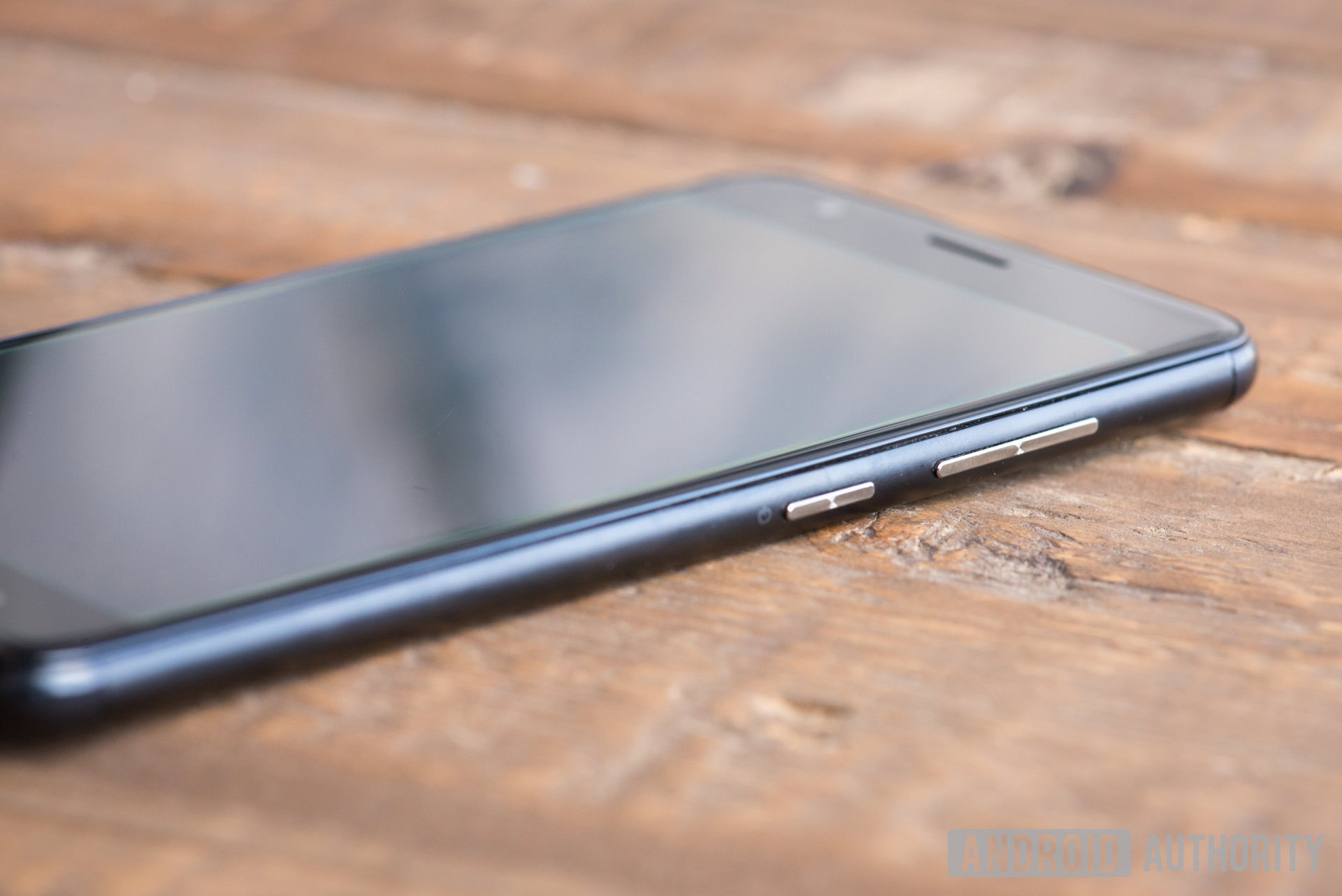
One thing I don’t like is that the capacitive buttons don’t light up, and require some muscle memory when operating the phone at night. It definitely takes some getting used to, as I still haven’t been able to consistently hit them in the dark without missing a few times.
Ultimately, the ASUS ZenFone 3 Zoom feels like a high-end smartphone. It is solid and very pleasing to the eye. I had one unexpected issue with its build quality, though. Despite never dropping or abusing the phone, I found a bend in the metal near the volume and power buttons. It’s not significant damage, but this is annoying considering I had only carried it around in my pocket.

Display & audio
The screen is nothing too fancy, but it gets the job done well enough. The 5.5-inch Full HD AMOLED screen displays deep blacks and vibrant colors. The panel is nice and bright too (up to 500 nits). So I never had an issue viewing content in direct sunlight.
My only gripe is that since the screen has a 1920×1080 resolution, pixels are occasionally visible. It’s a good screen for the money you are paying, but if you’re after something super crispy you’ll need to look elsewhere. The screen is coated with Gorilla Glass 5 which curves gently at the edges in typical 2.5D fashion.

ASUS talks all the talk about its sound quality; but does it walk the walk? Its fancy 5-magnet speaker construction, metal voice coil and expansive sound chamber do perform pretty well. The sound is surprisingly clear, but I feel it lacks bass and volume. The device can be a little quiet if outside noise gets even a little too high. It does an alright job, though, especially at this price range.
The ZenFone 3 Zoom has SonicMaster and High-Res Audio certification, which ASUS claims will deliver a superior listening experience especially with headphones on. The built-in NXP Smart AMP supports 24-bit/192 kHz playback on compatible headphones and DTS Headphone:X 7.1 surround sound . Naturally, your audio mileage will vary depending on the quality of the headphones you’re using.
Performance
Performance is not this phone’s strength, but it can hold its own with most casual tasks. It’s powered by the Qualcomm Snapdragon 625 platform, and runs relatively smoothly. Our version of the device came with 3 GB of RAM and 32 GB of internal storage, but there is a variant with 4 GB of RAM and 64 GB of on-board memory.
You won’t find yourself waiting much when checking your emails, going through social media and watching videos. It handles games mostly fine, but hiccups occasionally. If you consider yourself a power user, the ASUS ZenFone 3 Zoom handles everyday tasks well but falters in demanding situations.
Software

The previous ZenFone Zoom launched with Android 6.0.1 Marshmallow and plenty of bloatware. At the time, Nougat had already been around for a while, which made the choice unfortunate, especially considering that most affordable handsets were shipping with more recent Android versions.
The ZenFone 3 Zoom launches with Android 7.1.1 Nougat. Android Oreo is only just out for some devices, so at least it’s not already totally out of date.
Unfortunately, ASUS’ ZenUI is not the cleanest manufacturer skin around. Colors are cartoonish. Icons are large. The notification area feels clogged up and animations are a bit weird. It feels like a skin from 2013. Many of you won’t need to worry too much about these software annoyances, because if they really bug you, alternate launchers are there to come to the rescue.
People debate whether an app drawer is needed or not, so ASUS puts the choice in your hands.
There is still a bunch of bloatware in here, but it’s easy to uninstall or disable apps like Zenfit. Besides some of the pointless bloat, there are actually some cool features and apps included in the skin. I liked the Laser Ruler app, which uses the device’s laser to see how far an object is. You never know, that might come in handy.
People debate whether an app drawer is needed or not, so ASUS puts the choice in your hands. There is an app drawer by default, but you can get rid of it and simply throw all your apps on your home screen if you prefer the iOS approach. ASUS also threw in a blue light filter, so you don’t have to disturb your sleeping cycle when using the smartphone at night.
There are some helpful gestures in here too. The ZenFone 3 Zoom supports both motion and touch gestures, which allow for things like flipping over the device to silence it, putting the phone up to your ear to answer, and double tapping to wake the device. All pretty standard stuff, but better to have than not.
Camera
You don’t just throw the word “Zoom” into a smartphone name without justification. So we were expecting some serious close-up power from this handset.
What makes this phone series special is optical zoom, something we very rarely find in smartphones. The original Zoom had a big bump in the back. It looked ugly, but some people were willing to live with that for its 3x optical zoom. ASUS has downgraded a bit with the ZenFone 3 Zoom’s 2.3x optical zoom. Why?
There are no annoying bumps or awkward holding positions to deal with.
The main reason is probably aesthetics. The ASUS ZenFone 3 Zoom looks like a regular handset and a good looking one, at that. There are no annoying bumps or awkward holding positions to deal with. It’s just a dual-camera set-up hidden in the back corner. Regardless, optical zoom range seems to be about the only downgrade we can see on paper.
The newer handset comes with a couple Sony IMX362 12 MP sensors with an f/1.7 aperture and a large 1.4 µm pixel size. Other features include 4-axis optical stabilization, 3-axis digital stabilization, 4K @ 30 fps video recording, a white balance color sensor and dual-LED flash.
The front camera definitely received an upgrade too. It went from a simple 5 MP shooter in the previous generation to today’s 12 MP Sony IMX214 sensor with an f/2.0 aperture and large 1.12 µm pixels.
I can tell you right off the bat that this camera set-up is cool... but I don't know if it's really all that.
This all sounds amazing on paper, but how does it translate to real world usage? After using the camera for a week, I have gotten pretty acquainted with it and can tell you it’s not bad. The question is whether it deserves its camera-centric name, though.
I can tell you right off the bat that this camera set-up is cool… but I don’t know if it’s really “all that”. Let’s show you some examples and go over pictures together, shall we?

We can start with this picture of my friends, but let’s not focus on the totally manly things they are doing. Pay more attention to the center of the image, which showcases poor performance of the RGB white balance sensor. Sure, the socks look white, but the image shows a purple tint around the bike’s motor and tank, an area that should otherwise look jet black.
And despite the fact that we were outdoors in the blazing sun, I see a tiny bit of motion blur in the rider’s face. This should not happen at 1/450 shutter speed.

Now, let’s take a look at this one. Though it might seem like the image is too warm, this is a good thing. The area where this image was taken is actually filled with yellow lights, making this photo look accurate to real life. I was wondering if the camera was able to recreate the lighting effect, and surprisingly it did.

This place was very dimly lit, and the phone handled things pretty well. It’s by no mean a great image, but it did well considering the lighting. This is an example of where it’s not always good having an f/1.7 aperture, because only the front of the scooter is in focus. You start losing plenty of detail once you move away from that little area in the front fender.
Sadly, there isn’t much you can do about the aperture. There is a very cool manual mode that allows you to control white balance, shutter speed, ISO and more, but aperture is fixed. So you’ll just have to deal with the shallow depth of field. All you normally need to do to combat that though is just step back from the subject a bit.
But what about that zoom feature? After all, that’s what this phone is all about, right? Let’s take a look at some zoomed samples.
As you can see in the above, there’s a clear difference in how light and color were handled. The phone’s image processing system detects lighting differently when there are more variations in an image. The wider image has much more contrast, while the zoomed in version focuses on grabbing all the details it can from the shadows. Ultimately, you do get nice detailing in the zoomed in version, even if the photo is warmer and more washed out.
Better lighting clearly helps the 2.3x camera. The one thing that bugs me is that under good lighting the difference in quality is not very different when you compare optically and digitally zoomed images. Just open up the 1.0x image and zoom in as far as the 2.3x one. There is definitely a difference in detail if you really zoom in on both images, but you have to take it pretty far.
These photos were taken in a very dimly lit room. Zooming in on the 1.0x now shows a bit more of a difference when compared to the optically zoomed image. Noise levels and detail remain a bit better when using the 2.3x lens. You can especially tell this with the scooter images. Is the difference enough to justify getting this phone purely for its zoom capabilities? I wouldn’t say so, but it is cool to have.
Zooming in isn’t the only function this dual-camera setup has. Plenty of other phones with a similar system have used it to differentiate distance between objects and create a dramatic bokeh effect (otherwise known as “blurry background”). Want to see how well it works?


As you can see, this portrait mode works much better with people and objects at a farther distance. There is a clear distinction between the body and the background in the first image. Nothing seems off. Looking at the @ sign, things seem a little different. The camera thinks part of the @ sculpture is in the background and has blurred it out.
Then there is that orange part, which is a little sign in the background. Pay attention to it and you will see parts of it are blurred, while a smaller section isn’t. For some reason there is some concrete in focus in the background, right above that orange sign. It’s a total mess.
I took this selfie to show you guys how the front-facing camera works under regular conditions. This is also a high contrast image, though. I thought it would be a good chance to showcase the front-facing flash, which is just the screen throwing light at you.
The difference is quite apparent. More details appear in the image to the right, where the front-facing flash was used. Shadows are more balanced, even if the light becomes a bit over-bearing on the side where the sun hits my face. It’s a matter of preference, but it’s good to see you can light up the darkness, because the front-facing shooter does really bad in the dark.

Porcelain skin. Pitch black shadows. No details in the hair and beard. Need I say more?
Battery life
This is one of the ASUS ZenFone 3 Zoom’s main highlights. In fact, I would say this is more exciting than the optical zoom! The device packs a massive 5,000 mAh battery. Factor in the mid-end specs and the lower-resolution screen and you have a device that will easily take you through a couple days on a single charge. As a primary smartphone, I was never able to kill the phone in a single day, even when using it heavily. The ASUS ZenFone 3 Zoom is truly the king of smartphone battery life.
The ASUS ZenFone 3 Zoom is truly the king of smartphone battery life.
Out of the many phones I have used, this would definitely be my first choice to take on a camping trip. The device has so much battery, you can even use it to charge other products! ASUS’ reverse charging will charge slowly, as it is limited to 1A, and you will need an appropriate cable but it works, which is pretty crazy.
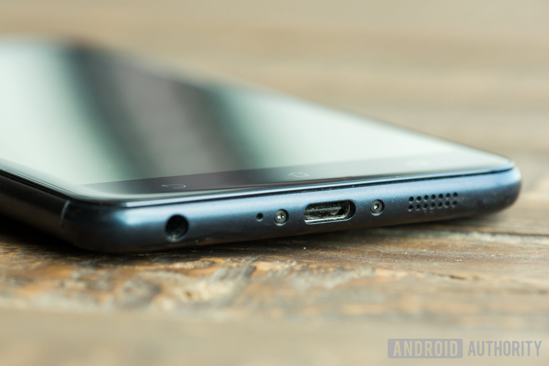
There is one downside to this huge battery, though. It takes forever to charge! This is because the phone’s fast charging is not up to standard. It juices up at 5V/2A, which is not that impressive compared to most modern smartphones. The phone takes a long time to die, true, but you will have to wait a while for it to revive when it eventually does.
We must give props to ASUS for being able to fit such a large battery into a regular-looking phone, without turning it into a heavy brick. This handset is thin and light (170 grams) and it still has a 5,000 mAh battery. To me, battery life trumps all (as long as the general experience is acceptable), so the ZenFone 3 Zoom has quickly become one of my favorite phones.
Specifications
| ASUS ZenFone 3 Zoom specs | |
|---|---|
Screen | 5.5-inch AMOLED 1920x1080 |
Processor | 2.0 GHz Qualcomm Snapdragon 625 octa-core processor |
RAM | 3/4 GB |
Rear camera | Dual 12 MP, SONY IMX362, f/1.7 aperture |
Front camera | 12 MP, SONY IMX214, f/2.0 aperture |
Storage | 32/64 GB (with microSD support) |
Dimensions | 6.07 x 3.03 x 0.31 inches |
Weight | 5.99 ounces |
Network | Dual-SIM |
Price & final thoughts

Using the ASUS ZenFone 3 isn’t a bad experience. You get modest mid-range specs that can handle most tasks properly. Just don’t expect premium performance out of it.
As for the camera, it’s pretty good. Its optical zooming capabilities are not amazing, but it’s a nice feature to have. I just wouldn’t buy the phone solely for that reason. Since the phone’s focus is in large part on its camera, this is pretty disappointing. At the end of the day, it can take some nice pictures, but they won’t compare to those coming from high-end handsets. The battery is arguably the ASUS ZenFone 3 Zoom’s best feature, not its camera.
The battery is arguably the ASUS ZenFone 3 Zoom's best feature, not its camera.
Interested? The ASUS ZenFone 3 starts at $329 from Amazon. It’s not an incredible camera phone, but if you are looking for an affordable handset that will last, this is it.