Affiliate links on Android Authority may earn us a commission. Learn more.
Building your Android UI: Everything you need to know about Views
Every mobile app has some form of user interface (UI), and in Android user interfaces are created using Views.
If you’re just getting started with Android development, then it makes sense to familiarize yourself with Views as soon as possible, as they’re central to many “Hello World” apps and Android tutorials.
Even if you’ve been developing Android apps for a while, it’s easy to get into a rut! If you’re using the same Views over and over, then now’s the perfect time for a refresher on all the different Views that are included in the Android platform.
In this article, we’ll be taking a closer look at this essential building block of Android development, before exploring some of the most commonly-used Views that you can use in your Android apps.
What is a View, exactly?
View objects, sometimes referred to as “widgets” are the building blocks of all Android UIs.
Each View occupies a rectangular area of the screen and typically draws something that the user can see, such as text or an image. In addition to displaying content, some Views also provide interactive functionality, such as Buttons, EditTexts and Spinners. Whenever an event occurs Android dispatches this event to the appropriate View, which then handles the event and notifies any listeners.
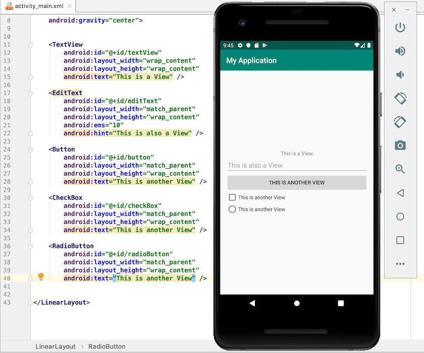
The easiest way to add a View to your Java or Kotlin project, is to define that View within an XML layout resource file. Android provides a simple XML syntax that corresponds to the different View subclasses, for example in the following snippet we’re using XML to instantiate a TextView:
<TextView
       android:layout_width="wrap_content"
       android:layout_height="wrap_content"
       android:text="Hello World!"
       app:layout_constraintBottom_toBottomOf="parent"
       app:layout_constraintLeft_toLeftOf="parent"
       app:layout_constraintRight_toRightOf="parent"
       app:layout_constraintTop_toTopOf="parent" />
The Android framework is responsible for measuring, laying out and drawing your Views, so you don’t have to explicitly call any methods to perform these actions.
To build a layout, simply keep adding View elements to your XML file, similar to how you create webpages in HTML – just try to keep nesting to a minimum, as it can negatively impact your application’s performance. User interfaces with “shallow” View hierarchies tend to be drawn faster, so if you’re going to deliver a high-performing app then you’ll need to avoid nesting wherever possible.
If you know all of a View’s properties at build time, then you can define this View entirely in XML. By keeping your UI code separate from your application code, you can provide alternate layouts that are optimized for different screen sizes, orientations and languages. This separation also makes your application code easier to read, test and modify, as it isn’t muddled up with UI code.
Since it’s the recommended approach, we’ll be defining Views in XML throughout this tutorial, although you can create Views programmatically where required.
If you need to edit a View’s properties at runtime, then’ll typically have to define some, or all of that View’s properties programmatically in Java or Kotlin. For example, in the following snippet we’re defining a TextView in Java:
//Create a TextView programmatically//

        TextView tv = new TextView(getApplicationContext());

//Define the View’s layout parameters//

        LayoutParams lp = new LinearLayout.LayoutParams(

//Set the View’s width//

                  LayoutParams.WRAP_CONTENT,

//Set the View’s height//

                  LayoutParams.WRAP_CONTENT);

//Apply the layout parameters to the TextView//

        tv.setLayoutParams(lp);

//Set the text//

        tv.setText("Hello World!");

//Add the TextView to the parent ViewGroup//

        rl.addView(tv);
    }
}
Note that you may be able to declare your app’s default layout in XML, and then modify some of its properties at runtime.
Working with Views: Common XML attributes
When creating a View, you’ll need to define various View properties, using XML attributes. Some of these attributes will be unique to that particular View, but there are a number of XML attributes that you’ll encounter over and over again, regardless of the kind of View you’re working with.
Identifying your Views
Every View must have an integer ID that uniquely identifies that particular View. You define integer IDs in your layout files, for example:
android:id="@+id/hello_world"The + symbol signifies that this is a new name that must be created and added to your project’s R.java file.
When you need to work with a View, you can reference it using its View ID. Typically, you’ll reference a View by creating an instance of that View object in your Activity’s onCreate() method, for example:
TextView myTextView = (TextView) findViewById(R.id.hello_world);The ID integer technically doesn’t need to be unique throughout the entire tree, just within the part of the tree you’re searching. However, to avoid conflicts and confusion it’s recommended that you use completely unique View IDs, wherever possible.
Layout parameters: Width and height
XML attributes that start with “layout_” define a View’s layout parameters. Android supports a variety of layout parameters, but as a minimum you must define a width and height using the layout_width and layout_height attributes.
Android devices have screens of varying dimensions and pixel densities, so 10 pixels doesn’t translate to the same physical size across every device. If you define a View’s width and height using exact measurements, then this can result in user interfaces that only display and function correctly on devices with specific screens, so you should never use any exact measurements when creating your Views.
Instead, you can define a View’s width and height, using any of the following relative measurements:
- wrap_content. This View should be just big enough to display its content, plus any padding.
- match_parent. This View should be as big as its parent ViewGroup will allow.
- dp. If you need more control over a View’s sizing, then you can provide a density-independent pixel measurement, for example android:layout_width=”50dp.” Note that one dp is roughly equal to one pixel on a “baseline” medium-density screen.
- sp. If you want to size text using a density-independent pixel measurement, then you should use scalable pixels (sp), for example: android:textSize=”20sp.” Scalable pixels ensure that your app’s text respects the device’s selected text size, so your text will appear bigger on devices that are set to display Large text, and smaller on devices that are set to display Small text.
Give your content some breathing space!
You can use padding to insert some space between the edges of a View and the View’s content, which can be useful for giving your content some “breathing space” and preventing your UI from looking overly busy or cluttered.
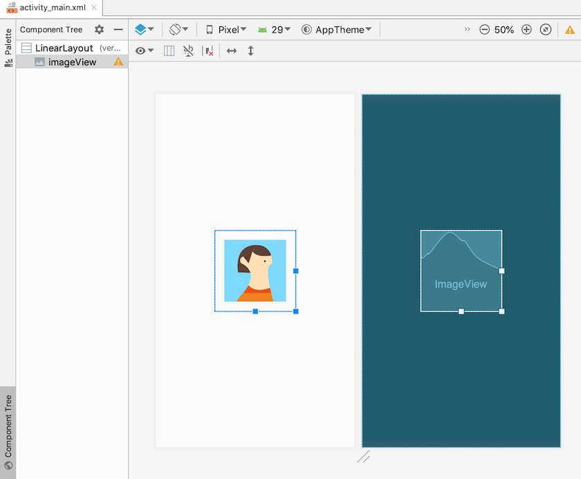
The following screenshot shows an ImageView with 10dp of padding:
Android provides the following padding attributes:
- android:padding. Adds extra space to all four edges. If you define a android:padding value, then it’ll take precedence over any edge-specific values, such as paddingLeft and paddingTop, but it won’t override paddingStart or paddingEnd.
- android:paddingBottom. Adds extra space to the bottom edge.
- android:paddingEnd. Adds extra space to the end edge.
- android:paddingHorizontal. Adds extra space to the left and right edges. If you define a android:paddingHorizontal value then it’ll take precedence over paddingLeft and paddingRight, but not paddingStart or paddingEnd.
- android:paddingLeft. Adds extra space to the left edge.
- android:paddingRight. Adds extra space to the right edge.
- android:paddingStart. Adds extra space to the start edge.
- android:paddingTop. Adds extra space to the top edge.
- android:paddingVertical. Adds extra space to the top and bottom edges. If you define a android:paddingVertical value, then it’ll take precedence over paddingTop and paddingBottom.
Margins: Adding space around your Views
While padding is applied between the edges of the View and the View’s contents, margins are applied outside of the View’s bounds. You can use margins to create space between your Views, or to create space between a View and the screen’s borders.
If your app contains multiple interactive UI elements, then margins can help ensure the user always activates the correct control, particularly for users who have manual dexterity issues.
Android provides the following margin attributes:
- android:layout_margin. Adds extra space to the left, top, right and bottom sides of a View, for example android:layout_marginRight=”10dp.” If you define a layout_margin value, then it’ll take precedence over any edge-specific values.
- android:layout_marginBottom. Adds extra space to the bottom side of the View.
- android:layout_marginEnd. Adds extra space to the end side of the View.
- android:layout_marginHorizontal. Adds extra space to the left and right sides of the View. Declaring a layout_marginHorizontal value is equivalent to declaring a layout_marginLeft and a layout_marginRight value. A layout_marginHorizontal value will take precedence over any edge-specific values.
- android:layout_marginLeft. Adds extra space to the left side of the View.
- android:layout_marginRight. Adds extra space to the right side of the View.
- android:layout_marginStart. Adds extra space to the start side of the View.
- android:layout_marginTop. Adds extra space to the top side of the View.
- android:layout_marginVertical. Adds extra space to the top and bottom sides of the View. Declaring a layout_marginVertical value is equivalent to declaring a layout_marginTop and a layout_marginBottom value. A layout_marginVertical value will take precedence over any edge-specific values.
What Android Views can I use?
Now we’ve covered some common layout attributes, let’s take a closer look at some of the Views that are provided as part of the Android SDK.
Displaying text, with TextViews
You use TextViews to display text to your users, including interactive text such as hyperlinks, email addresses and phone numbers.
To create a TextView, simply add a <TextView> element to your layout resource file, and then specify your text using the android:text attribute and a string:
<TextView
        android:id="@+id/hello_world"
        android:layout_height="wrap_content"
        android:layout_width="wrap_content"
        android:text="@string/helloWorld" />
If required, you can set or modify the View’s text at runtime, from your project’s Java code:
public class MainActivity extends Activity {

    protected void onCreate(Bundle savedInstanceState) {
         super.onCreate(savedInstanceState);
         setContentView(R.layout.activity_main);
         final TextView helloWorldTextView = (TextView) findViewById(R.id.hello_world);
         helloWorldTextView.setText(R.string.new_text);
     }
 }
You can also style your text, using elements such as android:textColor, android:fontFamily, and android:textStyle, which has possible values of bold, italic, and bolditalic.
EditTexts: Creating editable, interactive text
EditText is an extension of the TextView class, which allows users to enter text into the View or modify the View’s existing text. Some common examples of EditTexts include login forms where the user can enter their email address and password, and forms where you can enter your payment details.
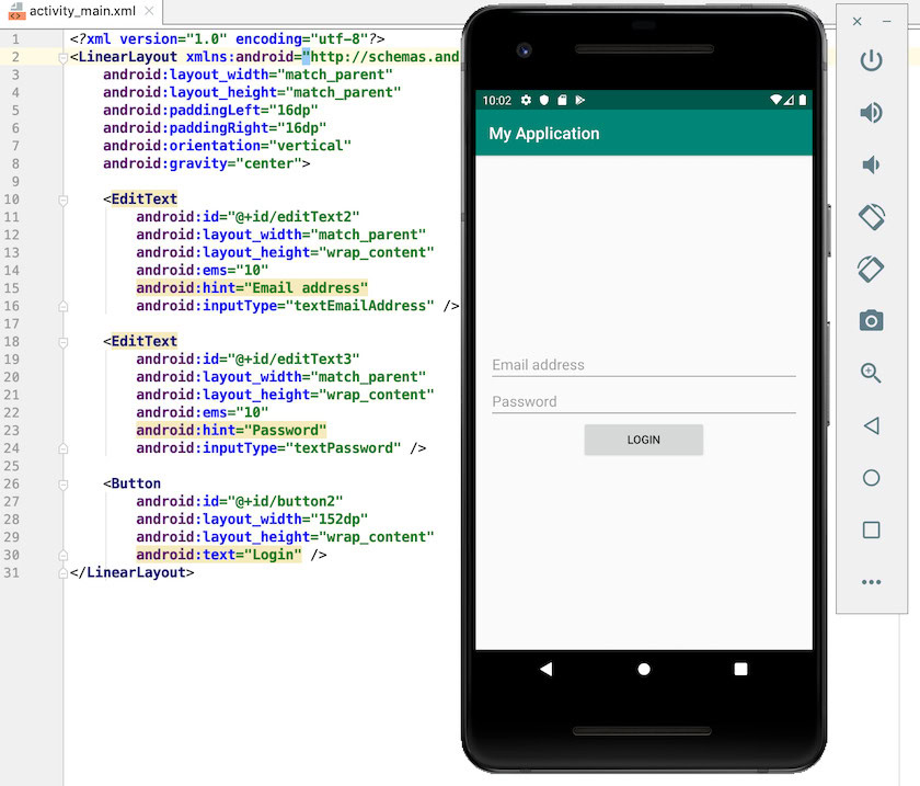
<EditText
    android:id="@+id/phoneNumber"
    android:layout_width="fill_parent"
    android:layout_height="wrap_content"
    android:inputType="phone" />
Android supports a list of inputTypes, including some that specify additional behavior, for example android:inputType=”textPassword” automatically masks the user’s input, which reduces the chances of someone spying on their password.
You’ll find a complete list of supported android:inputType values, over at the official Android docs.
Depending on the expected input type, you may be able to further streamline the user experience by combining inputType values with attributes that define additional behaviour, such as whether to provide spelling suggestions, or automatically capitalize new sentences. For example, if you wanted your EditText to capitalize the first word of a sentence and auto-correct spelling mistakes, then you’d use the following:
android:inputType=
        "textCapSentences|textAutoCorrect
By default, Android’s virtual keyboard provides a user action button, such as a Next or Done button. However, these default actions aren’t always appropriate for the currently-selected EditText, for example if your EditText is a search field, then a Search action makes much more sense than Next or Done.
You can specify an alternative action for your EditText, using the android:imeOptions attribute and one of the many supported values, such as an actionSearch which performs a Search operation using the EditText’s contents.
Finally, sometimes you may want to be notified when the user changes the contents of your EditText. For example if your password EditText requires a password that’s at least ten characters long and features a mixture of letters, symbols and numbers, then you can improve the user experience by automatically checking the user’s input as they’re typing and then notifying them of any issues with their password, before they hit the Register button. You can register to receive these callbacks, by adding a TextWatcher to your EditText.
Displaying PNGs, JPGs and GIFs
You can use the ImageView class to display images. These images can be drawables that you instantiate from an image resource that’s saved in your project, or they can be images that your app downloads over the device’s Internet connection.
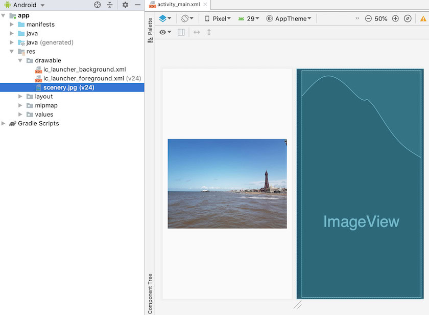
To instantiate a drawable from an image resource, you need to add a PNG, JPG or GIF to your project’s res/drawable directory and then reference that file from your XML layout. You’ll need to use the image’s file name as its resource ID, so if you had a file named scenery.jpg then you’d display that image using the following:
<ImageView
         android:id="@+id/myImage"
         android:layout_width="wrap_content"
         android:layout_height="wrap_content"
         android:src="@drawable/scenery" />
The following screenshot shows this scenery drawable, rendered in Android Studio:
Alternatively, in Android 5.0 (API level 21) and higher you can use vector drawables, which define an image as a set of points, lines, and curves. Vector drawables can be scaled without loss of display quality, so you can use a single file for all of Android’s different screen densities.
Creating a custom vector drawable is beyond the scope of this tutorial, but you can get a taste for working with vectors, by taking a look at Vector Asset Studio, which is included as part of Android Studio.
You can use Vector Asset Studio to quickly and easily add any of the stock Material design icons to your project, in vector drawable format:
- In Android Studio, Control-click your project’s drawable folder.
- Select New > Vector Asset.
- In Asset type, select Clip Art.
- Select the Clip Art button, which displays the Android logo by default.
- Choose any of the Material design icons; I’m using “done.”
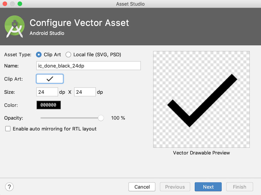
- Give this asset a descriptive name, and then click Next.
- Read the onscreen information, and if you’re happy to proceed then click Finish.
- Open your project’s drawable folder and you should see a new XML file that defines your chosen Material icon as a vector drawable. Here’s the contents of my vector drawable resource:
<vector xmlns:android="http://schemas.android.com/apk/res/android"
       android:width="24dp"
       android:height="24dp"
       android:viewportWidth="24.0"
       android:viewportHeight="24.0">
   <path
       android:fillColor="#FF000000"
       android:pathData="M9,16.2L4.8,12l-1.4,1.4L9,19 21,7l-1.4,-1.4L9,16.2z"/>
</vector>
You then just need to reference this vector drawable in your ImageView, in exactly the same way you’d reference a standard drawable resource, for example android:src=”@drawable/done_vector.”
Buttons and ImageButtons
Buttons and ImageButtons are Views that listen for clicks and then call a method in your code every time the user interacts with that button.
You can communicate the action that’ll occur when the user interacts with your button, using a text label, an icon, or a text label and an icon.
In the following snippet, we’re creating a Button that features a text label:
<Button
   android:layout_width="wrap_content"
   android:layout_height="wrap_content"
   android:text="@string/button_label"/>
To create an ImageButton, you’ll need to add an image file to your project and then reference it in exactly the same way you referenced your drawables in the previous section. For example:
<ImageButton
    android:layout_width="wrap_content"
    android:layout_height="wrap_content"
    android:src="@drawable/button_icon"/>
If you want to create a button that features an image and a text label, then you’ll need to add a text label as normal, and then reference your drawable using one of the following attributes:
- android:drawableLeft. Position the drawable to the left of the text.
- android:drawableRight. Position the drawable to the right of the text.
- android:drawableStart. Position the drawable to the start of the text.
- android:drawableEnd. Position the drawable to the end of the text.
- android:drawableTop. Position the drawable above the text.
- android:drawableBottom. Position the drawable below the text.
Here, we’re creating a button_icon drawable and placing it at the start of the Button’s button_label text:
<Button
   android:layout_width="wrap_content"
   android:layout_height="wrap_content"
   android:text="@string/button_label"
   android:drawableStart="@drawable/button_icon"/>
In addition to adding labels and images, you can customize your Buttons and ImageButtons by adding a background image or a color resource, using the android:background attribute. For example, you can turn a button blue, by adding the following to your Button or ImageButton declaration:
android:background="#0000FF"Whenever the user interacts with a button, that Button or ImageButton will receive an onClick event. You’ll need to define a handler for this event, using the android:onClick attribute.
The value of the onClick attribute must correspond to a public method, which will be called in response to the onClick event, for example:
<Button
   android:layout_width="wrap_content"
   android:layout_height="wrap_content"
   android:text="@string/button_label"
   android:onClick="displayToast" />
Next, you’ll need to implement this method in the Activity that’s hosting your Button or ImageButton. This method must be public, return void, and define a View as its only parameter, for example:
public void displayToast(View view) {
       Toast.makeText(MainActivity.this,
               "Your Message", Toast.LENGTH_LONG).show();

   }

}
Alternatively, you can declare an event handler programmatically. In Java, this means creating an View.OnClickListener object and then assigning it to the Button or ImageButton, using setOnClickListener(View.OnClickListener).
Give your users options, with CheckBoxes
CheckBoxes allow the user to choose one or more options from a vertical list.
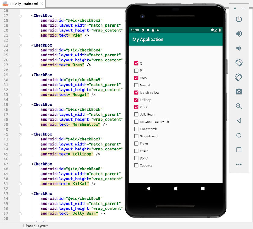
You create a CheckBox by adding a <Checkbox> item to your XML layout:
<CheckBox android:id="@+id/yes"
        android:layout_width="wrap_content"
        android:layout_height="wrap_content"
        android:text="@string/yes"
        android:onClick="onCheckboxClicked"/>
Since CheckBoxes typically allow the user to select multiple items, you’ll need to add an android:onClick attribute to each individual <CheckBox> element, and then reference the method that’ll be called in response to CheckBox click events.
When you implement the corresponding method in your hosting Activity, you’ll need to verify which CheckBox was selected, and then perform an appropriate action depending on the user’s selection. For example, if we created Yes and No CheckBoxes, then we’d add the following to our hosting Activity:
public void onCheckboxClicked(View view) {
    boolean checked = ((CheckBox) view).isChecked();

//Verify which checkbox is selected//

    switch(view.getId()) {
         case R.id.yes:

//If the “yes” checkbox is selected, then...//

            if (checked)

//Do something//

            else
            Break;

//If the “no” checkbox is selected, then….//

        case R.id.no:

            if (checked)

//Do something//
Views and ViewGroups: Creating RadioButtons
RadioButtons allow the user to choose from a set of mutually-exclusive options, such as the Agree/Disagree buttons commonly found on Terms and Conditions forms.
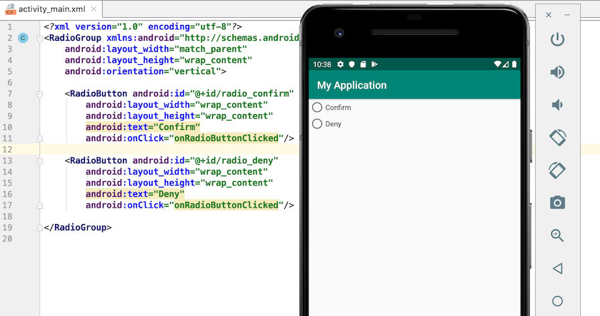
You create each RadioButton by adding a <RadioButton> element to your layout. Since RadioButtons are mutually exclusive you’ll need to arrange all of your <RadioButton> elements inside a <RadioGroup> ViewGroup, which ensures that only one RadioButton can be selected at a time.
<?xml version="1.0" encoding="utf-8"?>
<RadioGroup xmlns:android="http://schemas.android.com/apk/res/android"
    android:layout_width="match_parent"
    android:layout_height="wrap_content"
    android:orientation="vertical">
    <RadioButton android:id="@+id/radio_confirm"
        android:layout_width="wrap_content"
        android:layout_height="wrap_content"
        android:text="@string/confirm"
        android:onClick="onRadioButtonClicked"/>
    <RadioButton android:id="@+id/radio_deny"
        android:layout_width="wrap_content"
        android:layout_height="wrap_content"
        android:text="@string/deny"
        android:onClick="onRadioButtonClicked"/>
</RadioGroup>
You define a click handler by adding the android:onClick attribute to every RadioButton in your RadioGroup, and then implementing the corresponding method in your hosting Activity. Similar to our CheckBox example, this method needs to verify which RadioButton is currently selected, and then take appropriate action based on the user’s selection.
public void onRadioButtonClicked(View view) {
    boolean checked = ((RadioButton) view).isChecked();

//Verify which RadioButton is selected//

    switch(view.getId()) {

//If the “confirm” radio button is selected, then...//

        case R.id.radio_confirm:

            if (checked)

//Do something//

            Break;

//If the “deny” button is selected, then...//

         case R.id.radio_deny:

             if (checked)

//Do something//
Spinner
When tapped, a Spinner displays a set of values as a dropdown menu.
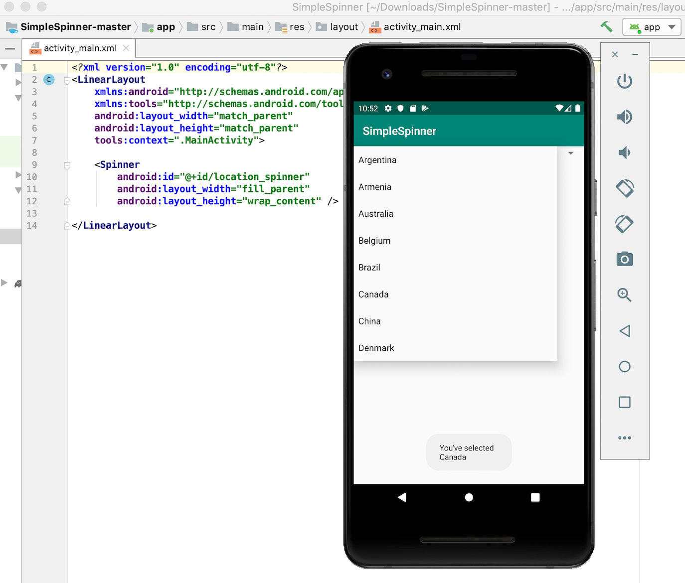
The user can tap any item in the Spinner, and your application will perform an action based on their selection. By default, a Spinner always displays the currently-selected value.
A functioning Spinner consists of several components:
- A <Spinner> element that you add to your layout resource file.
- A data source that supplies your Spinner with some information; I’ll be using a simple String Array.
- An ArrayAdapter that converts your data into View items, ready to be displayed in your Spinner.
Let’s start by adding a <Spinner> to our XML layout:
<?xml version="1.0" encoding="utf-8"?>
<LinearLayout
   xmlns:android="http://schemas.android.com/apk/res/android"
   xmlns:tools="http://schemas.android.com/tools"
   android:layout_width="match_parent"
   android:layout_height="match_parent"
   tools:context=".MainActivity">

   <Spinner
       android:id="@+id/location_spinner"
       android:layout_width="fill_parent"
       android:layout_height="wrap_content" />

</LinearLayout>
If the data is predetermined, then you can provide it as a String Array that’s defined in your Strings.xml file:
<resources>
   <string name="app_name">SimpleSpinner</string>
       <string-array name="location_array">
           <item>Argentina</item>
           <item>Armenia</item>
           <item>Australia</item>
           <item>Belgium</item>
           <item>Brazil</item>
           <item>Canada</item>
           <item>China</item>
           <item>Denmark</item>
           </string-array>
           </resources>
You can then deliver this Array to your Spinner using an instance of ArrayAdapter, which you implement in an Activity or Fragment.
To define an ArrayAdapter, we need to complete the following steps:
- Create an ArrayAdapter from the String Array, using the createFromResource() method.
- Specify a layout resource that defines how the user’s chosen item should appear in the Spinner. Android provides a simple_spinner_item layout that you should use unless you specifically require a custom layout.
- Use setDropDownViewResource(int) to specify which layout the Adapter should use for the Spinner dropdown menu. Once again, Android provides a ready-made layout (simple_spinner_dropdown_item) that should be suitable for most projects.
- Apply the Adapter to your Spinner, by calling setAdapter().
Here’s my completed code:
Spinner spinner = (Spinner) findViewById(R.id.location_spinner);

//Create an ArrayAdapter//

ArrayAdapter<CharSequence> adapter = ArrayAdapter.createFromResource(this,

//Populate the spinner using the String Array and the simple_spinner_item layout//

        R.array.location_array, android.R.layout.simple_spinner_item);

//Specify the layout that should be used for the dropdown menu//

adapter.setDropDownViewResource(android.R.layout.simple_spinner_dropdown_item);

//Apply the Adapter to the Spinner//

spinner.setAdapter(adapter);
The Spinner will receive an onItemSelected event every time the user selects an item from the dropdown. To process this event, you’ll need to use the AdapterView.OnItemSelectedListener interface to define an onItemSelected() callback method.
In the following code, I’m displaying a toast every time onItemSelected() is invoked, and incorporating the name of the newly-selected item into my toast. I’m also defining a onNothingSelected() callback method, as this is also required by the AdapterView.OnItemSelectedListener interface.
Here’s the completed Activity:
import androidx.appcompat.app.AppCompatActivity;

import android.os.Bundle;
import android.view.View;
import android.widget.AdapterView;
import android.widget.ArrayAdapter;
import android.widget.Spinner;
import android.widget.Toast;

public class MainActivity extends AppCompatActivity implements AdapterView.OnItemSelectedListener {

   @Override
   protected void onCreate(Bundle savedInstanceState) {
       super.onCreate(savedInstanceState);
       setContentView(R.layout.activity_main);

       Spinner spinner = (Spinner) findViewById(R.id.location_spinner);
       spinner.setOnItemSelectedListener(this);

       ArrayAdapter<CharSequence> adapter = ArrayAdapter.createFromResource(this,

               R.array.location_array, android.R.layout.simple_spinner_item);
                   adapter.setDropDownViewResource(android.R.layout.simple_spinner_dropdown_item);
       spinner.setAdapter(adapter);

   }

   public void onItemSelected(AdapterView<?> parent, View view,
                   int pos, long id) {

       Toast.makeText(parent.getContext(),
               "You've selected \n" + parent.getItemAtPosition(pos).toString(),
               Toast.LENGTH_LONG).show();
   }

   @Override
   public void onNothingSelected(AdapterView<?> adapterView) {

//To do//

   }
}ListViews: Displaying your data as scrollable lists
A ListView displays a collection of items as a vertically-scrolling, single column list. When the user selects an item from a ListView, your app will typically perform an action, such as displaying additional information about the selected item.
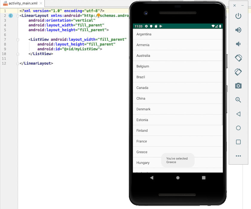
To create a ListView, you’ll need to add a <ListView> element to your XML layout resource file, and then create an Adapter, which will handle the process of displaying each item in your ListView.
Let’s start by adding a <ListView> to our layout:
<?xml version="1.0" encoding="utf-8"?>
    <LinearLayout xmlns:android="http://schemas.android.com/apk/res/android"
    android:orientation="vertical"
    android:layout_width="fill_parent"
    android:layout_height="fill_parent">

    <ListView android:layout_width="fill_parent"
        android:layout_height="fill_parent"
        android:id="@+id/myListView">
    </ListView>

</LinearLayout>
A ListView requests Views on-demand from its assigned Adapter. In our MainActivity, we need to create an Adapter and then associate it with our ListView, using setAdapter(android.widget.ListAdapter).
import android.app.Activity;
import android.widget.AdapterView;
import android.widget.ArrayAdapter;
import android.os.Bundle;
import android.widget.ListView;
import android.view.View;
import android.widget.Toast;

public class MainActivity extends Activity {

    String[] countryArray = {"Argentina" , "Armenia", "Australia", "Belgium" ,"Brazil" ,"Canada" , "China" ,
            "Denmark" , "Estonia" , "Finland" , "France" , "Greece" , "Hungary" , "Iceland" , "India" ,
            "Indonesia" , "Italy" , "Japan" , "Kenya" , "Latvia"};

    @Override
    protected void onCreate(Bundle savedInstanceState) {
        super.onCreate(savedInstanceState);
        setContentView(R.layout.activity_main);

        final ListView listView = (ListView)findViewById(R.id.myListView);

 ArrayAdapter<String> adapter = new ArrayAdapter<String>(this,android.R.layout.simple_list_item_1, countryArray);
   listView.setAdapter(adapter);

        listView.setOnItemClickListener(new AdapterView.OnItemClickListener() {
            @Override
            public void onItemClick(AdapterView<?> parent, View view, int position, long id) {
                Toast.makeText(parent.getContext(),
                        "You've selected \n" + parent.getItemAtPosition(position).toString(),
                         Toast.LENGTH_LONG).show();

            }
        }
        )
                ;
    }}
You can download this completed ListView project from GitHub.
Designing unique experiences: Creating custom Views
While there’s no shortage of built-in Views, sometimes you may have very specific requirements that aren’t met by any of Android’s built-in Views. In this scenario you can create your own, custom Android Views.
Most of the time, you’ll create a custom View by identifying a built-in View that almost meets all of your requirements, and then extend this View with your own modifications. However, it’s also possible to create a View from scratch, by extending the base View class.
Creating a custom View is an advanced topic that requires you to complete multiple steps, including providing overrides for the methods that Android usually calls automatically, such as onDraw() and onTouchEvent(), but custom Views can be an effective way to deliver unique experiences to your users.
Wrapping up
In this article, we explored all of the most commonly-used Android Views, plus some of the key attributes you’ll use when creating these Views.
Are there any Views you’d like us to explore in more detail? Let us know in the comments below!
Thank you for being part of our community. Read our Comment Policy before posting.