Affiliate links on Android Authority may earn us a commission. Learn more.
An overview of the Android Design Support Library
September 16, 2015


Google introduced the Material Design guidelines for Android developers, but, initially, neglected to provide some of the new widgets and elements. At I/O 2015, however, the Android Design Support Library was announced, which greatly simplifies the effort required to implement some of the Material Design widgets and techniques in Android apps. The Design Support Library is incredibly easy to use, and, unsurprisingly, is compatible with Android versions from API 7 (Gingerbread) upwards. Excited yet? Let’s jump right in.
Adding the Design Support Library, using Android Studio, is straightforward. Firstly, update your SDK tools to the latest version, then, from Android Studio menu, click “Build”, “Edit Libraries and Dependencies…”, click the green “+” button at the top right, select “Library Dependency”, scroll and locate “design (com.android.support:design:x.y.z)”. On the other hand, edit your app build.gradle, and include the following line in the dependencies section
compile 'com.android.support:design:x.y.z'Where x.y.z represents the version available on your installation. As at publication, this is 23.0.0.
Some of the most exciting widgets provided by the design support library, which you would use frequently, include:
TextInputLayout
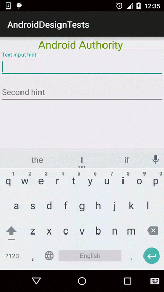
The TextInputLayout is a great addition, and it is designed to add functionality to the well known EditText. The TextInputLayout isn’t designed to replace the EditText, but should be used along with the EditText. An EditText is wrapped within a TextInputLayout, to get advantage of the TextInputLayout. With an EditText, you can set a hint that is shown to the user before he begins typing in a value. When the EditText is selected, however, the hint disappears. Using the TextInputLayout, the hint transitions to a label above the EditText field.
<android.support.design.widget.TextInputLayout
    android:id="@+id/textinput"
    android:layout_width="match_parent"
    android:layout_height="wrap_content">

    <EditText
        android:id="@+id/edittext"
        android:layout_width="match_parent"
        android:layout_height="wrap_content"
        android:hint="Text input hint" />

</android.support.design.widget.TextInputLayout>
From the above, you can see that the only change to your current code involves wrapping the EditText with a TextInputLayout. The wrapped EditText can be referenced in code using TextInputLayout’s getEditText() method. Also, the TextInputLayout can be used to show error messages, for example
textInputLayout.setErrorEnabled(true);
textInputLayout.setError(getString(R.string.text_error_message));
Snackbar

Every Android app developer should be familiar with the Toast component, which provides a simple way to show a quick message to the user at the bottom of the screen. Unlike a Toast, a Snackbar can have an Action bundled with it, like an “Undo” button. Snackbars can also be swiped away before the display duration has elapsed, and, when used properly, a Snackbar can alert other widgets of its visibility, enabling these other widgets move out of the way (like a FAB for instance). Implementing the Snackbar is very similar to a Toast, however, the Snackbar must be anchored to a View that knows the bottom of the app’s display (the app’s base view).
Snackbar.make(view, editText.getText(), Snackbar.LENGTH_LONG)
    .setAction("Dismiss", new View.OnClickListener() {
        @Override
        public void onClick(View v) {
            // The snackbar is automatically dismissed, so you add
            // whatever additional tasks to be performed
        }
    } )
    .show();
Much like using a Toast, do not forget to call show() on your Snackbar.
Floating Action Button

The FloatingActionButton is possibly the most well known new widget specified in the Material Design guidelines. The FAB is a very important part of the specifications, considering that it should be the primary action button, and should experience frequent user interaction. While Google designers and developers repeatedly talked about how it was simply a round button, reading the specifications shows that it is a round button with a specific size, should be properly elevated with shadows, should be responsive to clicks, should respond to changes in the app layout…You get the idea. Thankfully, with the Design Support Library, app developers no longer have to spend days/hours either implementing their own interpretation, or using one of the many third party FAB libraries that sprung up. The new standard FAB has two possible sizes, normal (56dp) and mini (40dp). By default, the FAB will use your app’s theme accent color for it’s background, as per the guidelines.
Using a FAB is pretty straightforward
<android.support.design.widget.FloatingActionButton
    android:id="@+id/fab"
    android:layout_width="wrap_content"
    android:layout_height="wrap_content"
    android:layout_gravity="end|bottom"
    android:layout_margin="16dp"
    android:src="@drawable/ic_fab" />
The FAB can be customized with a few attributes. Some of the attributes likely to be altered regularly include
- fabSize – Set the size of the button to either “normal” or “mini”
- backgroundTint – Set the background colour of the button
- borderWidth -Set the border for the button
- rippleColor – Pressing a FAB should produce a ripple effect, and this sets the colour of the ripple
- src – Customize the icon displayed within the FAB
Note that these attributes are in the app namespace, so to set the fabSize for instance, you would use
app:fabSize="normal"CoordinatorLayout
The CoordinatorLayout is an exciting and interesting new Layout. It enables the creation and implementation of interactions between views, such as the ability to move a child view as a result of the movement (or visibility) of another child view. To take advantage of these effects, be sure to update your support libraries to the same version as the design support library version. For example, having the FAB automatically shift upwards, and out of the bounds of a displayed Snackbar, can easily be achieved by simply using a Coordinator layout as the base layout.
<android.support.design.widget.CoordinatorLayout
    android:id="@+id/main_content">

</android.support.design.widget.CoordinatorLayout>
Some of the important attributes (also in the app namespace) include
- layout_anchor – Used to anchor the view on the edge of another view
- layout_anchorGravity – Used to set the gravity to the applied anchor
To make a FAB move out of a Snackbar’s bounds, simply add the FAB within the CoordinatorLayout, and pass the CoordinatorLayout as the Snackbar’s View parameter
Snackbar.make(coordinatorLayout, "Have a small snack", Snackbar.LENGTH_LONG)
    .show();
TabLayout
The TabLayout is a new component, designed to simplify our app development efforts. Tabs are used in a lot of apps, and is a great design when used properly. With the Material Design guidelines specifying how Tabs should look, it is only proper for a new widget that implements the guidelines to be released. The TabLayout can be used with a ViewPager to easily add tabs to a layout, which is great, considering the ViewPager is available via the support library. To use the TabLayout, it can be included in the layout
<android.support.design.widget.TabLayout
    android:id="@+id/sliding_tabs"
    android:layout_width="match_parent"
    android:layout_height="wrap_content"
    app:tabMode="fixed"
    app:tabGravity="fill" />
The TabLayout can be customized to have either fixed tabs, or scrollable tabs. In addition, we can set different listeners on the TabLayout to track the states of the Tabs, such as
- OnTabSelectedListener
- TabLayoutOnPageChangeListener, and
- ViewPagerOnTabSelectedListener
NavigationView

The “slide in” navigation drawer design is a commonly used technique in Android app development. Unfortunately, there has been various implementations, with varying degrees of slide distance (or navigation drawer width), height, and content type. The Material Design guidelines has defined very specific rules regarding the correct implementation of a navigation drawer, but there was no standard (official) widget. The design support library has the NavigationView, which simplifies the implementation of simple navigation drawers, and can be easily customized. The NavigationView must be added within a DrawerLayout in the layout xml
<android.support.v4.widget.DrawerLayout xmlns:android="http://schemas.android.com/apk/res/android"
    xmlns:app="http://schemas.android.com/apk/res-auto"
    android:id="@+id/drawer_layout"
    android:layout_height="match_parent"
    android:layout_width="match_parent"
    android:fitsSystemWindows="true">

    <FrameLayout
        android:id="@+id/main_content"
        android:layout_width="match_parent"
        android:layout_height="match_parent" />

    <android.support.design.widget.NavigationView
        android:id="@+id/nav_view"
        android:layout_height="match_parent"
        android:layout_width="wrap_content"
        android:layout_gravity="start"
        android:fitsSystemWindows="true"
        app:headerLayout="@layout/nav_header"
        app:menu="@menu/drawer_view"/>

</android.support.v4.widget.DrawerLayout>
The NavigationView supports the use of an attribute, called headerLayout, that allows the use of a header section in the navigation drawer, above the list of navigation items. The navigation items can be declared in a menu resource file
<menu xmlns:android="http://schemas.android.com/apk/res/android"
    xmlns:tools="http://schemas.android.com/tools"
    <group android:checkableBehavior="single">
        <item
            android:id="@+id/navigation_item_1"
            android:checked="true"
            android:icon="@drawable/ic_android"
            android:title="@string/navigation_item_1" />
        <item
            android:id="@+id/navigation_item_2"
            android:icon="@drawable/ic_android"
            android:title="@string/navigation_item_2" />
    </group>
</menu>
CollapsingToolbarLayout and AppbarLayout
Have you noticed how the Material Design guidelines seem to complement the migration from the ActionBar to Toolbar? Have you noticed that Toolbars that slide in and out of view (or alter size) in response to scroll events in the app content is now available in a lot of android apps? Have you tried to implement this functionality in your app? The Design Support Library provides new widgets that help app developers implement similar animations with ease and minimal fuss. Using the above mentioned CoordinatorLayout, along with the AppbarLayout, CollapsingToolbarLayout and Toolbar, you can achieve tons of different effects, guaranteed to be smooth and aesthetically pleasing, as well as supported on a wide range of devices.
There are many different permutations and combinations (possibilities) for using these layouts together, and we absolutely have an upcoming article discussing some of these possibilities.
Conclusion/Roundup
The Android Design Support Library is a great addition to the Android developer tool-set. It greatly simplifies the work of developers striving to adhere to the Material Design guidelines. Rather than spending hours trying to achieve simple tasks such as a correct FAB implementation, hiding, and showing Toolbars in response to user scrolling among others, these can be completely abstracted away, and achieved with simple one liners (or more). It is worth mentioning, though, that the Material Design guidelines is much more than simply having the right widget, with the right look and feel. The Google Material guideline specification is available online, but for a summary, check out our Material Design guidelines article.
We have been hard at work using and experimenting with these widgets, so stay tuned for our in-depth articles, along with our experiences and challenges. Share your experiences in the comments, or request for a closer look at any of the widgets (and we just might write those first). Happy coding.
Thank you for being part of our community. Read our Comment Policy before posting.