Affiliate links on Android Authority may earn us a commission. Learn more.
Are you excited or worried about Android 17’s blurry future?

🗣️ This is an open thread.
We want to hear from you! Share your thoughts in the comments and vote in the poll below — your take might be featured in a future roundup.
This is a rather obvious statement, but you won’t find every single person in a group of millions agreeing with a decision, and this makes designing something as integral as an operating system’s UI rather tricky. Google has been pretty good at it in the past few decades — at least I haven’t met anyone who outright hates the look and feel of Android.
We’re currently in the Material 3 Expressive era, which sees the likes of Android 16 play with more colors and fluid animations while placing greater emphasis on personalization. I feel that it’s Google’s best work, and it looks splendid on modern Android phones. However, this is by no means the end of the road for the design langauge.
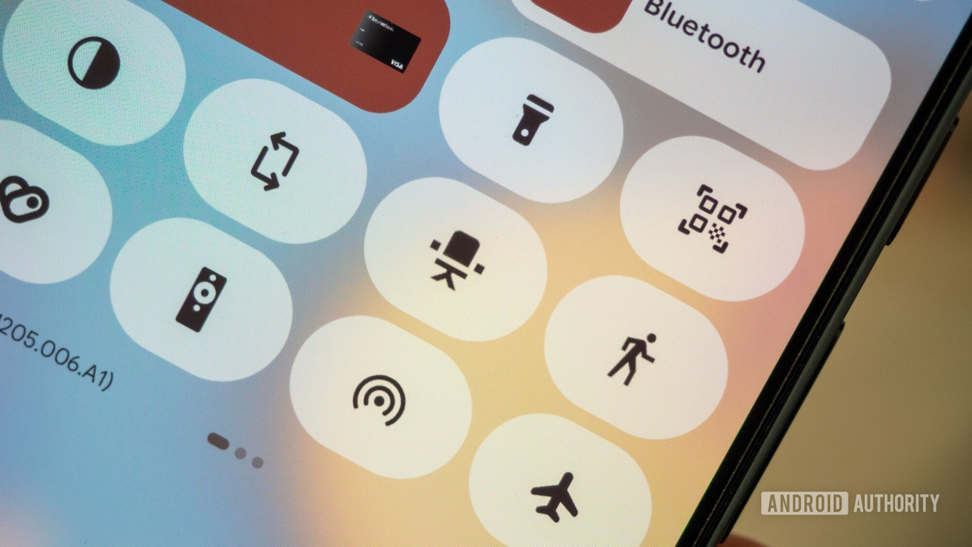
As the first images of Android 17 come trickling through, there’s one additional design decision that Google is seemingly pushing hard this year: it’s turning that blur dial all the way up. For some, this is brilliant news. Blur and transparency do look decidedly gorgeous on the right screen and with the right UI elements, but I’m not entirely sure how necessary they are, at least for improving information delivery to the user.
I remember the first iteration of Material Design on Android 5.0 Lollipop rather fondly. Although I do enjoy the flourishes of modern Android, Lollipop introduced solid elements that were easy to see — much like ink on paper, albeit a digital version. It didn’t sacrifice visuals for usability, something that I fear future Android versions are heading towards.
Don’t want to miss the best from Android Authority?
- Set us as a favorite source in Google Discover to never miss our latest exclusive reports, expert analysis, and much more.
- You can also set us as a preferred source in Google Search by clicking the button below.
This got me thinking — while my eyes adore Material 3 Expressive, I’m not quite sure that it is the best Google design language thus far from a usability and accessibility standpoint. Sure, you can disable the blur, but how many novice users would know to do this?
So, I want to hear from you: what do you believe was the best era for Android design language in terms of user experience and usability? Which design language or Android version was your favorite in terms of aesthetics, and why? And what do you think of Google’s move towards more blur and transparency in Android 17?
Here are some more questions:
- What are your feelings about Android 17’s design leaks thus far, specifically the additional use of blur?
- Which Android design language era do you believe was the best, and why?
- Do you think that Google is looking over at Apple’s use of blur to inspire its own work? Is this a sensible move or a cop-out?
- If you could make one significant UI change on Android 17, what would it be?
- Are you convinced that Google is still focused on improving the user experience and reducing friction on Android, or has it become obsessed with aesthetics?
Do you think Android 17 is at risk of becoming too much like iOS?
👇 And if you have a specific comment related to your poll choice, or want to answer any of the questions posed above, be sure to have your say in the comments below.
Thank you for being part of our community. Read our Comment Policy before posting.

