Affiliate links on Android Authority may earn us a commission. Learn more.
5 examples of dated app design
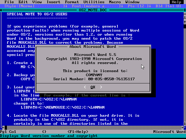
Android has been around for a while now and in that time, it has seen some significant changes. A couple of years ago, Google introduced us to its ‘material design’ vision for what modern apps should look like. Meanwhile, improvements in hardware and the OS itself have redefined what’s possible in an app and thus what one should look like.
As such, the modern Android app looks very different today than it did five years ago. So in order to stay relevant and to grab attention for the right reasons, it’s imperative that creators keep up with these developments; lest they find themselves looking dated and out-of-touch.
And no, this isn’t like those flares in your wardrobe that recently came back into style. Unlike fashion trends, technology keeps on moving forward so you can’t make the ‘retro chic’ argument. And mobile apps haven’t been around long enough, unless you’re going full ZX Spectrum…
The modern Android app looks very different today than it did five years ago.
Let’s take a look at five misguided examples of dated app design that still pop up in the Play Store from time to time.
Holo theme
Before material design, there was ‘holo theme’. Holo was the name of Google’s previous design direction but featured some marked differences from material design.
Notably, holo theme was significantly darker than most apps are today and featured lots of jewel colors against dark backgrounds. It also tended to look a lot busier and in general the whole design language was vaguer than what we have now.
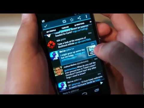
I for one actually quite liked the direction holo theme went in but there’s no arguing that it looks dated when put side-by-side with today’s material apps. Moreover, there’s no reason that a developer would actively choose to design apps using a defunct scheme. Which means that you can almost guarantee that apps still using this approach haven’t had any updates to their design recently. Unless they’re trying to be ironic…
Skeuomorphic icons and interface
‘Skeuomorphic’ means that a design is based on a real-world object that we are already familiar with. For example, a skeuomorphic icon for a phone would be an actual picture of a phone. It might even vibrate when the phone rings. And the interface within the app will probably require you to enter numbers using a rotating dial… How quirky!
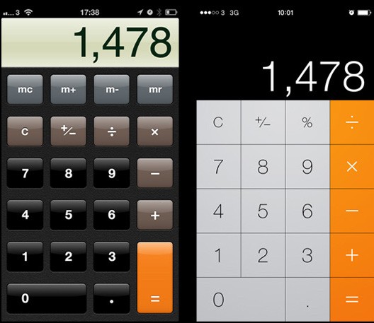
Skeuomorphic elements like this can still be charming in the right context but they should be used sparingly and no longer be the ‘default’ approach to your various elements. Ultimately, relying too much on pre-existing interactions to define a UI appears somewhat unimaginative and is also rather restrictive.
”[Developers
should ask themselves, ‘what’s the most efficient way to achieve X with the hardware and software available to me?’” qposition=”center” qcolor=”color3″ qstyle1=”bold” qstyle2=”” qcap=”normal” qsize=”medium”]
One good example is any older calendar app. For a long time, calendar apps were designed to function like their physical counterparts with the user moving from one month to the next. This creates a problem though: on the 31st of July, users can’t see any of their appointments for August. This is a restriction that was unavoidable for a conventional paper calendar but which has no reason to exist in software form. That’s why Google’s vertical approach makes much more sense for an app.
From a design perspective, developers need to approach their apps not by thinking ‘I’m going to make an app that works like an X’ but instead should ask themselves, ‘what’s the most efficient way to achieve X with the hardware and software available to me?’. And this should bleed into the way your app looks as well.
For those who are interested, this relates indirectly to the cognitive bias called ‘functional fixedness’. Look it up for an interesting read…
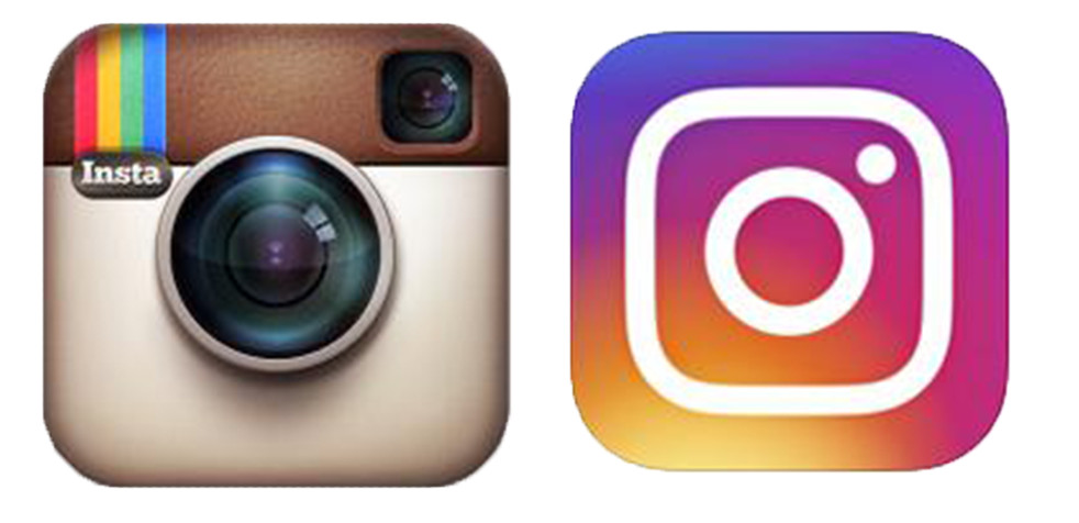
Use of gradients/shading
This flat, crisp approach should also apply to all the other UI elements on your page such as buttons, dialog boxes and fonts. Fonts with shading just look like Word Art and the old default buttons that get lighter near the top scream lazy (as in, you forgot to design your own buttons and haven’t updated your UI).
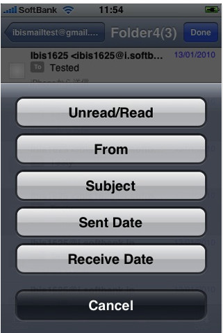
This is true partly because shaded buttons once again have a skeuomorphic appearance. It’s not a real button, it’s not claiming to be 3D, so it shouldn’t have shading. Moreover, gradients used in this way defy some of the principles of material design ethos itself. Specifically, material design smartly uses depth to help communicate importance and relevance. Information hierarchies are organized using the Z axis and this is conveyed partly via a uniform light source. As soon as you introduce a button that’s lit in the opposite direction it creates incongruence. Not only does it look wrong when you have lots of icons that are shaded with their light sources coming from different angles, but it muddles the subtle cues that the design gives to the user about how to interact with the software. Google puts it better. Also gradients also remove contrast, introducing yet more problems.
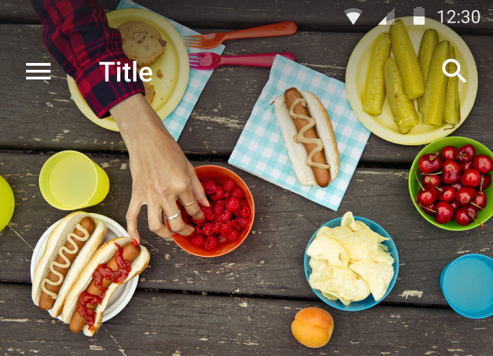
There are still certain scenarios where gradients are useful of course. For example a ‘scrim’ is a slight, translucent gradient applied over an image to help make text visible. But this is an entirely different context, so it doesn’t really contradict the point. And even these are apparently ‘discouraged’. Scrim:
Transparencies and ‘retro futuristic’
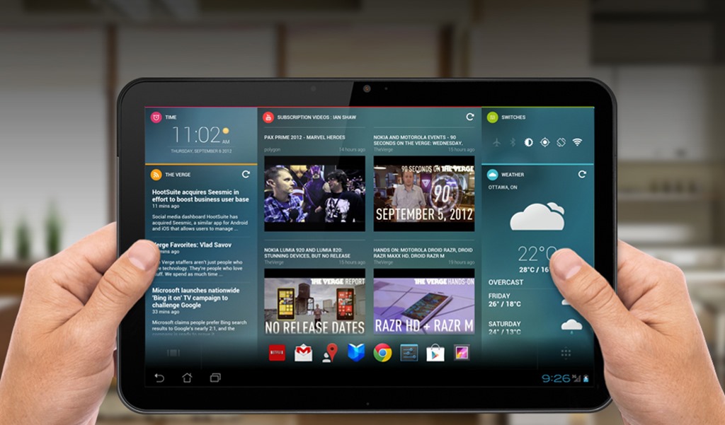
Material design is flat in all the best ways. The objective is to mimic a piece of paper and to embrace the inherently 2D nature of a mobile phone screen. As such, many of the attempts to make an app look ‘futuristic’ or ‘high tech’ now look dated in the same way that 80s visions of the future look dated. I choose transparencies because this is one of the most common examples but you can also include unnecessary controls, large swathes of information (that would be better off hidden away) and white text on dark blue backgrounds to create a look like a schematic. Neon and glowing things are also a great way to date your apps.
The problem with transparencies in particular is that once they were hard to do in the early days of the web. So when they became possible, everyone started doing them to look fancy and this carried over a little to apps. As a result, an over-use of transparencies is now a great way to show your age.
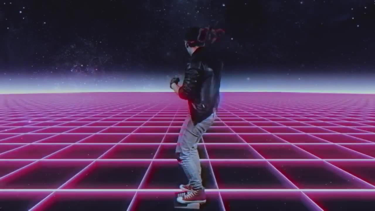
Try and think in terms of what’s efficient. I used to be guilty of making practically everything transparent but what does it really add to the experience? If anything, it makes it less obvious where one element ends and another begins and thereby invites confusion.
In other words: stop trying to make apps look like they’re out of Minority Report. That was 2002 and the world has moved on. Ironically, the less you try and make your app look like it’s from the future, the more modern it will actually look. Otherwise, you come across as a try-hard.
‘Pages’
When mobile apps first started to become popular, they understandably drew a lot of inspiration from web design. Websites were definitely the closest things to apps at the time in terms of form and function, so it made sense to borrow navigation, UI and design cues from that medium. In fact, a lot of apps were (and still are) nothing but wrappers for HTML sites!
Thus, many apps feature ‘pages’ and involve the user navigating from one section to another. In more modern approaches though, a subtle shift has occurred in the way that transitions and animations are handled. Today, smart apps try and keep the user in one place while the app itself will move and transform around them. This is a subtle difference but it alters the experience significantly; empowering the user while keeping them engaged with the content.
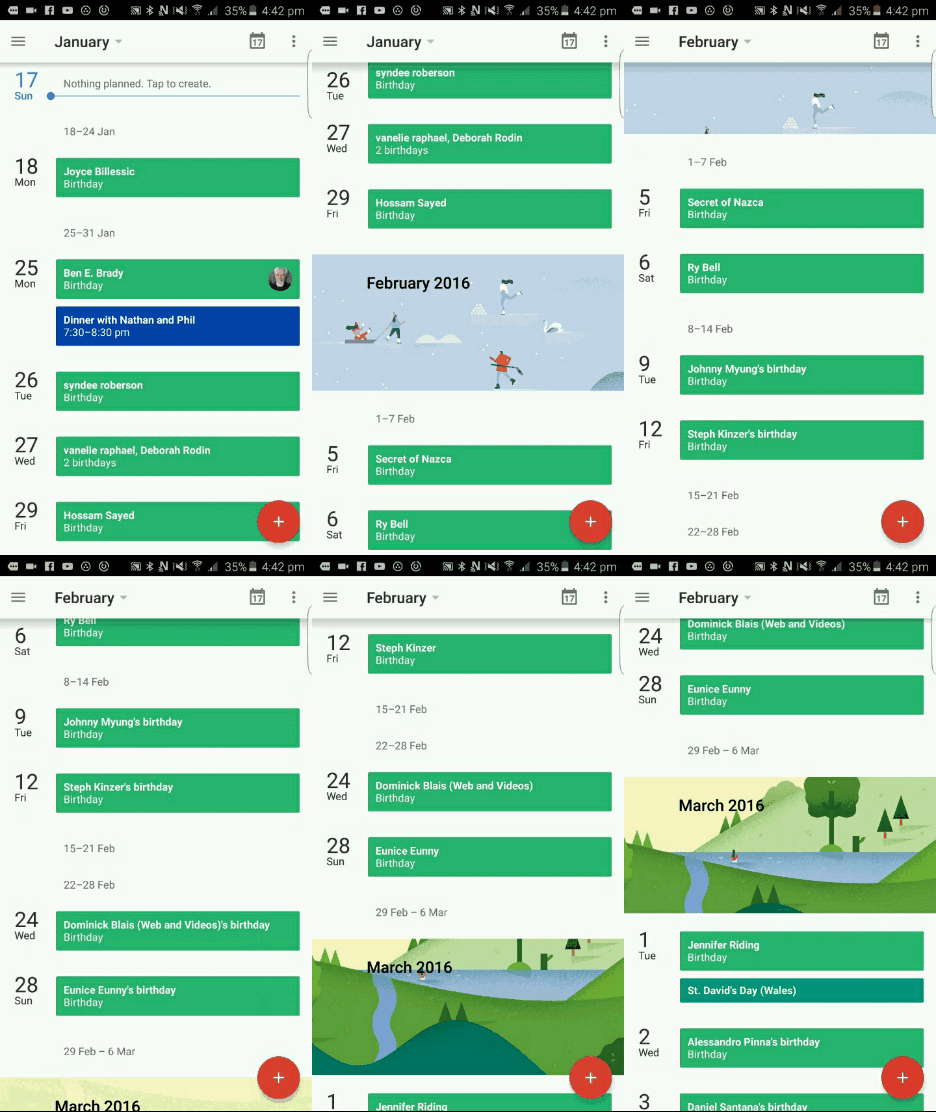
One of the best examples of this is the way that most modern menus work. Instead of taking the user to a new ‘menu page’, modern menu buttons will instead cause the menu to ‘sweep in’ from the side with some kind of animation. This keeps the user in one place and avoids breaking immersion. Another example is the calendar app we discussed earlier – an added bonus of the vertical scrolling is that it brings the information to you.
Ideally, your app should not have a ‘home page’ or an ‘about page’. The information should come to the user.
Conclusions and caveats
Ultimately, changes in mobile app design reflect not only changes in technology but also our relationship with that technology. We no longer rely on the crutch of skeuomorphism to understand how we’re supposed to interact with software because we’re that much more experienced as a whole. Instead, smart app design taps into the innate way that we consume information which is informed abstractly – not literally – by our interactions in the physical world. In other words: we know to read left to right, top to bottom and near to far and that’s good enough now we innately understand the language of this technology. We don’t need arrows or dog eared ‘pages’ to make it blindingly obvious where we’re meant to click.
With all that in mind though, do remember that there are exceptions to every rule. In some cases, gradients and skeuomorphs look great. And note as well that some day material design will probably be outdated too. Some may balk at that idea seeing as it was explicitly designed to be no-frills and efficient. But all good things come to an end. In time, changes in hardware and in fashion will force app UIs to evolve once again. Apart from anything else, people eventually get bored of seeing the same skins applied to different apps over and over…
Now we innately understand the language of this technology
Like I said, you need to adapt if you’re going to stay relevant. And you also need to know when to branch out, when to be more original in your approach and when to break the mold. Being completely unique is often actually the best way to future proof yourself and potentially to be a trend setter than just one more developer lagging behind the pack.