Affiliate links on Android Authority may earn us a commission. Learn more.
Top examples of Google ignoring its own Material Design guidelines
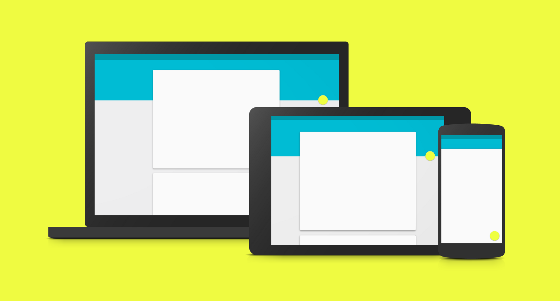
Pointing out the hypocrisies of big companies never gets old, even when the big company in question is our very own Google. Let’s be honest, Google is hardly beyond reproach when it comes to some of its business decisions and the tech giant has definitely been known to slip up now and again.
Google is employing a ‘do as we say, not as we do’ approach
And this holds true for its implementation of Material Design. While Material Design is and attractive design language and a great idea in principle, it hasn’t always been handled perfectly. Indeed, it sometimes appears that Google is employing a ‘do as we say, not as we do’ approach to the theme. On the one hand, it gives strict instructions regarding how everyone else should apply the UI that it built, while on the other it disregards those guidelines whenever it feels like it.
Here are a few examples that show even Google isn’t infallible when it comes to Material Design…
The new icons
It has recently been pointed out by a few, that the new Google Play app icons don’t really conform to Google’s guidelines. They certainly look Material enough at first glance but if you delve deeper, you’ll find that they break a fair few rules.
For one the actual shapes employed don’t stick within the grids that Google released to show the accepted sizes of squares and rectangles used in icons. This was meant to ‘establish a clear set of rules for the positioning of graphic elements’. Why does this matter? Because if you create a row of icons, these ones are now going to stand out for being misaligned with the rest or appearing larger.
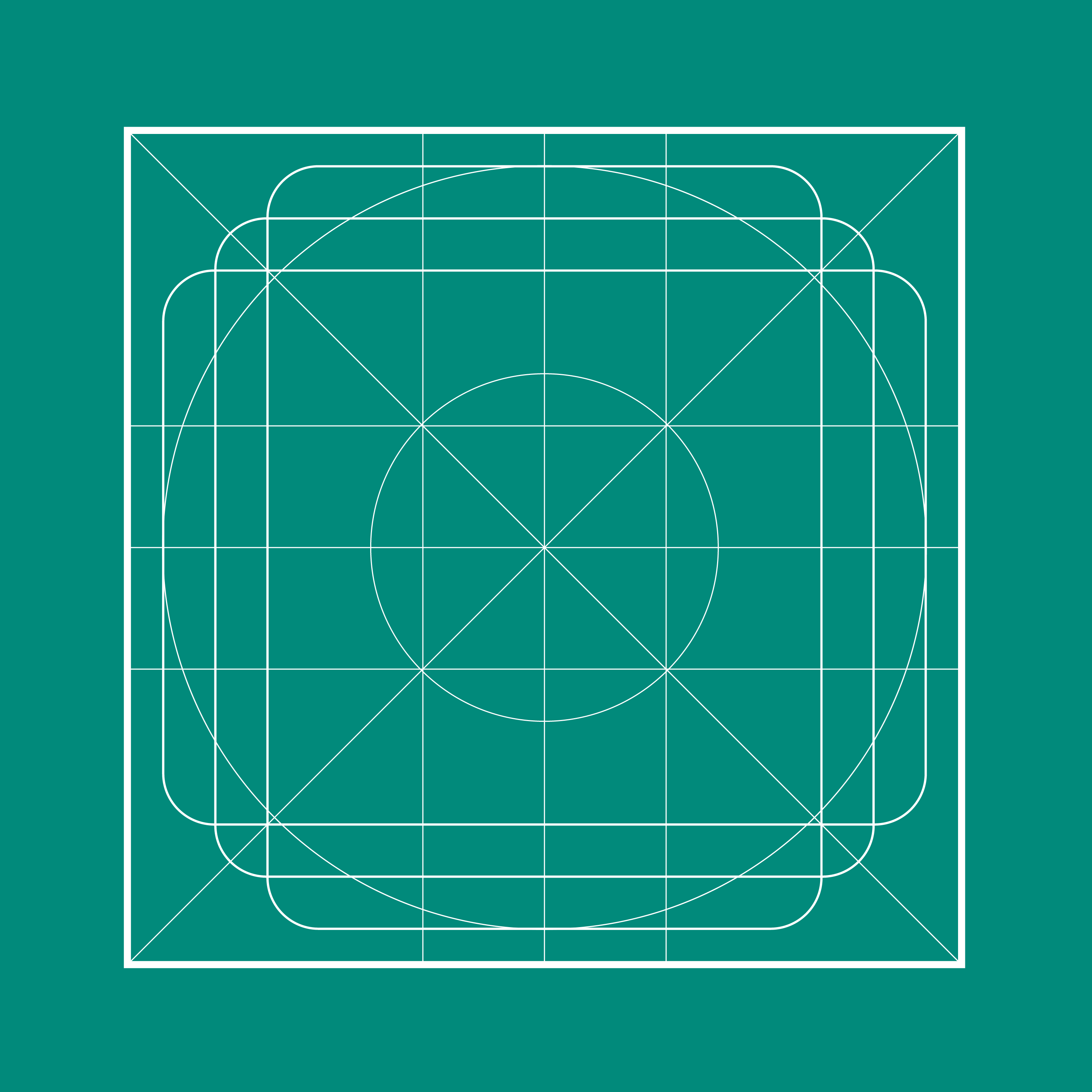
No doubt a fair few developers have been painstakingly working within these guidelines only for Google to trash them. At the same time, Google’s icons also fly in the face of the section on ‘product icon anatomy’. In particular, the rule that you shouldn’t crop elevated material elements within another shape. That means that the upper most layer shouldn’t have its boundaries defined by the lower layer. Which the icons for Movies, Music, Games, Books and Newsstand seem to gleefully defy.
The new icons have even done away with the 45-degree light source that is supposed to ubiquitously act on all icons. With that gone, your app draw will no longer look consistently lit because that lighting effect won’t be impacting on every element in it. The dream is dead.
There’s more too but I won’t go into all the detail here. Check out Google’s Own Icons Don’t Follow Their Own Guidelines for a more in-depth look at the icons and their failings.
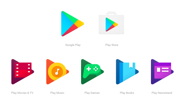
They do look nice though! Also, did you know that you should theoretically be able to make accurate mock-ups of all icons out of paper in order for it to meet the guidelines? I dare you to try that with all these…
Google’s own guidelines (!)
Actually, if you want to delve even deeper down this rabbit hole, then check out What Google missed in their guidelines for Material Design iconography from Uplabs. Here, the writer points out that some of the instructions in Google’s own guidelines are actually wrong in a couple of instances.
For example, discrepancy between PX and DP throughout the instructions would actually result in the edges of icons appearing too thick if you were to follow the instructions exactly as they’re laid out. The same goes for the drop shadows.
Now this isn’t a big problem if you just look at Google’s examples and try to recreate them freehand. But if you were to go to lengths to work out the precise recommended opacity for your shadows and thickness of your edges in pixels as decreed by Google, then you would be left with an incorrect final product. And that could be considered annoying by some.
The spirit of conformity
But it’s not just in the actual execution of Material Design that Google has occasionally been known to drop the ball. You could also argue that Google sometimes forgets the very ideals that it set out with when it created the style guide. What ideal was that? That Android users would have a consistent experience across apps that would help those transitions feel more intuitive and seamless. It’s a nice vision of harmony and order and everything in its right place.

Too bad that Google doesn’t feel iOS users deserve the same consistency, as evidenced by its insistence upon using its own Material Design on iOS, rather than conforming to Apple’s design guidelines. Bearing in mind how keen Google is to encourage developers on Android to adopt its principles, this could certainly be seen as double standards…
One Apple design critic, John Gruber, said of the situation:
“Follow the idioms and standards of the platform you’re writing for” is good sound advice. But Google is doing just the opposite with nearly all of their iOS apps. They’re not adhering to iOS design idioms – they’re adhering to their own Material Design style. Look no further than the “sharing” button in the iOS YouTube app – it’s Android’s.
The apps that Google forgot…
Type ‘Google’ into the Google Play Store and scroll down. You’ll find for the most part that the options on display are at least trying to appear material design-esque.
But if you keep on scrolling and scrolling, you’ll find some anomalies. In fact, it’s not actually that long before you get to ‘Google Talkback’ which has an icon that looks nothing like Material Design. This is a narration app for those who need ‘eyes-free computing’ and doesn’t actually have its own UI… but still, that just means it would be even easier to fix!
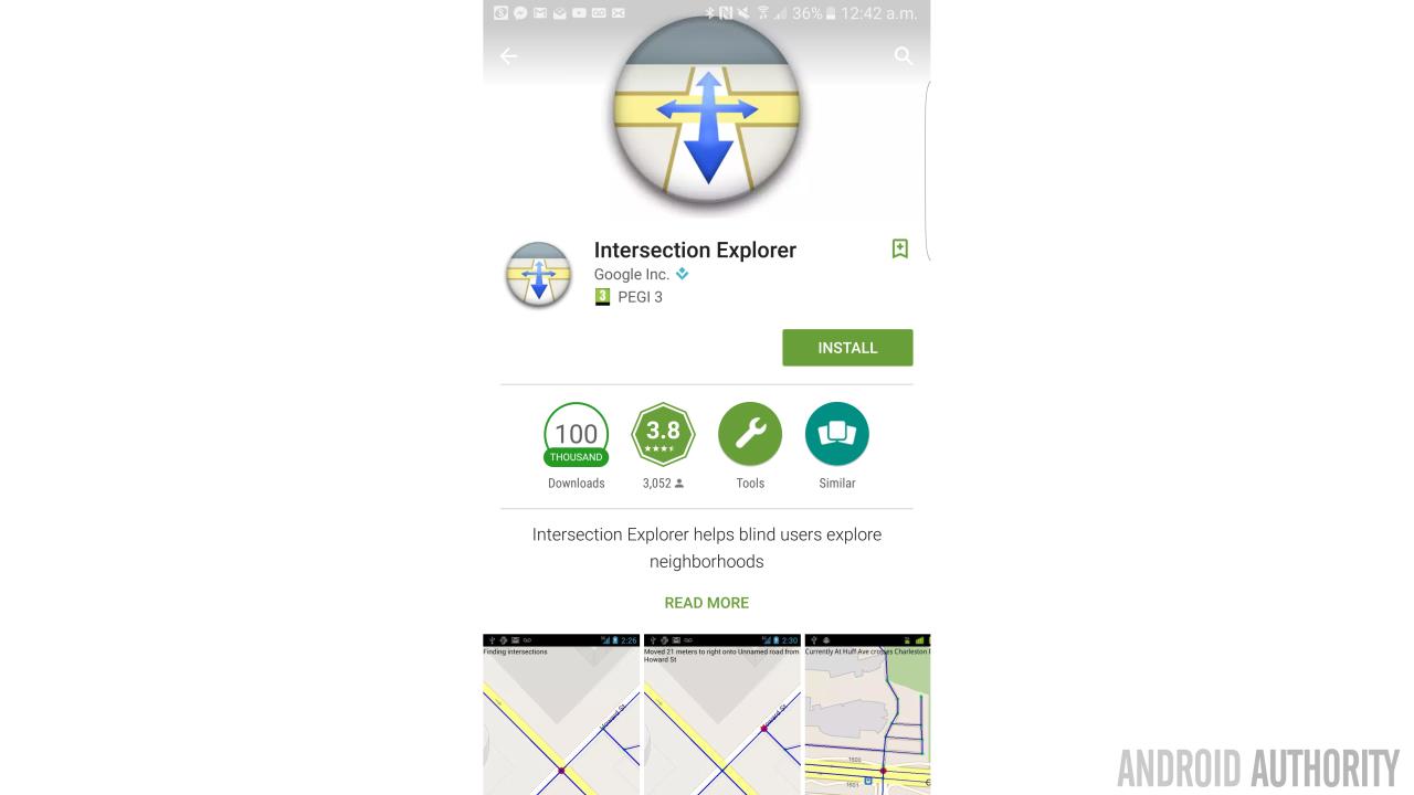
Perhaps the ugliest icon in the list though is Intersection Explorer. A quick look at the screenshots for both these apps tells us that Google hasn’t thought about them since the days of Holo, which is a more likely explanation.
Is it harsh to go trawling through Google’s archives and pointing out where it forgot to make updates? I don’t think so, life is harsh and seeing as Google is a huge organization, you’d think that it would at least updated all the icons and screenshots in its own store. It’s only been years after all.
Google’s big apps
But it’s not just the obscure apps that are dropping the ball here.
How about Chrome? Here, the Android app also shows precious few examples of Material Design at work. There’s no FAB anywhere to be seen and no side navigation bar so it just doesn’t behave like the majority of Google’s apps. You could argue that Chrome doesn’t need a FAB (and Google does say there are situations where no FAB is called for) but there’s definitely a case to be made for the navigation bar.

The YouTube app meanwhile has the FAB but still no navigation bar. Google Maps has FABS and a side navigation bar but the FABs have lost their drop shadows; which they shouldn’t according to Google. These are not big issues themselves but when you consider that so many other developers have actually managed to do this better it does seem a little odd.
Also, why is the Google Plus app bright red and lime green?? Does anyone else think that’s an eyesore?
Address bars
This one might not strictly be an example of Material Design but I think it does fall into the same category as something Google has been trying to push others to do but hasn’t done itself…
That is that none of Google’s websites use the theme color tag. Visit Android Authority in Chrome on your Android device and the address bar and status bar will change to various shades of Android-green. But visit YouTube and no equivalent color effect occurs. Perhaps that’s because Google would rather you were using the YouTube app, but that doesn’t explain why it also doesn’t happen for Google itself. It also doesn’t explain why it hasn’t happened for the Material Design guidelines. The front page even has a strong turquoise color scheme that would be perfectly suited to this effect.
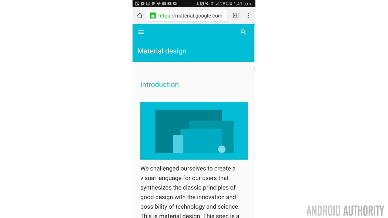
It would take literally 2 seconds for Google to implement this. For those interested: <meta name=”theme-color” content=”#999999″ />. There are also various plugins for WordPress that will do the trick.
Conclusions
Of course in reality none of this really matters. These are guidelines rather than strict rules after all and developers are still free to use whatever UI they like. Good design doesn’t mean blindly following rules but rather knowing when to bend or adapt those rules to different situations.
Good design doesn’t mean blindly following rules but rather knowing when to bend or adapt those rules to different situations.
Overall, Material Design has helped our phones look more attractive and cohesive and Google has done a good job of implementing it. Mostly. This article is really just meant as a bit of fun but there are some definite lapses in concentration and faux pas here. Perhaps the big lesson to take away is that it’s impossible to conform 100%, so developers shouldn’t be afraid to occasionally deviate from Google’s suggestions.