Affiliate links on Android Authority may earn us a commission. Learn more.
Diving into Android M: what else is new in Preview 2?

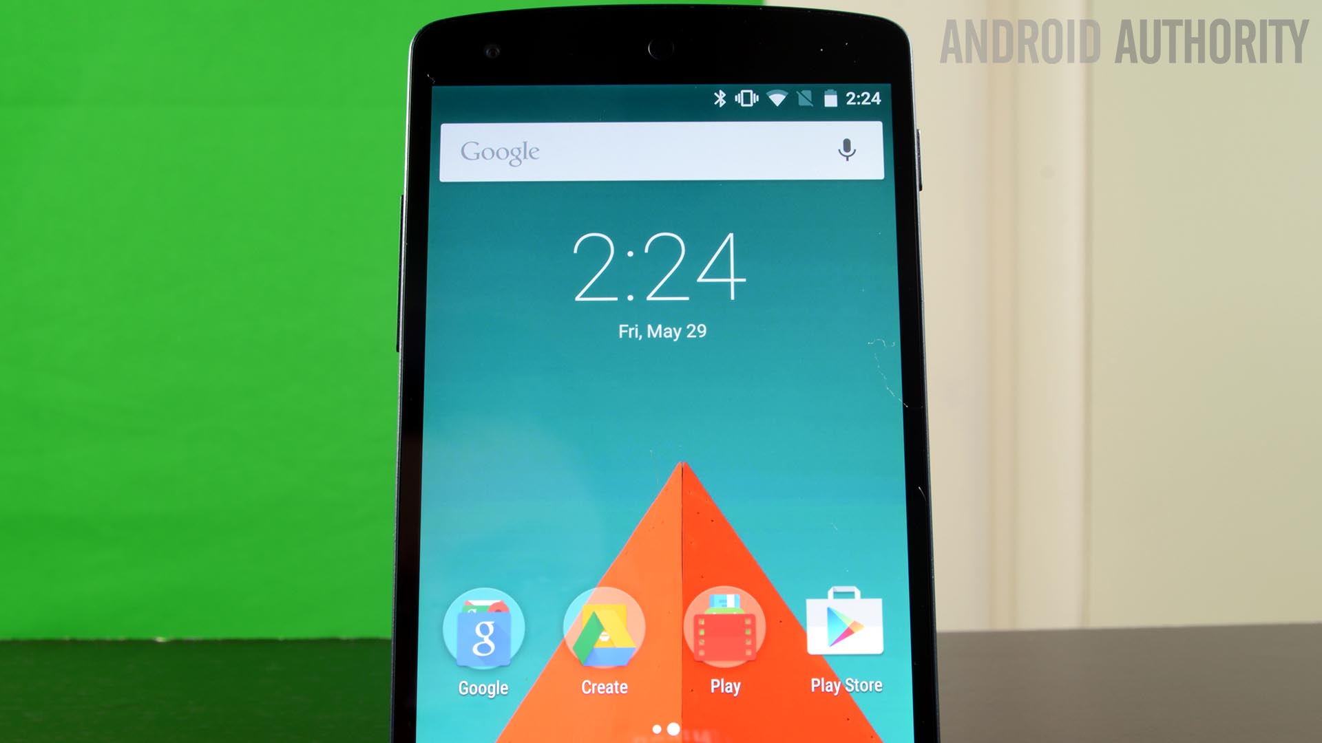
Last week Android M Developer Preview 2 arrived on scene. That very day I released our first “Diving into M” post for the second preview, which highlighted the changes to the launcher and the ability to now edit the status bar with the Tuner UI tool in the developer options.
While I had planned to create more follow-up posts, I quickly realized that most of the changes that had been discovered were pretty small and so the decision was made to play with it throughout the weekend before summing up everything that has visibly changed all in one post — while also commenting a bit on what’s not visible.
Want to dive even deeper? Check out our full “Diving into M” series by clicking here.
As we’ve already mentioned before, the Android M Developer Preview 2 is less about showing off new changes and more about (near) finalizing the many new APIs coming with Android M so developers can test them out prior to the final release. After all, this is a developer preview.
That said, there are some changes. Let’s start by talking about the under the hood stuff.
Stability, performance, and battery life
It has to be said that, even from day one, Android M’s stability was considerably better than we saw with L. This makes sense considering Lollipop was a big departure from KitKat, while M is more a minor evolution of what was started with Lollipop. With the new preview, stability only gets better.
I used my Nexus 5 as my daily driver the entire weekend and ran into virtually no problems. Not only was my experience with the phone smoother, battery life seemed better than it had with Lollipop and — while it might have been in my head — seemed better than it had in the first preview as well. How much better depends on how heavily it is used, but I will tell you that with Android Lollipop I generally found myself going to bed with 3 to 9% battery life on average. With M, it’s been around 15 to 18%, and this weekend it is has been slightly better than that (around 15 to 20%).
Bottom-line, Android M is shaping up to be a very stable, efficient build and should hopefully have considerably less bugs and other day-one issues than we saw with Lollipop. Considering Lollipop still is riddled with bugs and performance issues, we are really excited to see that M is taking a step forward here.
As for what’s new in the Android M Developer Preview 2? Here’s what all we found (in addition to the previously mentioned launcher and status bar changes):
Memory Manager UI gets reworked

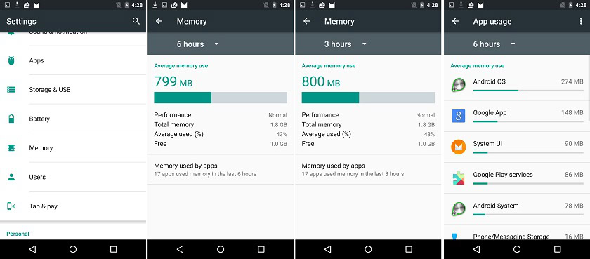
One of the changes found in the original M Preview was an improved memory manager that added several new features including a way to better see how much RAM each of your apps was using.
Finding the setting in M originally required you to take several steps, but in Preview 2 it is more prominently found in its own “Memory” tab right in the Settings screen. Beyond that, the UI has also been cleaned up considerably making it much more pleasant to use than before.
Deleting screenshots from within notification tray

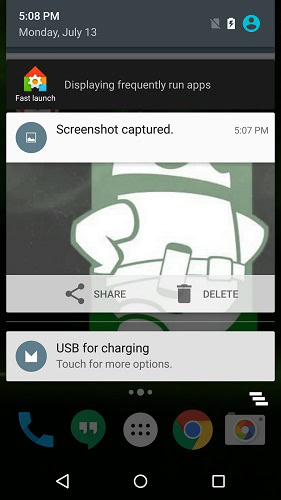
Each time you take a screenshot in Android (4.0 and higher), you’ll get a notification in your tray letting you know it has been saved. With Android M Developer Preview 2, however, there’s now also an easy way to delete them as well.
It’s a simple, minor change but still a welcome one for those times when you accidentally take a screenshot at the wrong moment or simply decide not to keep it.
No more dark theme

The new (optional) dark theme in Android M was one of the first things we noticed when diving into the developer options for the test build. It was nice to finally have another option aside from the very bright standard UI. Unfortunately, it is no longer present in the second preview.
The removal of the feature just goes to show you that test builds don’t always give an accurate picture of what to expect from final software. Is the dark theme gone forever? Hard to say. It’s possible that they were merely testing it and decided it wasn’t worth keeping. Or dark theme might not be fully ready for prime time and was removed in preview 2 to further fix it up for a final release. Only time will tell for sure.
Wrap up
As you can see, there’s not much for new features here. There are a few other minor changes like the addition of a Google on Tap option in Google settings (but it does nothing at this stage), a slight change to “Storage” (now Storage & USB), but let’s remember that Android M’s big goal was about polish and that’s exactly what we are seeing with Android M’s second preview.
What do you think of Android M in general, both the first and second preview? For those that have tried the second preview, have we missed anything noteworthy?
Thank you for being part of our community. Read our Comment Policy before posting.