Affiliate links on Android Authority may earn us a commission. Learn more.
Watch Urbane LTE impressions: LG's little known WebOS experiment
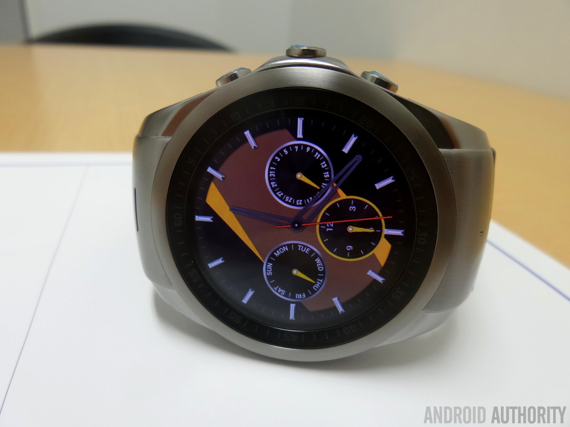
When LG announced its pair of rounded, metal-made smartwatches earlier this year, all attention was focused on the WiFi only model that made use of Android Wear. The standard Urbane has already been discussed and dissected to death in the media, though very little is known about its sibling. But LG’s mysterious marvel, the Urbane LTE, is very much a real product. It’s also a product that has been out for some time now, though in a rather nontraditional sense.
Introducing the Urbane LTE
“LG Watch Urbane LTE” is a mouthful. It’s also quite possibly one of the biggest paradoxes of the year, for it’s a smartwatch from a major OEM that includes a cellular radio for calls and data (not unlike the Gear S), is designed for Android, and yet it runs… a version of Web OS, LG’s relatively new acquisition from HP (which HP itself acquired from Palm).
First off, there are a few caveats to offload:
1. The Urbane LTE is sold as a carrier-exclusive device in South Korea, and exclusively on LG’s own U+ network.
2. The Urbane LTE has an embedded SIM which means that you can not insert yours. This is not unlike the Gear S which Verizon sells.
3. The Urbane LTE is expensive. At the time of purchase it was sold at just over $500.
4. The Urbane LTE doesn’t have a leather band, rather it has a thick plastic one. The design itself is quite stylish, but there is a sense or irony that with the extra cost of LTE comes the replacement of premium leather with a cheaper material.
Before starting this piece in earnest, please be aware that I have not used the Android Wear Urbane. To this end, I can’t make a value judgement about battery life comparisons between the LTE model and its WiFi-only Android Wear sibling.
What’s with WebOS?
First, let’s clarify one thing: the operating system of the Urbane LTE is based on WebOS, but LG actually calls it “LG Wearable Platform OS.” We don’t know the reason for using this stuffy moniker, but we do know in fact that it’s a version of WebOS – LG confirmed it to us at MWC and the name “WebOS” appears in the Japanese version of the companion Android app (but not in the English version).
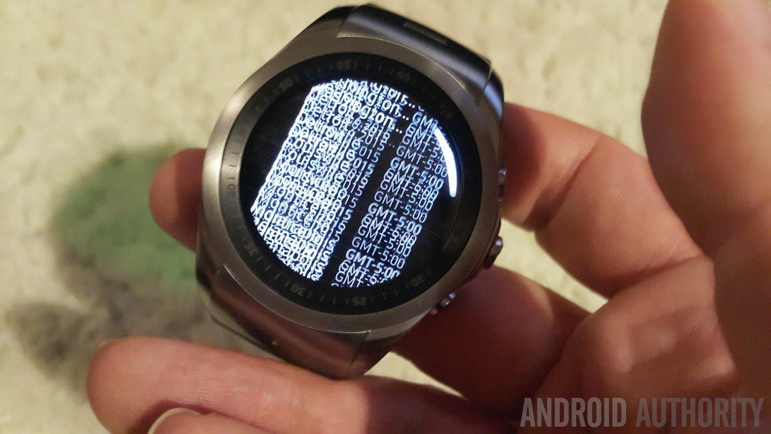
The software works much like Android Wear, but with the inclusion of circular designed navigational menus in key places. Honestly speaking, the ring interface is quite cumbersome if not downright infuriating (at times) to use. Your input is frequently rejected, which causes either a mistake or else nothing to happen. A perfect example of this is selecting a time zone. The device wants you to scroll through the list of what must be every single time zone in the world, and the movement is incredibly laggy, almost as if the entries were streaming over a 2G connection. Take a look at this image to get an idea of what happens should you move your finger too quickly:
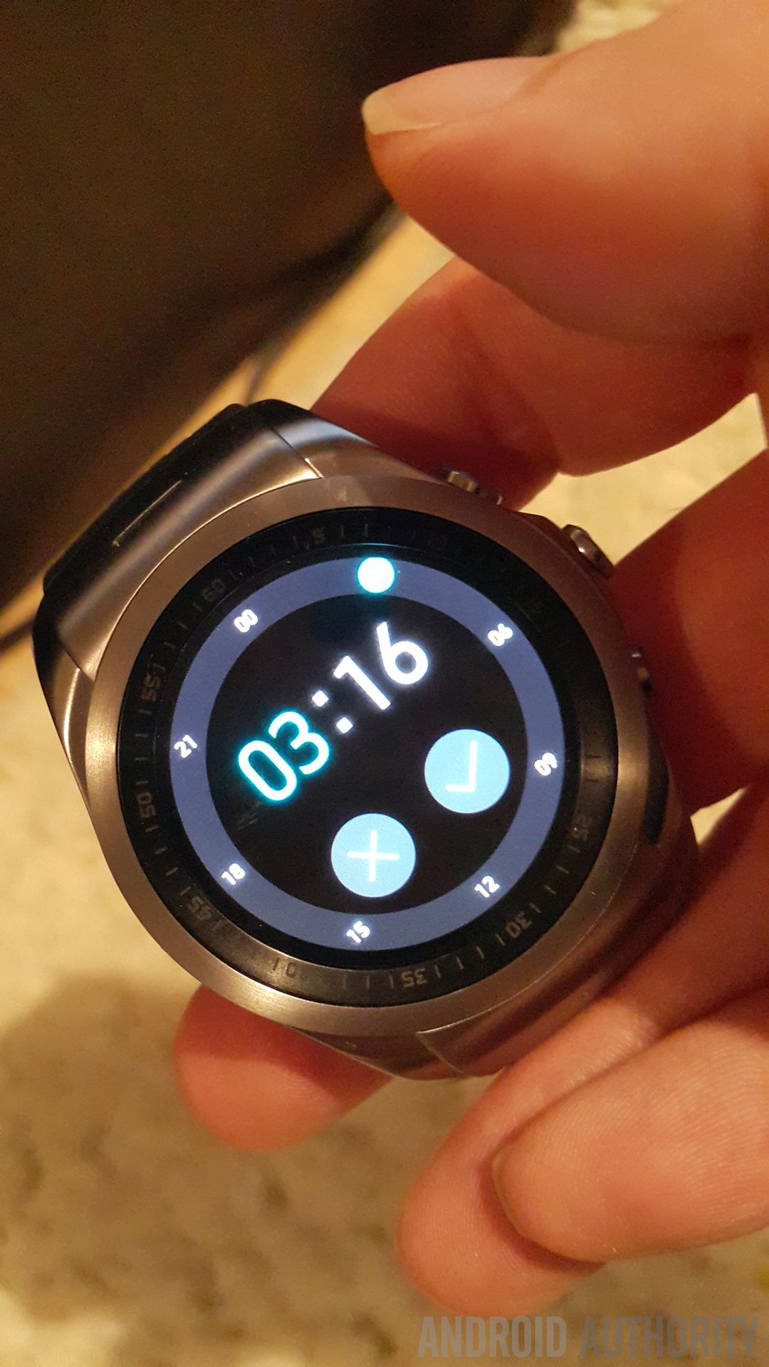
Another frustrating circular-shaped interface problem is setting the brightness. While touching the quick setting button will allow you to select from four preset levels, if you want to manually set the backlight level, it means touching the perimeter of the phone at the set percentage you want, with 12:01 representing the lowest setting and 12:00 representing 100%. This sounds fine on paper, but in practice it’s rather annoying because your finger is much larger than the tiny granular elements of the UI and thus precision is lost. In a very real way, the Urbane LTE is it’s own worst enemy, simply because the device uses a (small) circular screen, and because the bezel around the screen is elevated. The Samsung Gear S, for example, works much better, as does the Apple Watch for that matter.
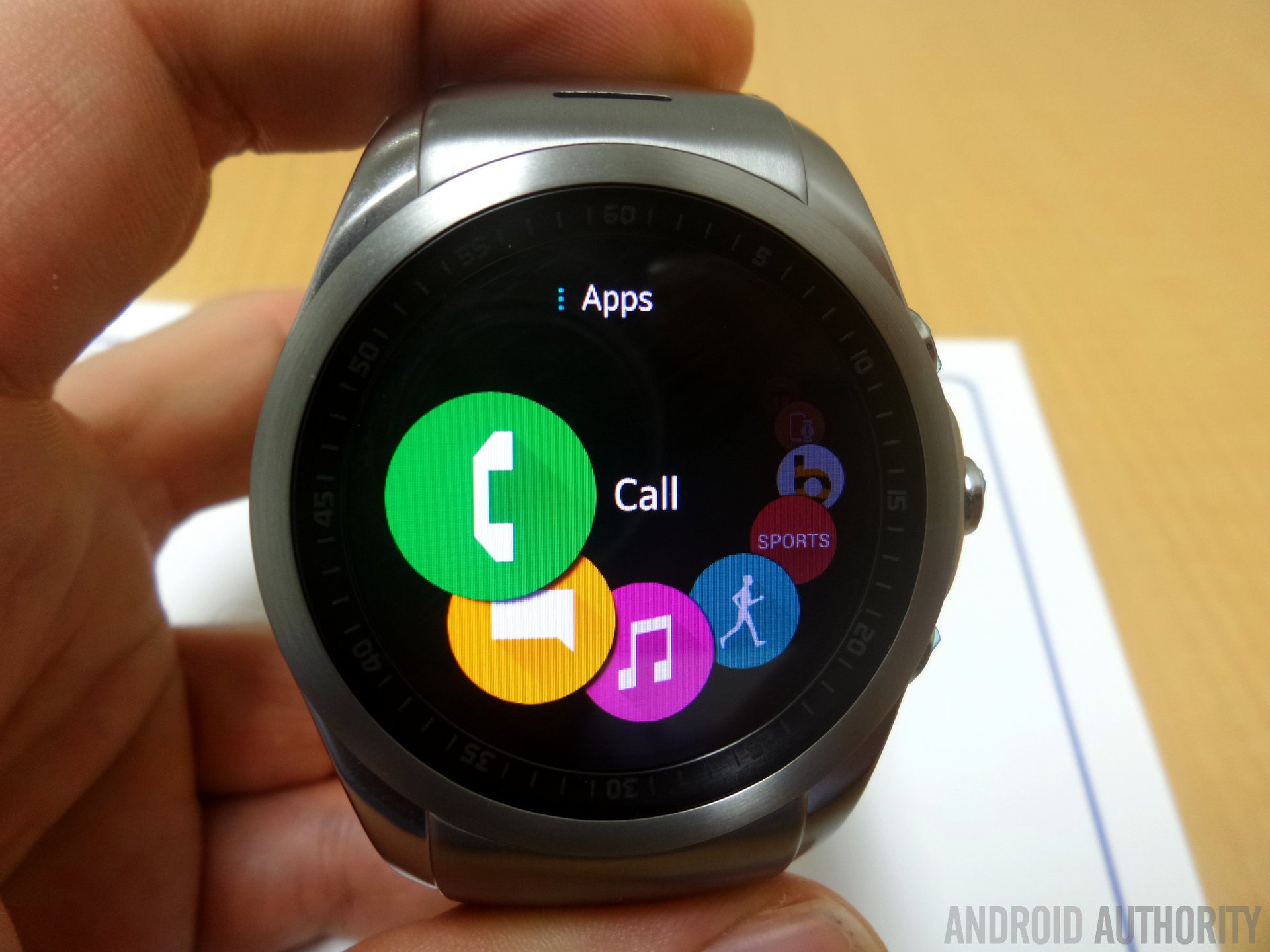
The main menu is a little better, thanks to the presence of large circular icons as can be seen below. Simply rotate your finger in a circular motion and the list will cycle through all the installed apps. Given that this product is sold exclusively through a mobile carrier, it also means that there is a sizable amount of bloatware installed on the device, not to mention other carrier-specific settings and menus. Again though, there is an incredible amount of lag involved in the process, something that might have been acceptable in 2010, but in 2015 where mobile phones have 4GB of RAM and even TouchWiz is smoothing to silk, this wearable feels like it fell into a time warp. Hopefully LG will eventually make significant improvements with the WebOS build (which, despite several updates, is still on version number 1.0).
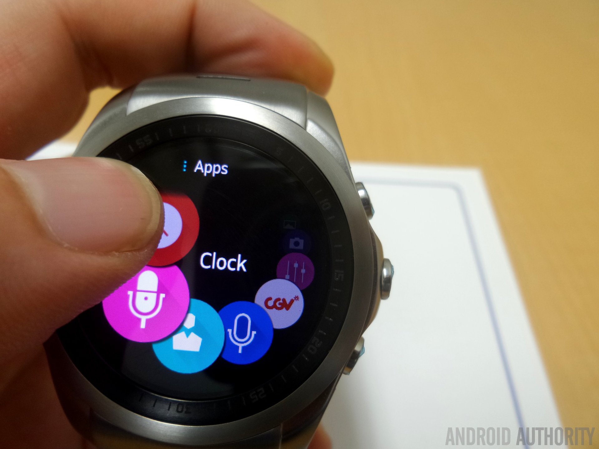
The actual watch navigation centers around the three buttons on the right side. The center button, the crown, is used to access the main menu or return to the watchface. The upper button is used to access quick settings as seen below: the default settings can be seen on the left image and includes Bluetooth, WiFi, Brightness, Silent Mode, Volume, and Data Transmission. The second image is the second screen (activated by pushing the center of the Quick Settings ring) and contains NFC, Airplane Mode, Eco Mode, Driving Mode, GPS, and Voice Input. Finally, below the crown we have the bottom button, basically a “back” key that usually has no function except when several layers down into the OS menus. The last two pictures show the System Update and System Info; pressing Back would return to the upper layer of system settings.
In all honesty, having used the Apple Watch for about a week last month, I would much rather have seen LG make use of the Urbane’s crown in a similar fashion as to what the “fruit” did. Turning a dial would have been much easier to navigate through the various menus, or at least have served as a viable alternative for those who found the touch-based navigation too cumbersome. This is hardly a deal breaker per se, but at the same time I haven’t been wildly eager to play around with some of the settings that require significant scrolling.
Some (very incomplete) battery life impressions
Now, because LG only sells the Urbane LTE on one carrier in Korea, I wasn’t really able to test the device the way it was meant to work. Because of the construction of the device, you can’t just pop in a different SIM and get cellular connectivity. So that means I relied on Bluetooth and WiFi whenever I needed to sync it.
If I didn’t turn on Bluetooth or WiFi at all, the Urbane LTE can get about three days of use out of the thing before having to recharge. Yes, I realize what you’re thinking, “that defeats the entire purpose of having a smartwatch” and indeed it’s a valid point to make. While the Bluetooth connectivity trials I’ve made between the watch and my phone have yielded results that were somewhat better than those on Android Wear devices I used in the past, the fact that I couldn’t use LTE means that I can’t really comment on the battery life of the device.
One other thing that needs to be said about Bluetooth syncing: notifications on the watch also seem to suffer a delay, at times in upwards of 15 seconds or more, but the reason is not clear to me.
Also related to battery life is the fact that the Urbane LTE uses the same always-on screen feature as Android Wear, but it seems there are major issues with either the sensor calibration or the software, as the watch often fails to wake when my arm is raised, requiring multiple attempts to complete a very simple task.
Intelligent design
As we have already reviewed the standard, Android Wear-toting Urbane, I’m not going to touch upon the physical design of the wearable in great detail. Suffice to say that the device looks much better in person than it does on any press render that LG has put out, and several friends of mine have came to the same conclusion. It’s a very thick watch and somewhat heavy, given the use of metal, but at the same time it doesn’t look gaudy or weigh down my wrist. I would suppose a thin leather band might also reduce some weight as opposed to the thick piece of rubber the LTE model comes with.
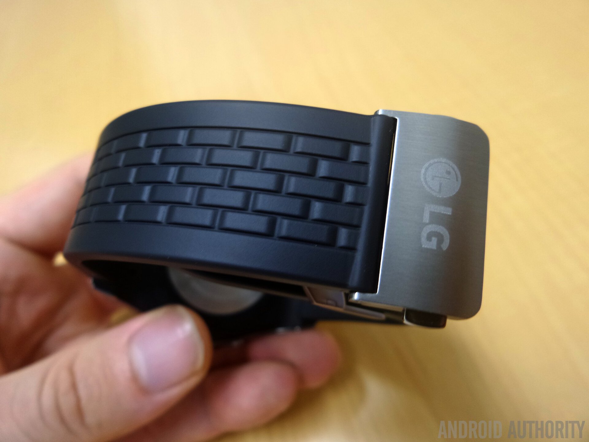
Why the Urbane LTE comes with a rubber band is beyond my capacity for understanding. Considering the device actually costs substantially more than the standard WiFi version, one might expect it to have an element of extra-premium potential, all the more so given that its using a somewhat “experimental” OS that LG is testing out (assuming one might call WebOS experimental, and Android Wear not). Still, it’s quite thick and well-made so the watch feels firmly attached to the wrist. It can also be adjusted to a wide range of different lengths.
What truly surprised me though, was just how impressively integrated and intelligently designed the Urbane LTE is… on the Android side of things. The LG Watch Manager (made exclusively for the Urbane LTE) app is just fantastic, quite possibly the best smartwatch companion app I’ve used to date.
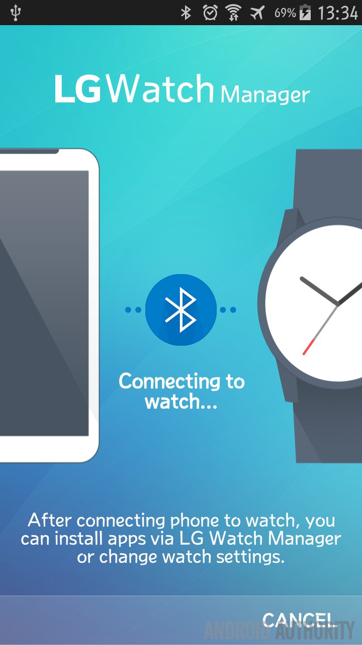
You can change the watch face design , of course, or the numeric design, or even the clock hands. You can save the finished theme for quick selection layer. Other features include the ability to send files on your smartphone to the watch, at least music or pictures. The few songs I transferred took a rather long amount of time to download to the Urbane LTE, which was a bit frustrating. I’m not sure if this process works faster on the Android Wear platform, in which case it would seemingly be an issue with WebOS’ file management. Take a look at the interface and some of the features:
In my opinion, LG has created a piece of software that is far, far superior to that of Samsung’s Gear Manager, and looks far less gaudy no less.
With respect to intelligent design (planning), I must tip my hat to LG for getting one thing right: device pairing. Given that I test various different phones, it goes without saying I have ran into one major problem with Android Wear: every time you want to pair a wearable with a new device, all the data is deleted from the old one. Amazingly, LG has actually considered this and allows you to pair the Urbane LTE with a new device sans deleting the memory. While it will be removed from the previous phone or tablet it was paired with, switching back would just require a quick repairing Bluetooth authorization. This means that any songs or pictures and whatnot you’ve transferred will still be on the device.
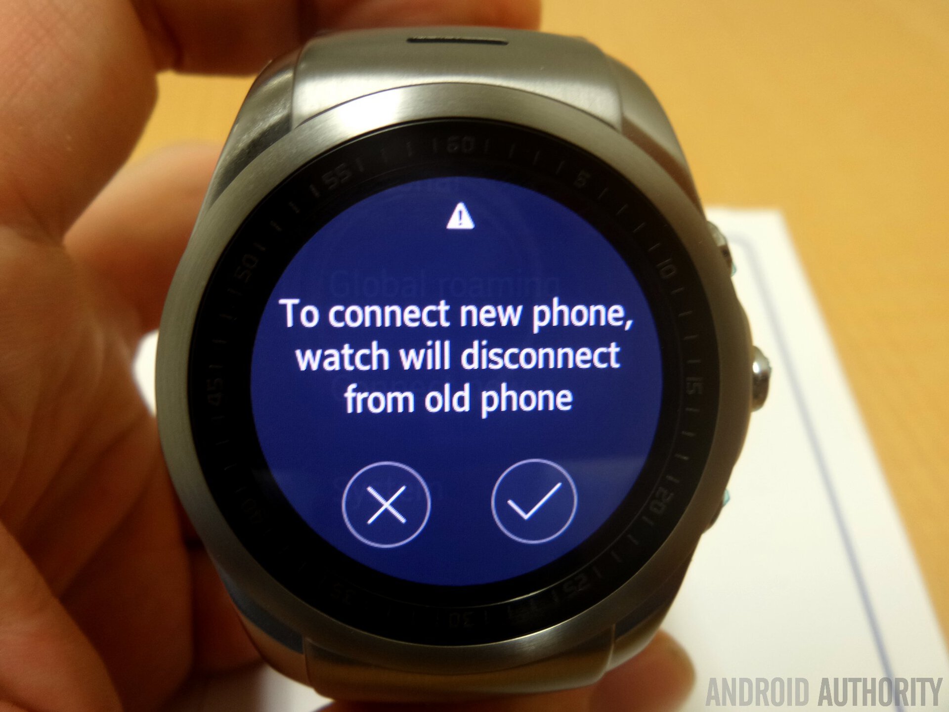
One last pet peeve is the mildly frustrating reminder that the Urbane LTE needs to be activated each time it’s restarted. Given that I don’t have a contract with LG U+ for it, let alone reside in South Korea, it’s something that is never going to disappear. Thankfully opting not to activate the watch allows it to (seemingly) work uninhibited.
Ecosystem
Watch LTE is clearly an experiment by LG and so it’s no surprising that there isn’t a real ecosystem to talk about. There is a small number of apps available through the Watch Manager app, many of them supplied by LG. Don’t expect anything resembling the variety and richness of the Android ecosystem, or even the Android Wear ecosystem, for the matter. You get some productivity apps, a few games, communication apps and of course many watch faces.
Wrap up
The LG Watch Urbane is a fascinating product for several reasons, perhaps the largest being WebOS, and the second being the fantastic level of connectivity that LG included. It’s every bit as integrated as Samsung’s Tizen, and that’s what really counts. Of course there are several strikes against it as well, namely the laggy software, the embedded SIM, and the high cost of the device.
LG has made no small effort to maintain the device’s existence as an “experimental” product, and truth-be-told the retail device still feels like it in many ways, at least the hardware. Software wise, the Android application is top-notch. It will be interesting to see what the future holds for this potential product line: will WebOS become a true competitor for Android Wear, or is LG just timidly trying to hedge its bets?
Thank you for being part of our community. Read our Comment Policy before posting.