Affiliate links on Android Authority may earn us a commission. Learn more.
Slack gets Material Design overhaul, better notifications and much more in version 2.0 update

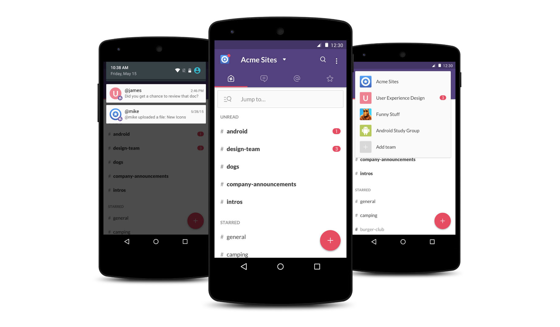
Slack, the popular communications app, is getting a huge update to version 2.0 that brings a much more polished, refined navigation experience, a ton of visual changes, and improved notifications.
Upon opening the app for the first time, you’ll notice the Slack team has taken some inspiration from Google’s Material Design guidelines, giving the app a nice aesthetic refresh. Both the left and right navigation drawers have been removed this time around. Instead, the app relies heavily on a much simpler tabbed navigation layout, which should be a welcome change for most users. This way you’ll be able to easily navigate to your channels, direct messages, starred items and mentions. You can now quickly jump to any channel, group or direct message by using the new “Jump to…” search bar at the top.

The notification experience has been improved this time around, with notifications now being separated by team. Version 2.0 also brings a floating action button for quick access to DMs. If you’re interested, here’s the full changelog for the version 2.0 update:
- The left and right drawers have been dropped in favor a simpler tabbed navigation. Tabs provide quick access to all your channels, direct messages, starred items, and mentions.
- Know exactly where you want to go? Quickly “Jump to…” any channel, group, or direct message.
- Constantly switching between teams? Simply select your team from the top dropdown and off you go.
- A much refined notification experience, with notifications grouped by team.
- A shiny new button floats attractively in the bottom right corner of the channels list for quickly locating or creating channels, DMs or groups.
- Search functionality has been greatly improved with the ability to open search results in a new “archive viewer” so you can see the full context of a message result.
The new version of Slack is rolling out in the Google Play Store as we speak, though the Slack team notes that the update will be rolling out through tomorrow. Head to the Play Store link below to check for the newest version!

Thank you for being part of our community. Read our Comment Policy before posting.