Affiliate links on Android Authority may earn us a commission. Learn more.
Samsung Galaxy S6 Edge Unboxing

You might have already seen the stellar review of Samsung Galaxy S6 Edge by Lanh, re-iterating everything I loved about the Galaxy S6, from the fantastic design and new build quality, to the toned down TouchWiz. Lanh also concluded that the features the edges offer may not bring a lot to the table, it’s still a nuance that can certainly be developed further with upcoming releases.
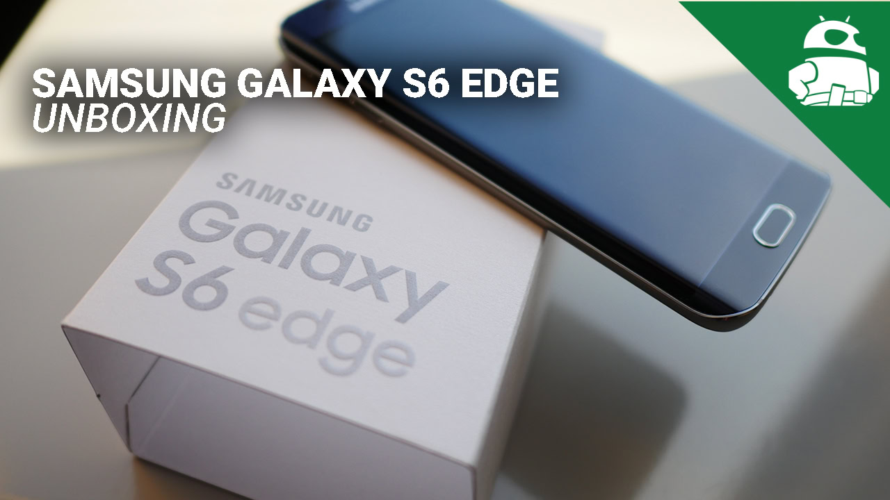
While Lanh’s Galaxy S6 Edge did not come in retail packaging, making an unboxing impossible, I received the retail version about a week ago, and so I’ve put together an unboxing, while also sharing some of my thoughts on the device after using it for a week. Without further ado, let’s jump right in!
[related_videos title=”Related videos” align=”center” type=”custom” videos=”597711,599201,595809,592809″]
Unboxing
Looking at the box, something that is noticeable right away, from the branding to the packaging itself, is that things have certainly changed with the latest addition to the Galaxy S series. The color of the device branding has been dialed back, and the box is no longer flashy, with the phone placed inside a simple white package. Opening the box shows off the Galaxy S6 Edge in all its glory, with other contents available including a pair of earphones, the fast charger, and the microUSB cable.
Impressions
Holding the phone in the hand, you’ll see that even with the edges on either side, the metal frame is very pronounced, allowing for a very nice grip. For all intents and purposes, the screen is just like any other screen, other than it happens to have curves on the sides. Functionality that is available with the edges, such as the notification center or the RSS feeds, won’t be triggered unless you turn them on. Even the night clock, which you can set to come on and go off at the times of your choosing, is quite low key.
What is great is that these functions cannot be accidentally triggered easily, and I found myself not requiring them. Even the People widget, that lists your favorite contacts in an easily accessible menu on the edge, was something I didn’t end up using a whole lot, if only because the messaging app that can be used is restricted to the one that is built-in. The function that results in the edge glowing when someone in your favorite contacts calls or messages you is also something that didn’t come up often.
The major difference comes in the handling experience of the device when compared to that of the Galaxy S6, with the edges allowing for a better grip and feel in the hand. The edges contour to your palm when you’re trying to reach from one side to the other, making it one of the easier to handle flagships of the year so far. The effect is also noticeable when using the display, with all the scrolling elements rolling in from the edges into your view, as was mentioned during the comprehensive review.
Everything found under the hood of its flagship sibling remains the same in this case. The camera provides the same fantastic experience, allowing for the great shots that I’ve taken. The software experience is also much improved, and frankly, isn’t as annoying as it has been with previous iterations.
If the difference between the prices of the Galaxy S6 and its Edge iteration weren’t above a $100, it would have been much easier to recommend the Galaxy S6 Edge. The Galaxy S6 is a great phone by itself, and with functionality somewhat limited as of now, all the edges do really provide are a unique look and feel. With either device though, Samsung has definitely made a huge leap forward in all key aspects.
Stay tuned with Android Authority for the full in-depth comparison between the two newest additions to the Galaxy S line, and for all the other great coverage from the world of Android!