Affiliate links on Android Authority may earn us a commission. Learn more.
Pushbullet gets a fresh coat of Material Design, dark mode, and more in latest update

It’s been a cool minute since the folks behind Pushbullet pushed out a major update, but that’s changing today.
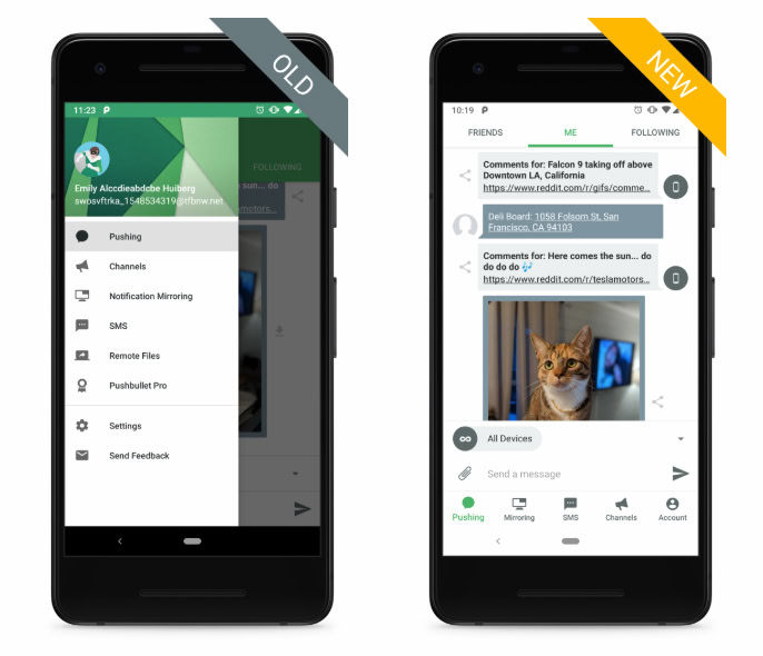
The headline feature is the revamped Material Design aesthetic, which replaces the hamburger menu with bottom tabs. The bottom tabs go away when the keyboard is open, a quality-of-life improvement that Pushbullet included during testing.

Google incorporated bottom tabs in its Material Design updates to YouTube, Phone, and Photos apps, so it’s nice to see them in more third-party apps. As with Google’s updated apps, however, the Pushbullet update also introduces more white to the interface. You can tone down the white with the new dark mode, though it’s only available to Pushbullet Pro users.

The update also replaces the static icon with an adaptive icon and changes the colors on the status and navigation bars to better match what’s on your screen.
Pushbullet said the update is now available to beta testers and will be available to everyone “soon.” To try the update right now, click the link to the Pushbullet app below and scroll down until you see the Join the beta section. You then tap Join now and then Join when you see the pop-up prompt. Beta signups take up to a few minutes to complete, after which you’ll receive the latest beta update.
Thank you for being part of our community. Read our Comment Policy before posting.