Affiliate links on Android Authority may earn us a commission. Learn more.
Nokia Z Launcher quick look! (video)

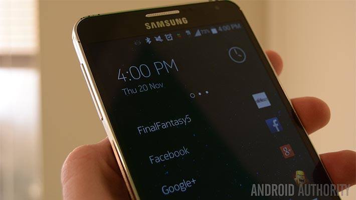
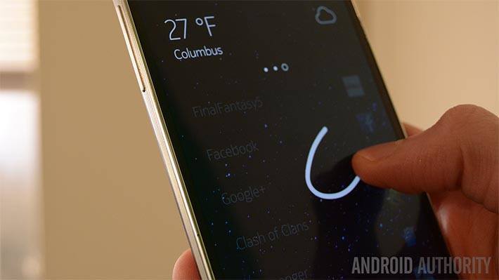
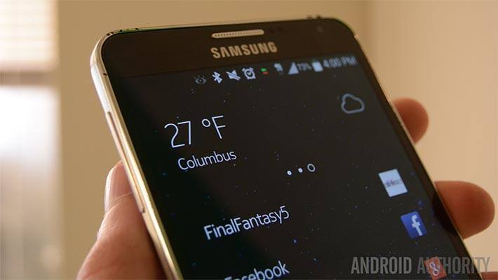
On the home screen you’ll see a short list of the applications you use the most and, in some cases, the people you contact most frequently. Along the bottom is your standard dock with four shortcuts and the app drawer button. Finally, along the top, there is a scrollable clock widget. If you scroll to the right you’ll see your next upcoming calendar event and finally one more swipe brings you to the weather.

The other big feature is that the Z Launcher learns what apps you like and shows them to you during different parts of the day. I’ve only had it a day so I couldn’t really test this one but contextual stuff is usually hit or miss so your results may vary.
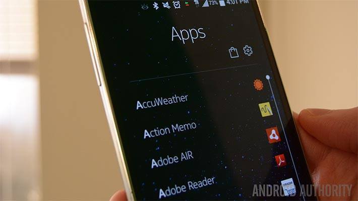
In the app drawer you’ll find one big, long, alphabetized list of all of your applications. At the top you’ll see a gear symbol to get to the Z Launcher settings and an icon shortcut to take you to the Google Play Store and while it is a small thing, the Play Store shortcut is a nice touch.
Here’s the thing, folks, that’s really it. I can’t stress enough how minimal and easy-to-use this launcher really is and that is both its biggest strength and its greatest weakness. Thanks to its clean, small, minimal style, the launcher uses little memory and doing anything requires very little time or effort and we liked that a lot. Many launchers these days have a labyrinth of features and settings but Z Launcher keeps it simple.

Perhaps the worst part is that there isn’t anything to do. If you’re like me, you like to browse around your home screens and if an app or game catches your eye you’re like hell why not. With the Z Launcher, there is no browsing really. It’s meant to keep things quick and simple. The kind of people who will like this are people who are minimalists and who know what they want when they pick up their device.
Aside from that, I noticed no discernible battery drain. The performance was fantastic. I’ve heard that the performance isn’t so great on Lollipop but this is a beta so those people should relax. I really liked the three page, scrollable widget at the top of the home screen and the Google Play shortcut in the app drawer. The gesture controls are really fun once you get used to them and the favorite apps list on the home screen is off to a good start.


Thank you for being part of our community. Read our Comment Policy before posting.