Affiliate links on Android Authority may earn us a commission. Learn more.
Moto X Style / Moto X Pure Edition unboxing and first impressions
2015 has been a great year for consumers in the Android world, thanks to an exponential rise in high quality, yet affordable, smartphones. This trend is not limited to the mid-range either, with a bevy of current generation flagships priced at least a couple of hundred dollars lower than the expected high-end standard. One such smartphone is the latest Motorola flagship, called the Moto X Pure Edition in the US, or the Moto X Style in other international markets. Before diving into a full review, here are our first impressions of the device, as we take a quick look at the unboxing of the Moto X Style / Moto X Pure Edition!
Unboxing
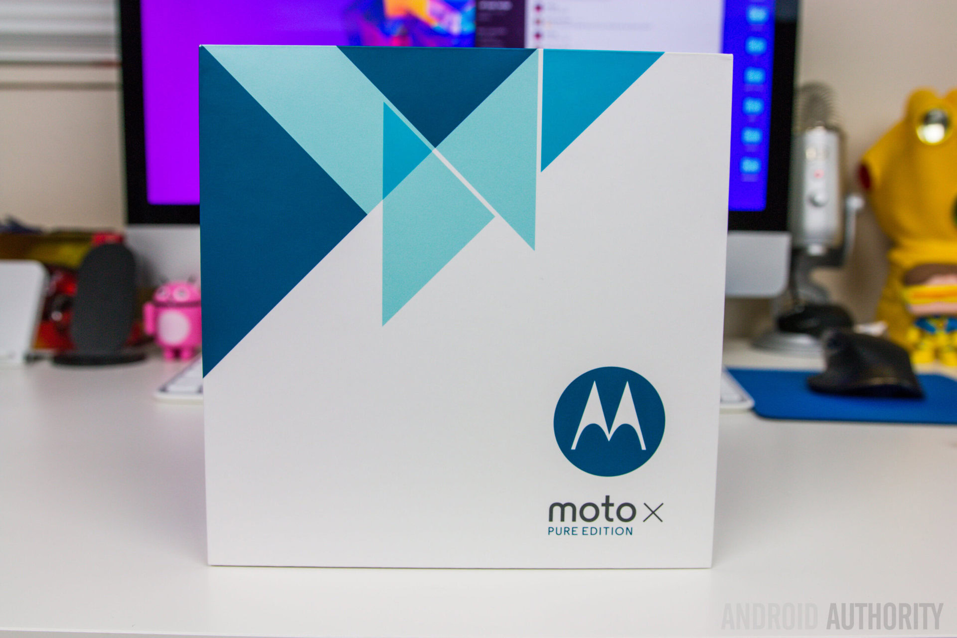
If you’ve stuck with the Moto X since its beginnings in 2013 like I have, the first thing you’ll notice right off the bat how much bigger the box of the latest iteration is. Obviously, the phone is much bigger this time around, but another reason for this difference in size is because of a bumper case that is included in the box as well.
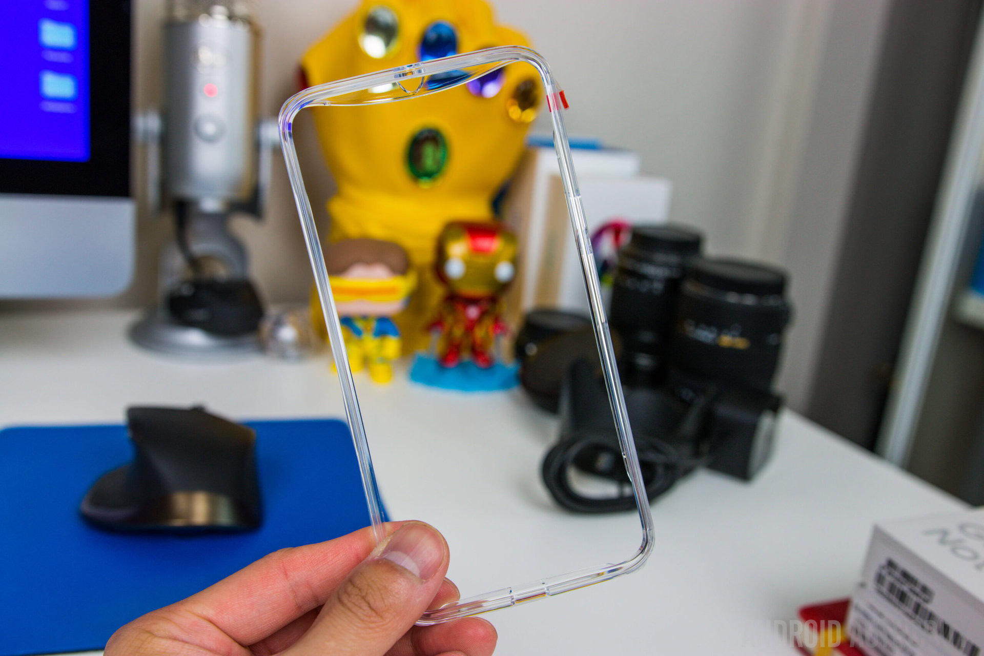
Opening the box reveals the smartphone in all its glory, and right next to it the bumper case. It is a plastic clear bumper case that isn’t anything fancy, but should get the job done just fine if you’re looking for a little bit of protection while being able to show off the unique stylings of your customized phone. Underneath the bumper case is Motorola’s Turbo power charging brick, to take advantage of the fast charging capabilities of the device, and Motorola claims that you will be able to get up to 10 hours of battery life back after just 15 minutes of charging.
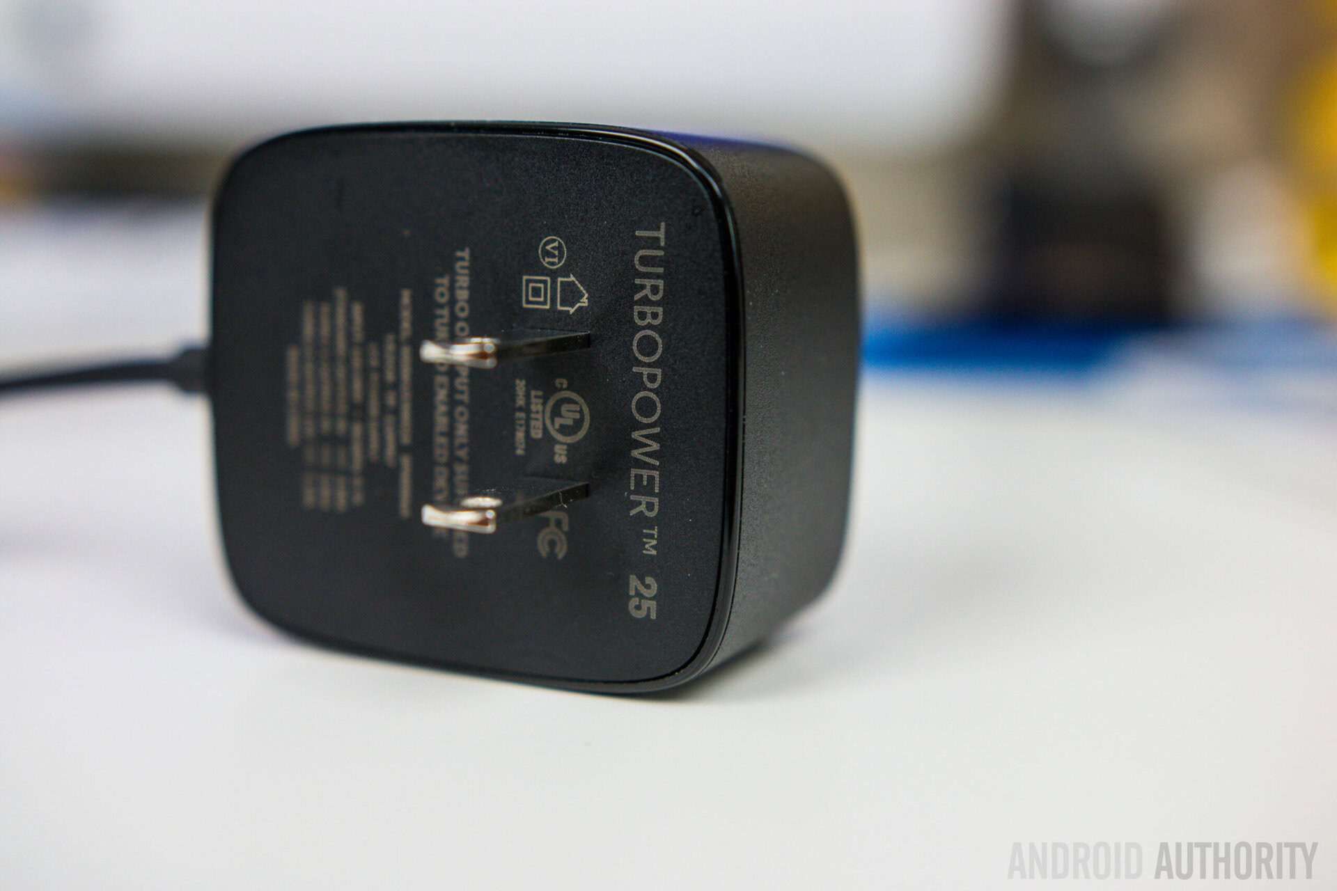
The only oddity here is the fact that the cable is permanently attached to the charger, so if you need a dedicated microUSB-to-USB cable for other needs, you will have to supply that yourself. Also included in the box is the typical documentation, including a Quick Start guide, warranty information, and other legal information. With the documentation is a leaflet that carries a standard SIM tray removal tool.
First impressions
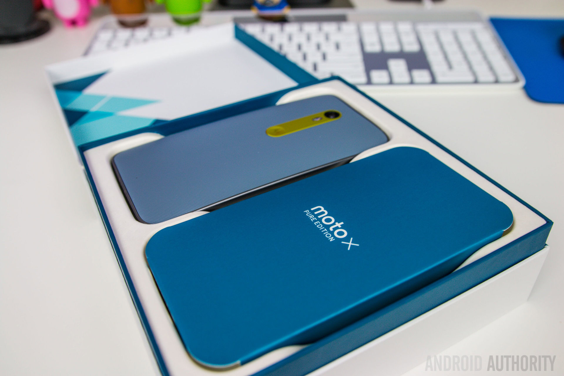
One of the biggest selling points of the Moto X line is the customization that is available via Moto Maker, to really make the device look and feel like your own. Doing exactly that, I decided to go with a black front, slate back, and lemon lime for the accents. You get to choose whatever colors and material choices you want, including leather and wood, and that’s part of the beauty of owning a Moto X.
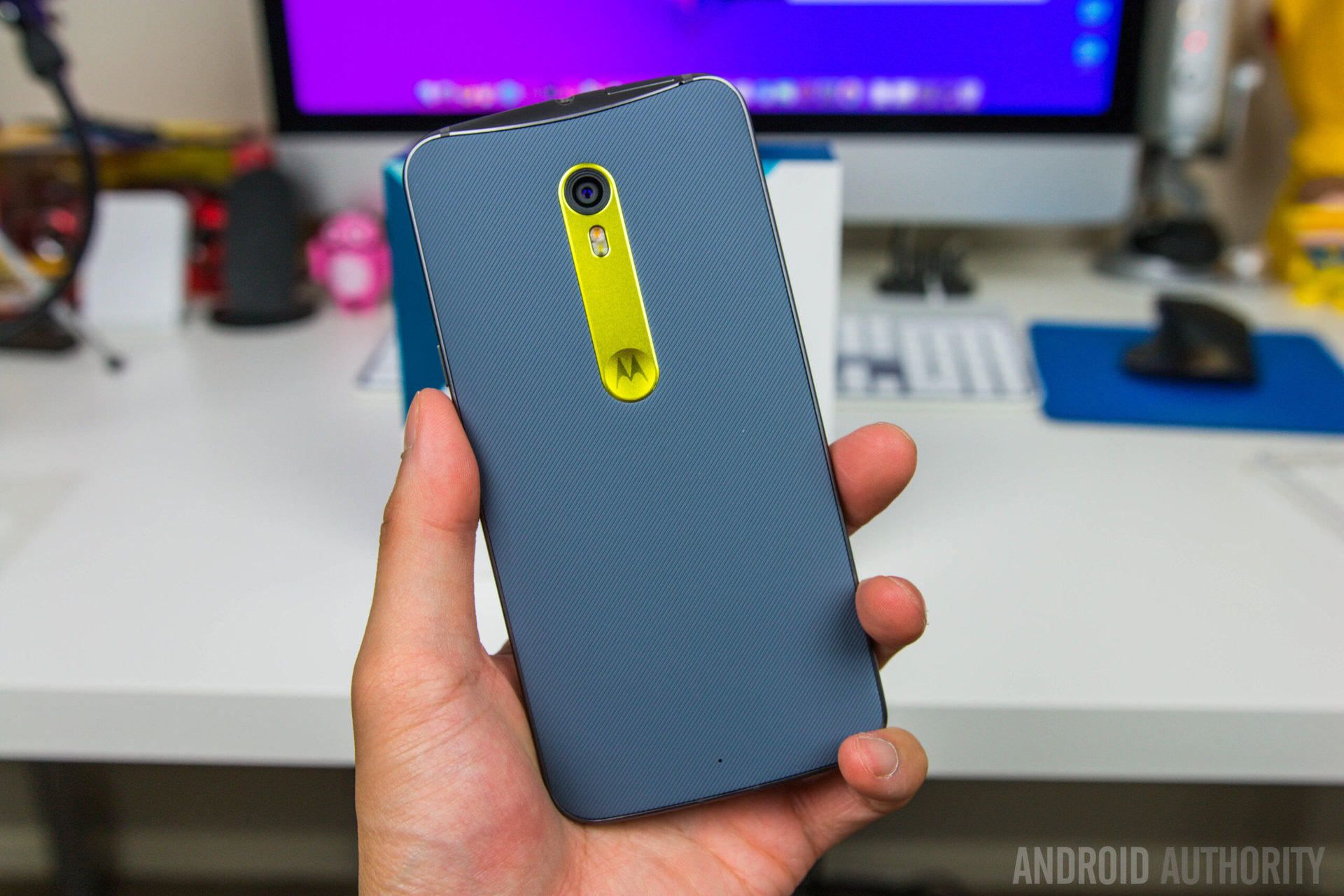
As far as the design language is concerned, there are a lot of similarities when compared to its predecessors, with its sloping curved back, rounded corners, and an unassuming and clean front. Motorola’s signature dimple returns on the back underneath the camera, but this iteration is far more subtle that what was seen with the Moto X (2014), and is certainly a lot better.
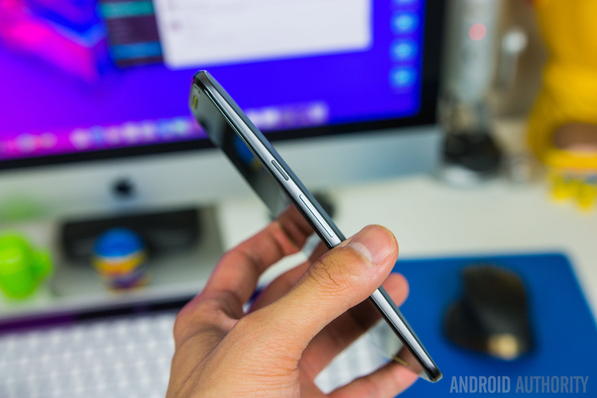
The biggest difference with the new Moto X Style is the size, and the 5.7-inch display did make it sound like this device would be too large, but when we got our hands on it for the first time during the launch event in New York, all my doubts were put to rest, and that is how I still feel about the device now. Of course, it’s not a small phone anymore, and does completely dwarf the previous generation devices, but Motorola has done a great job with keeping thin bezels, which makes the device feel very manageable in one hand. In fact, it is quite similar to the Samsung Galaxy Note 5 in terms of height and width, with the Moto X Pure Edition being slightly thicker.

As a refresher of the specifications, the Moto X Pure Edition is powered by a Qualcomm Snapdragon 808 processor, clocked at 1.8 GHz, and backed by the Adreno 418 GPU and 3 GB of RAM, and the device comes with 16 GB, 32 GB, or 64 GB of internal storage, which is further expandable via microSD card by up to 128 GB. Finally, the device packs a 3,000 mAh non-removable battery which is hopefully enough, especially when considering the fact that it has to power a large 5.7-inch TFT LCD display with a Quad HD resolution.
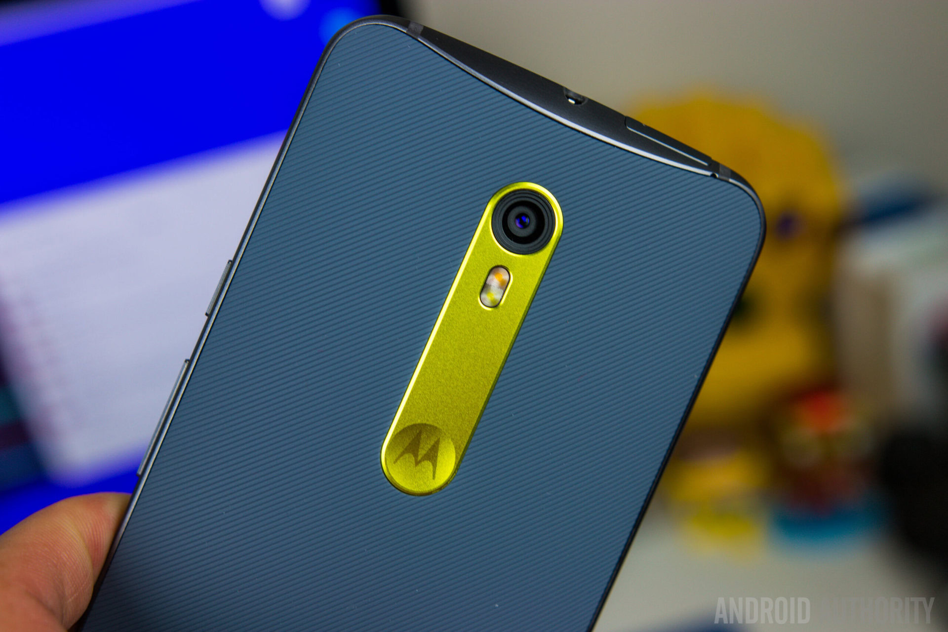
The cameras have also seen an improvement, at least on paper, with the phone now featuring a 21 MP primary camera and a 5 MP front-facing shooter with a wide angle lens and a “selfie” flash. We will, of course, be putting this camera setup through its paces in the upcoming full review, and we’ll have to wait and see whether this camera can stand up tall against the fantastic competition it faces in the Android world.
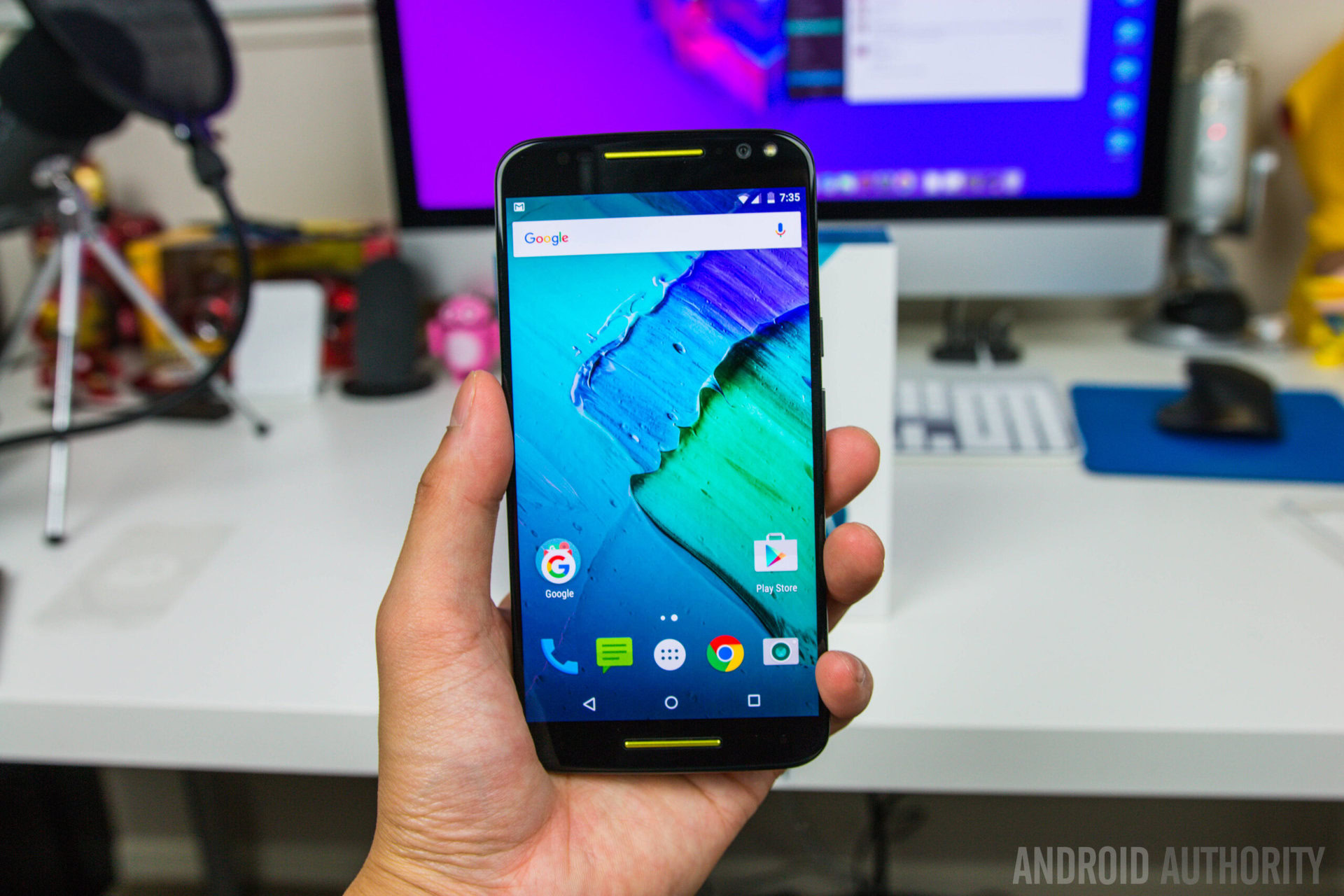
On the software side of things, the device is running Android 5.1.1 out of the box, and Motorola has had a really good track record with keeping the software experience very close to stock Android, which is what makes the Moto X one of the best alternatives to a Nexus device. In some ways, the Moto X is better, with some incredibly useful features that Motorola has baked in, such as the Moto Display, Moto Voice, and others. Another great aspect of the Moto X Pure Edition is that there is no bloatware to be found, and upon turning the device on for the first time, you will notice that there is only a page and a half worth of apps, most of which are Google applications.
So there you have it for this quick look at the unboxing of the Moto X Pure Edition / Moto X Style! Stay tuned with Android Authority for the upcoming comprehensive review of this smartphone, and for everything else that has to do with the world of Android.