Affiliate links on Android Authority may earn us a commission. Learn more.
What makes a great Android app UI? The devil is in the details!
The bottom line is that if an app is an eye-sore, if it looks unprofessional, or if it’s obtuse and unintuitive, it’s going to get deleted or forgotten. This all comes down to the design and user interface (UI), so the question is: what makes an app UI great? And if you’re a developer, how can you make sure that your app has the look and feel it needs to thrive?
Introducing “Material Design”
There is a distinction to be made here between a great app UI and a great Android app UI. When you load up an app on an Android device, you expect it to look and behave a certain way. This is something that Google actively encourages as well, in a bid to create a consistent experience across the platform. While it’s good for apps to have a distinct look and identity (more on this in a bit), it’s also important that they still have that Android-flavor, so that it isn’t jarring going from one action to the next.
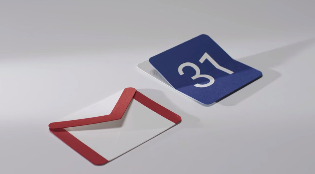
Look at Google’s own apps and you’ll notice this right away. The Calendar App, Google+, Gmail, YouTube and Chrome all have some clear similarities in their look and feel. They use bright colors, simple geometric shapes and lots of animations. Whether or not you like the look is beside the point – what’s important is that it brings together the ‘Google experience’ so that the lines between individual apps become blurred.
If you’re a developer and you’re creating a new app, then Google wants you to follow suit and take some of that same design language on board. And they call that design language ‘Material Design’.
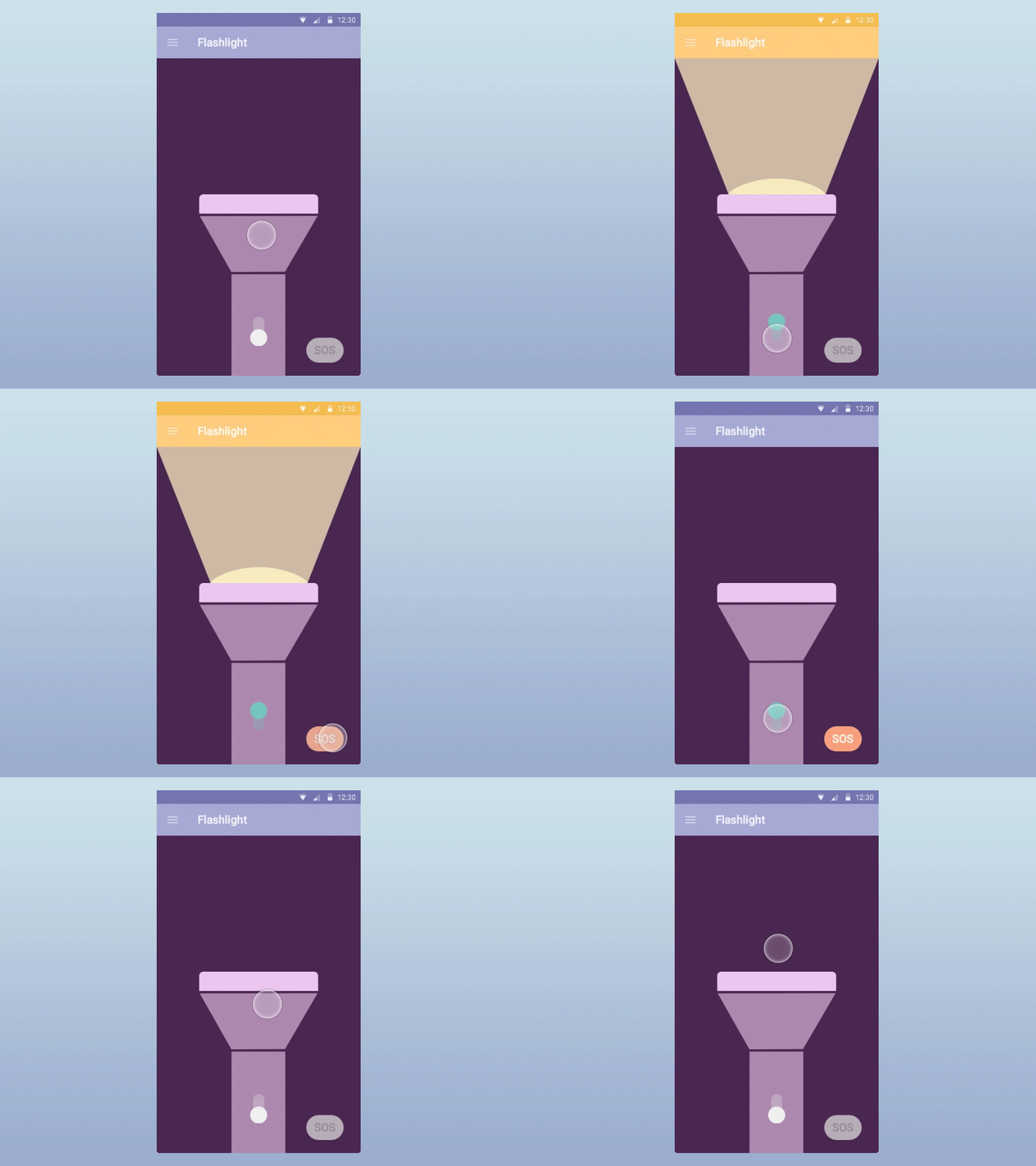
Other hallmarks of Material Design include:
- Bold graphics
- High contrast
- Large typography
- Pastel shades
- Intentional white space
It’s called ‘Material Design’ because it revolves around that metaphor; the elements of the app work like real, tactile ‘materials’ and the cues this presents should facilitate intuitive interaction. It’s a little like skeuomorphism (design based on real-world objects like phones and calendars) but with an added layer of abstraction.
There are plenty of resources that go into more depth on Material Design but suffice to say that a good UI on Android should conform to these standards, so as to create that uniformity for the end user. If your app is all static pages, small text and dark colors then users will feel taken out of the Android experience when it loads up.
You can choose to go an entirely different route if you like, but in doing so you will find that it’s harder to get Google to promote your app in the store and you’ll risk looking out-dated.
Branding and identity
That said, you also shouldn’t try to copy Google’s own apps exactly either. Do so and your offering won’t stand out and won’t make as much of an impression. What’s key then is that you have a strong branding that is felt throughout your design and that you can use as a ‘hook’ to remind people who you are.

That means you should have a great logo and app icon, plus elements from these should be echoed in some of your other design choices. For instance, it doesn’t hurt to use the colors from your logo in other on-screen elements throughout your app. Most company websites will be colored to match their branding and it’s just a smart move for building brand awareness.
This is also why it’s so important to think carefully when creating your logo to begin with. Certain colors have particular effects on us psychologically and some will work better in an app UI or others.
For instance, a blue logo will provide a pleasant basis for your color palette that’s easy on the eyes. Blue is a naturally calming and restful color and we tend to enjoy working around it for long periods of time.
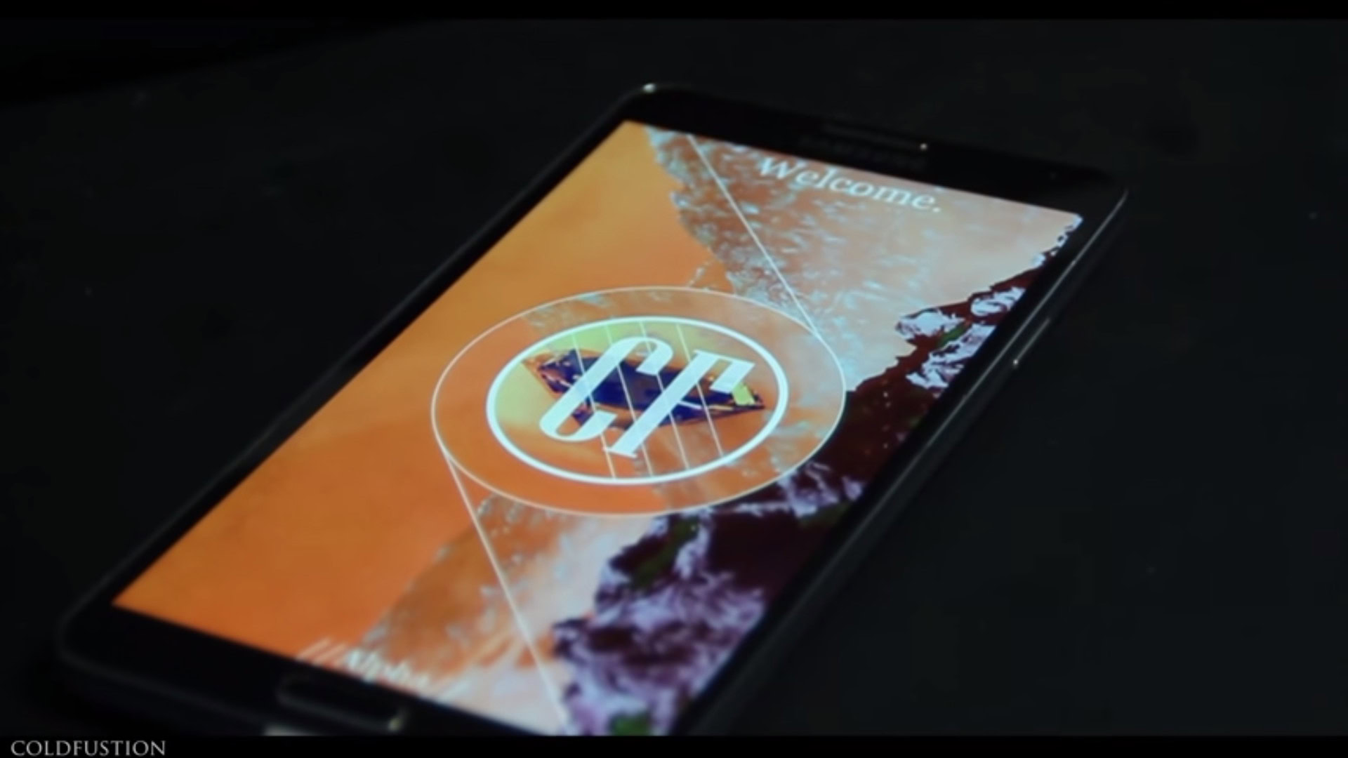
On the other hand, the colors red and orange are very bold and are useful for contrasting and grabbing attention. They’re not so great however for keeping people on one page as they actually raise the heart rate and cause a subtle stress response. Fast food chains allegedly choose these colors for their décor to encourage their clientele to eat faster and leave sooner – allowing them to increase turnover!
If you’re choosing a bright red and orange logo, think about how this might impact on your app design. There should be synergy between the look of your brand and the look of your app. Think as well whether the logo itself fits with the principles of Material Design. All this will just make things easier for you.
Then again, YouTube, Gmail and G+ are all predominantly red… rules are there to be broken!
When considering the actual shape of your logo, choose something relevant, simple, versatile and unique. Avoid obvious clichés like ticks, globes and lightbulbs – they’ve been done to death!
Color theory
Speaking of choosing colors, this is a whole science in and of itself. What’s key here is that you choose complementary colors for your app to avoid ugly clashes and to encourage ‘harmony’.
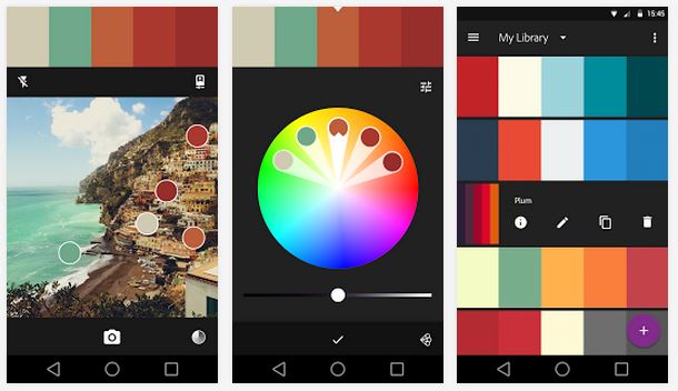
If you take the main color (the exact color code) from your logo as a starting point, you can then use a color wheel in order to select a color palette for your app. While you have a few different options, some common choices include:
Complimentary Color Palette
This is a color scheme based on two opposite colors from the color wheel. For instance, you might choose purple and yellow or red and green.
Triad Color Palette
This type of color palette uses the same basic principle as the complimentary color palette but takes it one step further by introducing a third color. All three should be spaced apart equally on the color wheel.
Analogous Color Palette
An analogous color palette takes the exact opposite approach by picking two or three neighboring colors.
Monochromatic Color Palette
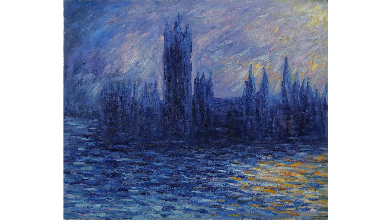
The monochromatic color palette uses just one color but in lots of different shades. This was Claude Monet’s favorite, though he didn’t make that many apps…
Natural Color Palette
A lot of color palettes are actually based on nature. Without getting too deep into evolutionary psychology here, it’s likely that a lot of our appreciation for color is based on what we would encounter in nature. Thus, you can take a photo of a landscape you find particularly moving and use then a color picker to select a primary and secondary color for your app. In most cases this should create a nice palette that’s very easy on the eye.
Try out a tool like Paletton.com, which can help you to generate attractive color palettes automatically.
Keep in mind as well that you want to direct the eye using contrast, so your color palette should allow for at least one color that will stand out from the rest and really grab attention.
Typography
When it comes to great app design, the devil is very much in the details. It’s all the things that the user doesn’t notice that give your design a professional and polished feel. Get it wrong and your app will feel ‘off’ even if they can’t put their finger on what’s wrong with it.
The aforementioned Color palette is one example of this. Another is the typeface. While you might think it’s fine to pick any font as long as it’s legible, in reality the world of typography is incredibly deep, fascinating and complex, and this choice deserves some real attention. (To learn about the fascinating history of typography I highly recommend the brilliant Type:Rider, an exceptional example of edutainment done right.)
For apps, as with websites, you should choose a primary typeface and most likely a secondary typeface for headers and other items of interest. You can use three fonts in rare cases but never go beyond that. The fonts you use should be similar in terms of mood and era while still offering a good amount of contrast.
The most important thing to emphasize here though is readability. Make sure that the main font you choose is easy to read on a mobile display and that it looks clean and modern. Don’t make your users squint at the screen or you’ll give them a headache!
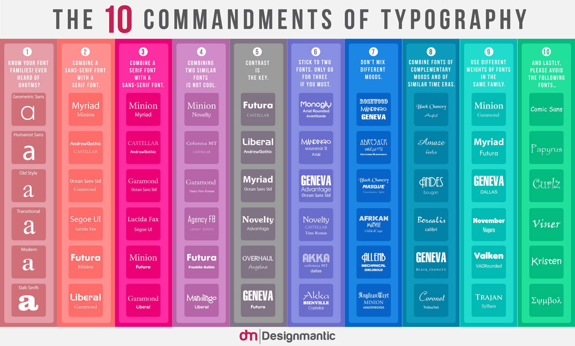
This usually means a sans-serif font; sans-serif meaning that it doesn’t have any of the feet or ‘flicky bits’ (as they’re technically known). If you choose a nice Humanistic Sans font for the bulk of your text, then you can combine this with a modern serif for your headings and that will look sweet. Check out this awesome infographic for more recommendations (source):
Google actually provides a ton of open-source fonts for you to use, so it’s easy for you to pick something with the company’s stamp of approval.
Animation and ‘easing’
One particularly nice element of Material Design is the emphasis on animations that revolve around the user. The idea is that instead of being taken from one page to the next as you interact with an app, you instead feel as though the app is moving around you to present the information you’re looking for.
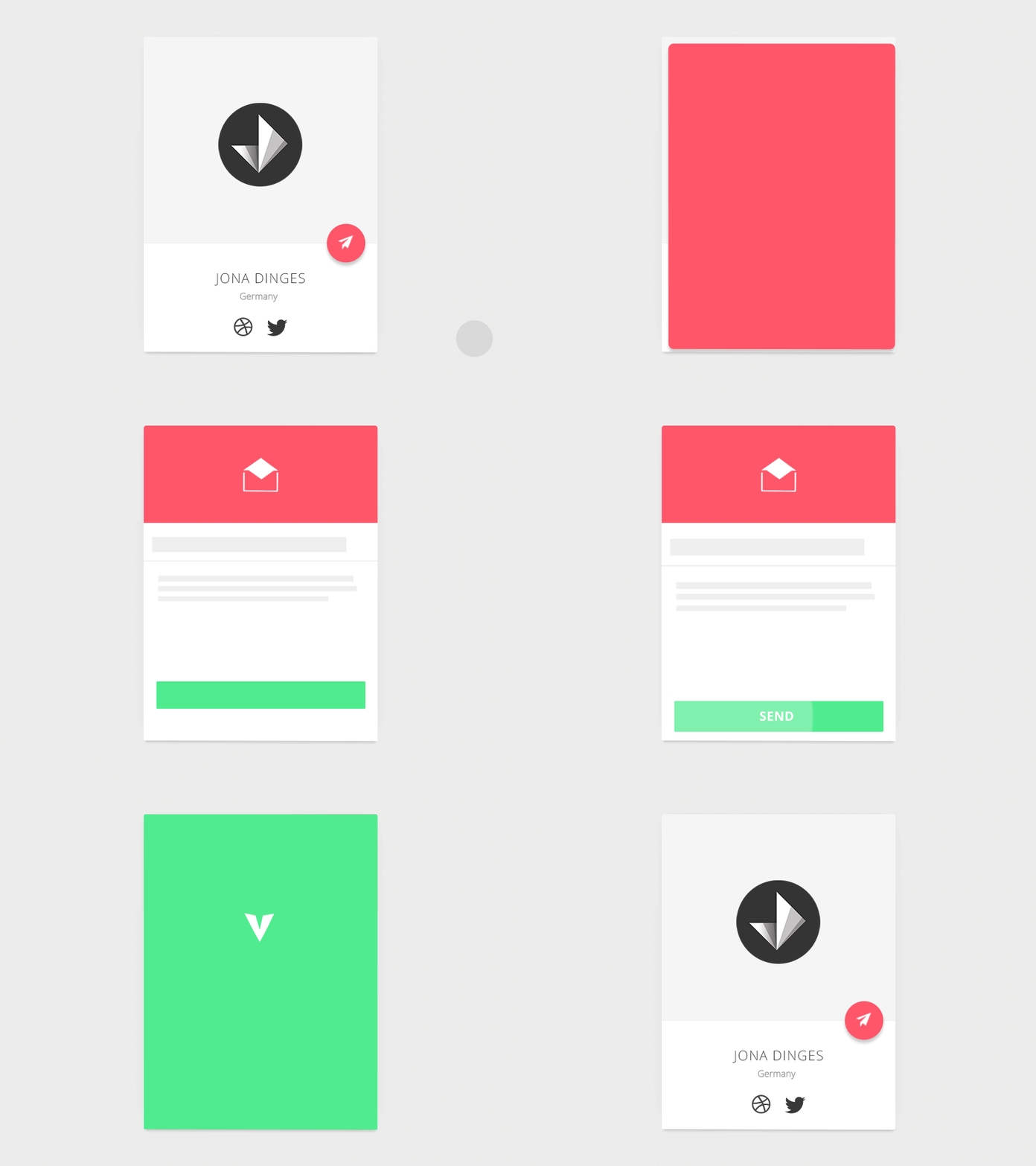
Animations also make an app appear a little more slick and again, more polished. Once agin, attention to detail is key to getting this right.
That’s because it isn’t enough to use ‘any old’ animation. If you want an element to swoop in from the left for instance, it can’t just be a case of If (positionx < targetx) { positionx = positionx + 1 }. In other words, it can’t just move left at a steady speed and come to an abrupt halt.
Pay closer attention to the apps you use on a daily basis and you’ll notice that the animations really do treat each element like a real-world object. They have momentum for instance and acceleration which creates the illusion of mass and weight. Menus and moving images have to build up speed and then come to a gradual halt – just as objects in the real world do. Likewise, you’ll notice that some elements ‘overshoot’ their target and then ‘snap’ back into place giving them an almost Loony Toons feel.
All this lends your app more character and makes it feel more natural. As Google puts it, ‘nothing in nature moves linearly from one point to another’. You can learn more about ‘easing’ here.
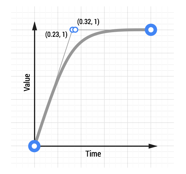
The good news is that you should find that these flourishes are built into whatever library you use for your animations. This is a great example of why you should rely on pre-existing libraries and not attempt to reinvent the wheel.
Navigation and leading the eye
A lot of what we’ve discussed here relates to design, more than user interfaces but it’s important to recognize that these two aspects of your app are intimately connected.
The most important requirements for an app’s navigation are that it is a) intuitive and user-friendly and b) optimized for touch. People should know immediately where they need to click and how to access the information they’re looking for.
To do this, you essentially use the layout of your app itself to educate the user implicitly on how to interact with it. Google talks about using Material Design to provide ‘visual cues’.
So how does this work in practice? When you design any interface, one useful tip is to remember that readers will consume media from the left to right and top to bottom. As such, it is often a smart move to put important aspects of your navigation in the top left corner. The top left is a good place for a logo, while navigation buttons will often go along the left or along the top.
Another place to put important items is in the center of the page – as we often look here when getting the ‘bigger picture’ of an app’s layout. Using this as a place for your important elements though leaves you with less space for everything else and makes it harder to create a natural flow of information.
If you have a series of images that gradually get smaller, then users will know to look at the largest first. This is also why the first letter in a magazine article is often bold, colored and large.
If you want to buck this trend and guide the user’s eye in a particular direction, then there are many more ‘cues’ you can use to lead them around. For example, we are naturally inclined to look at things that are bolder or larger first. If you have a series of images that gradually get smaller, then users will know to look at the largest first. This is also why the first letter in a magazine article is often bold, colored and large.
Try to avoid incongruence which confuses the user with contrary cues. That means you should avoid putting the largest object in a sequence on the right, which would send mixed signals.
Don’t be afraid to use arrows where necessary, or to use a little skeuomorphism. Seeing that a page has a bit of a dog ear in the bottom right corner suggests that it might act like a page in a book and can therefore swiped to progress. Without that subtle indicator though, your users might never have made it past page one!
This is another reason to use lots of white space. White space is a designer’s best friend because it makes it that much easier to make something stand out and thereby lead the eye. Follow the old designer’s maxim: communicate, don’t elaborate. If an element on the page doesn’t communicate something regarding your navigation or the content itself, you’ll probably do better to just lose it.
Check out this excellent video on leading the user’s eye for more tips and ideas.
Remember though that navigation mustn’t detract from the experience itself. Your content should still take center stage and as screen real-estate may be at a premium, try to minimize the amount of ‘chrome’ (navigation) as far as possible.
Technical and practical considerations for Android UI
All that information should serve as a good basic introduction to graphic design and creating attractive user interfaces.
However there are also some technical and practical considerations to keep in mind too and that might limit what you can achieve. For instance, if you’re developing for Android then you need to ensure your layout is responsive and that it will work with multiple screen sizes (another reason to use a minimalistic approach).
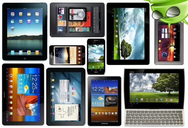
Think too about the standard elements of an Android app. You’ll probably need to include an app bar and a menu button for instance. Google offers some documentation regarding best practices in a number of areas, which can be of some assistance.
Remember that your design ideas will need to work within the context of the tools you’re using to build your app. Think in terms of LinearLayout or RelativeLayout and make choices that will lighten your work load and make your program easier to update in future.
Then there’s the matter of resolution and how it relates to file sizes. You want your images to be beautifully crisp but not if it means your app takes a year to install. Make sure that you always use vectors rather than raster files when designing your various elements. This will allow you to more easily alter the resolution and to make changes in future.
Another tip? Know your limitations! No man (or woman) is an island – so if you’re not a master of design then hire someone who is. This will save you a ton of time and the result will be a more professional-looking end product.
Research, experiment and iterate
Okay so that sounds like a lot to take on board, but in reality a lot of it is fairly intuitive. The main take-home message is just to spend some real time thinking about those smaller choices in your app design and to do your research prior to creating your masterpiece. It takes a little work but once everything comes together you’ll have a striking app with bold, contrasting colors and intuitive interface that dynamically changes shape around the user… making that little extra effort will be worth it.
If you take a look at some of the apps on the Play Store that you like, read up on Material Design and just immerse yourself in great UI for a bit, then you should find that a lot of this information sinks in via osmosis. Pinterest is always a great resource for design inspiration, while MaterialUp.com showcases examples of Material design from around the web.
Experiment, have fun and create something that’s as beautiful to look at, as it is joyous to use!