Affiliate links on Android Authority may earn us a commission. Learn more.
My G Flex 2 impressions: falling short of expectations
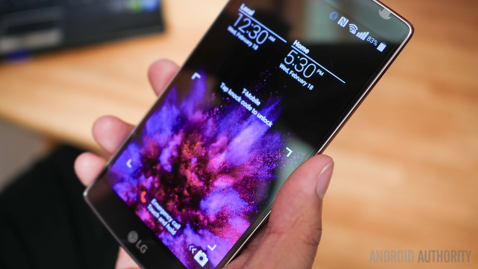
Despite the fact that the LG G Flex 2 has only been released in key markets (such as the USA), one might be forgiven for forgetting the device is technically new. Released at the end of January in LG’s home country of South Korea, it’s about two months old and yet its relevance is almost non-existent save for the novelty-seeking, tech savvy crowd who avoided importing it weeks ago. The device, by all accounts, should be a fantastic piece of kit given the outstanding hardware inside, and yet — for me at least — it fell far short of expectations.
I’ll be perfectly honest here: the original LG G Flex was my favorite phone of 2014. I had openly wished for a follow-up on many occasions, and when the first real leak showed up just prior to MWC, my heart nearly skipped a beat. Unfortunately, once I saw the device, any possible arrhythmia was instantly cured, and by the time I actually got it and started using the Korean model at the start of February, the only cardiac arrest in play was the flat-lining of my purchase’s pulse.
Let me break the bad news down, bit-by-bit, although note that these are only my post-purchase impressions. For the full LG G Flex 2 review please click here.
[related_videos title=”Great related content! ” align=”center” type=”custom” videos=”589204,593588,588275″]
Blasé about the battery
By-and-large, the biggest disappointment I experienced with my time using the G Flex 2 was the poor battery life. While I have read some reports that claim the lifespan is good, either my device had faults or else it depends on the network. Whereas the original G Flex had such an impressive battery life that I actually selected it as my device of 2014, the followup is an embarrassment that had me questioning its ability to get through most of the day from the second it was unplugged from A/C.
The problem was especially troublesome in that, when the screen was off, the battery drain wasn’t actually worth mentioning. Perhaps a few percentage points would decrease within the span of a few hours or, at most, overnight. The problem was, the second I started using the thing, I could see the numbers drop, something I haven’t experienced since using the Galaxy Nexus years ago. Even if I was on a WiFi connection with the cellular radio on Airplane Mode, the drain was still horrible.
Assuming my device wasn’t faulty, the question of why the battery life is so poor is a mystery. Could it be the heavy UI that LG put on Android Lollipop? Is it the screen? Could the extra 500mAh the original’s battery had really make that much of a difference? I suspect it’s actually a combination of all the above, but nonetheless, it remains shocking just how poorly the battery performed when compared to the original model.
NOTE: It’s worth pointing out that, when I tested a Hong Kong model, the battery life seemed a bit better than the Korean model I was originally working with. While the device sadly crept under 40% before the clock even hit 2pm, admittedly this was from heavy use. The drain overall was less noticeable, so either LG changed things up with a software update in the past two months, or else the Korean model itself just had poor battery life (something that might have to do with the Broadband LTE-A connection perhaps).
Suppose there is a screen
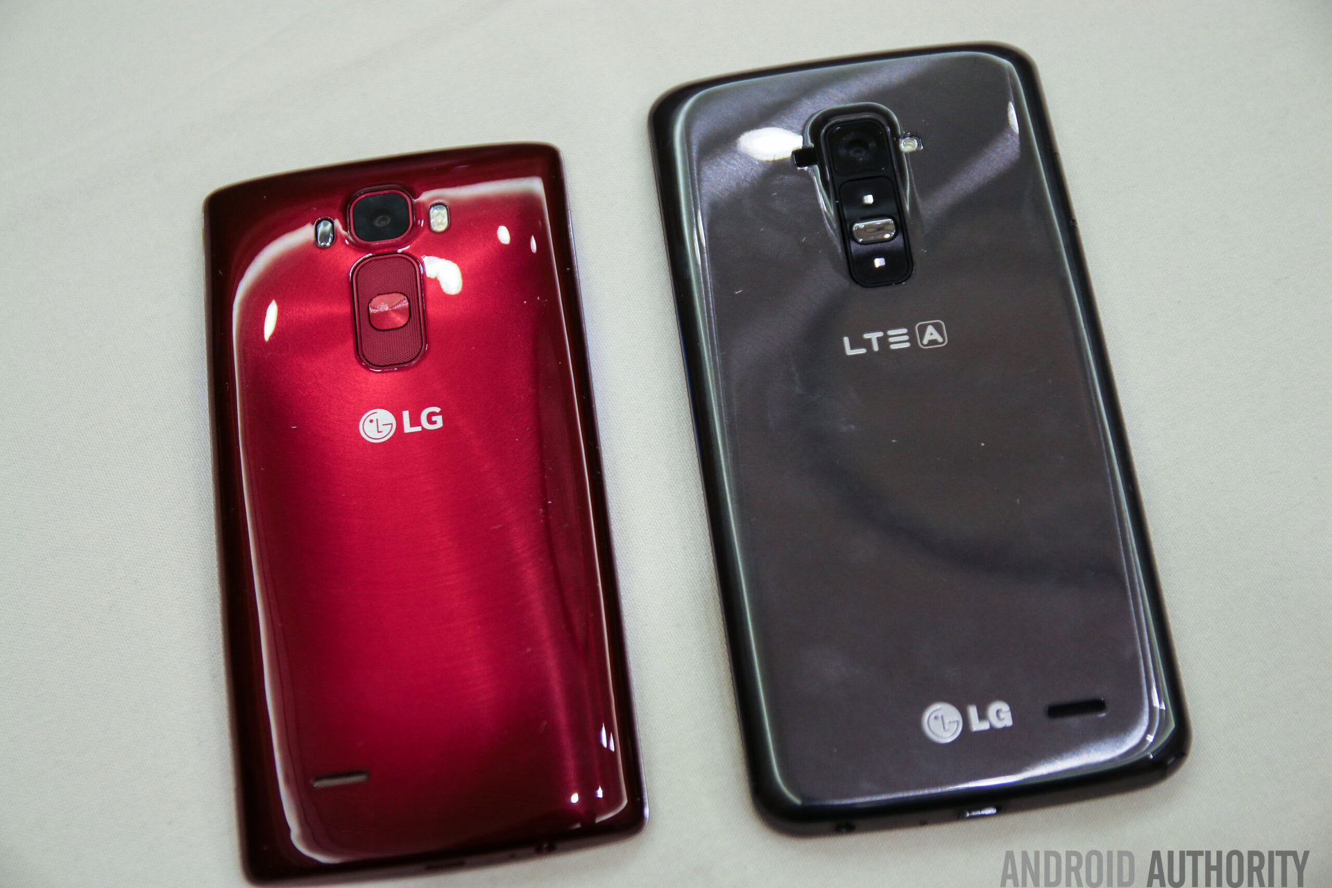
Another element of the G Flex 2 that disappointed me was the screen. Mind you, it’s not that the display wasn’t significantly better than the original. Full HD looks wonderful and the plastic panel itself did without the grainy elements the original had. The problem, for me at least, was the screen size. I fully understand that most people don’t like phablets over 5,7 inches, but the 6-inch screen on the original Flex was one of its strong points. Outside of the larger Galaxy Mega (6.3 inches), HTCOne Max, or the Xperia Z Ultra, the G Flex was the only mainstream big phablet from an established player.
By reducing the screen size, the Flex 2 is lost in a sea of similarly, notwithstanding the company’s own LG G3, and quite possibly the upcoming G4 as well, though word has it that said device will feature a smaller — yet curved — display.
Crafting the creation
I also call into question the lack of a removable battery. The first device had such good battery life that it didn’t matter if we couldn’t remove it. The follow-up has atrocious battery life and yet actually has a removable back cover! Was that really necessary just to fit the SIM card and microSD? I don’t even understand why LG needed to make use of the self-healing rear given that you can just change rear covers. It seems to be little more than a marketing point.
Aesthetically speaking, the phone also proved a let down, in my opinion. Plus, the hard angular sides meant that the device was less comfortable to use or put in a pocket than the softer curves its predecessor employed.
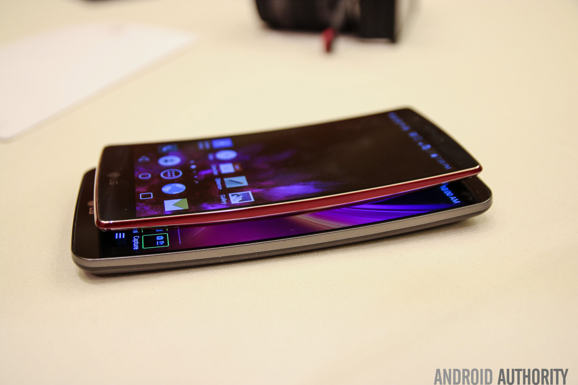
Furthermore there’s the curve itself. LG had previously stated it could produce a much more dramatic one than the original had, however restrained itself from doing so. This time, the company indicated that an even slighter curve was used. I’m sorry, but what’s the point of having these niche devices if they don’t use their potential to the max? Given how early leaks of the G4 look, the Flex 2 need not have been curved (or exist) at all.
I’m not suggesting the device should have looked like a dried fruit peel, mind you, but if the entire purpose of a product’s form factor is the bent display, then bend it!
Software skin
It’s ironic that despite the heavy skinning LG layered into the G2, G Flex, and G3, I actually liked them all the more for it. The ability to customize even the on-screen navigational items was fantastic. This time, however, the only word I can use to describe the skin is “repulsive”. I can’t stand the large Lollipop “PlayStation” navigation menu buttons for starters. There is no option to alter their width or height, and even lowering the text size didn’t seem to work. They are too big, and too close together, neither of which is true of the Nexus 6 or Nexus 9.
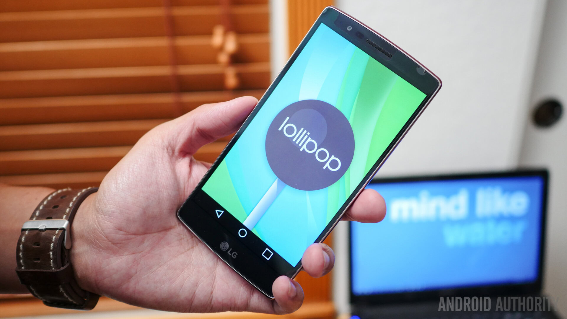
Lollipop itself looks quite trendy (as to if people like the motif or not is another story) and thus to bear witness to the mess LG has made of it really disappointed me. There is an odd combination of circular and squared icons. The settings menu has been altered, the lock screen, the drop down menu (complete with the smallest “Dismiss” button I’ve ever seen and which also gets obscured more often than not). Sadly not even throwing on the Google Now launcher (or any other for that matter) can truly purify this bastard hybrid from the hell LG has wrought onto it. You can’t help but imagine Matias Duarte cringing, silently shedding tears.
The problem wasn’t made any better by the fact that the phone only has 2GB of RAM and I frequently experienced lag. This mystified me in-and-of-itself, for if there is one thing Korean phone versions are, it’s superlative. Yet, lo and behold, the 3GB variant hasn’t been released there. Given how obtuse LG’s Lollipop skin is, I really would have preferred the extra GB of RAM to smooth things over. Applications take time to open, even the Recent Apps listing took time to open and clear.
As a final gripe, I detest the fact that LG has once again opted not to include a system option to deactivate the “Knock On” feature. The double tap issue means that while carrying the device in your hand, it will randomly turn on because your movement has triggered the wake. This doesn’t help battery life either. At the very least give owners the ability to turn it off like they can the Knock Code element.
On a positive note
1. The screen is 1080p. Again I had absolutely no problem with the 720p resolution on the original device, but the higher resolution did make things look that much sharper (also a result of the decision to reduce the screen size). Especially when set to Vivid Mode and with the right background, it’s probable that, sooner or later, you might end up gawking at the beauty of the screen for such nice color saturation.
2. Compact build. Don’t get me wrong here, the 5.5-inch display was a negative for me, but that being said, the phone felt far smaller than it really was. LG did a very good job keeping the bezels thin, and in the end I often found myself looking at the thing wondering how the display size could possibly be accurate.
3. Color Choice. Interestingly enough, the Japanese version of the G Flex had a different color scheme than the rest of the world, being a dark shade of black. The international models all featured a grey finish, at least as far as I know. While I did in fact buy the red Flex 2 and ultimately didn’t care for the color choice, kudos to LG for opting to make the device in a second color, and all the more so for actually making some components match. Far too often companies will simply swap the back cover and call the product a new shade (the Galaxy S5 comes to mind save for the white and gold variants).
Wrap up
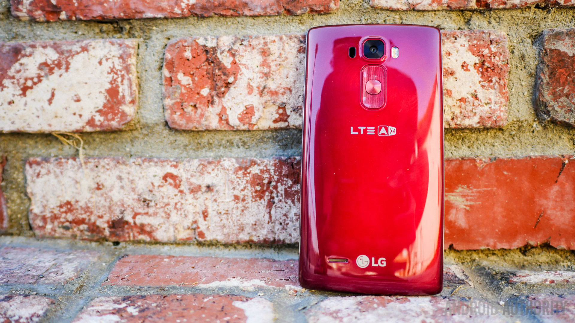
All-in-all, I am sorely disappointed with the G Flex 2, and were it to be in a contest for “biggest disappointment of 2015”, it would be neck-and-neck with the HTCOne M9 in my book. Granted some of my gripes might be of a far more personal level (the “small” size for example) and your own impressions may differ.
Regardless of my own personal points, this device has lost momentum at a momentous meter, in no small thanks to the Galaxy S6 and S6 Edge. Samsung has knocked the ball out of the park with the premium design factor, and meanwhile this plastic-plated piece comes across as being a pricey proposition.