Affiliate links on Android Authority may earn us a commission. Learn more.
Google Sheets lets you make charts simply by asking for them

Spreadsheets have been the future of business ever since the 1980’s, but much of the fundamentals haven’t changed. We’re still using complicated formulas and menus to create visualizations from these sheets, and up until now they haven’t really evolved to mimic today’s technological abilities. Google thinks this needs to change, and has added natural language input to allow users to create charts just by asking.
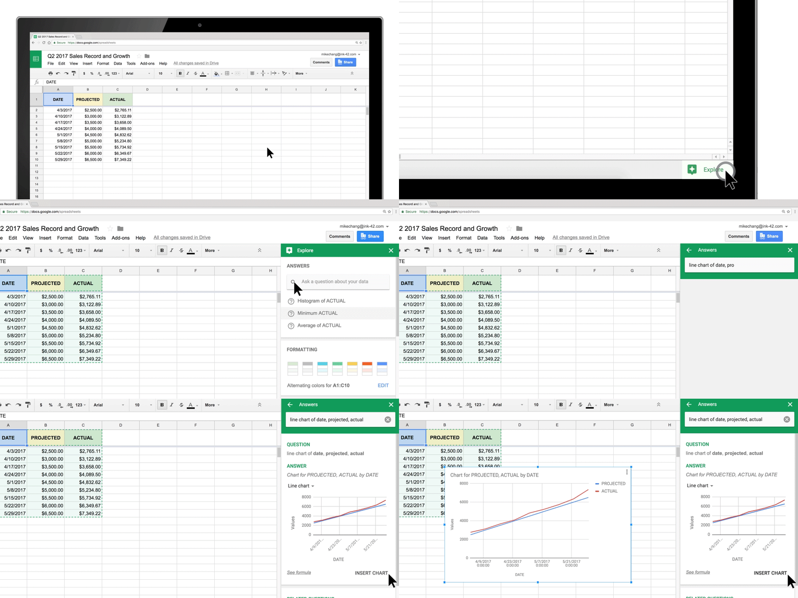
The feature is hidden in the ‘explore’ section of Google Sheets, Docs, and Slides, and allows you to simply ask for a representation of your data in whatever method you prefer. For example, the GIF above shows how you can simply ask for a line chart of your data, and it will immediately pop up on the screen.
The new update gives Sheets, Docs, and Slides the ability to communicate with one another as well, so you’re easily able to move data between the programs as you need. If you create a chart in Sheets and copy it to Slides, the chart will update as you manipulate the original Sheets data. Pretty cool.
Last but not least, the update is changing the way the print interface works as well, allowing you to adjust margins, alignment options, and scale before you send it to the printer. This should help to make sure you get a perfect print every time, since often times spreadsheets don’t play too well with the printer.
Are any of these updates useful to you? Personally I think it’s great that they are trying to make G Suite work a lot more cohesively, and it will likely be very beneficial to those who use these programs on the daily.
Thank you for being part of our community. Read our Comment Policy before posting.