Affiliate links on Android Authority may earn us a commission. Learn more.
Android TV brands really need to address the Netflix button

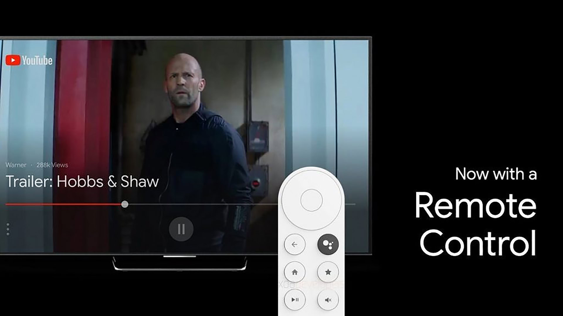
Leaks have once again revealed the existence of a Google-branded Android TV dongle, similar in form factor to a Chromecast. But unlike the Chromecast, this device doesn’t restrict you to casting only and comes equipped with its own TV remote.
We can only see the top half of the remote in the leaked material, but we really hope Google steers clear of one of the most annoying practices in the Android TV space today. Yep, I’m talking about the ever-present Netflix button.

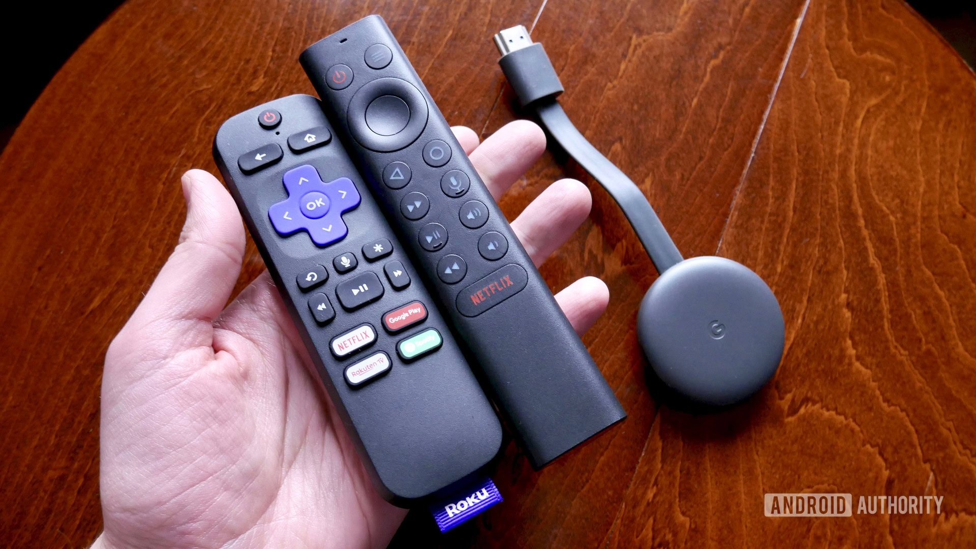
From Xiaomi’s Mi Box lineup to the NVIDIA Shield series, we’ve seen this button appear on a range of Android TV remotes. As you’d expect, the button lets users quickly activate Netflix without the need to manually navigate to the app in the homescreen and launch it.
The big problem in my household is that I accidentally press it far more often than deliberately hitting the button. We’ve got a NVIDIA Shield TV tube. The Netflix button on the remote is massive! It’s at least twice as large as the home, back, and volume keys.
Read: We don’t own our digital lives and it’s time we started caring about it
Couple that button size with the fact that it’s at the bottom of the remote — near where you’d grab it in the first place — and it quickly becomes annoying.
Thankfully, there are unofficial button mapping apps available for the likes of the NVIDIA Shield, allowing users to disable the Netflix button or link it to another app. But this solution is a workaround rather than an official capability, and it doesn’t work with every Android TV box with a Netflix button. A button remapping utility also doesn’t change the fact that you’re still staring at a Netflix-branded button.
Netflix buttons part of a wider push

One reason for the adoption of the button on Android-based smart TVs is the company’s push for Netflix Recommended TV certification. The streaming service says smart TVs with this branding deliver a “better experience for Netflix” and other apps, while also noting that TV brands need to meet at least five out of seven criteria.
The criteria needed to earn Netflix Recommended TV status includes: instant on capabilities, fast app launching, shipping with the latest Netflix version, a high resolution Netflix interface, support for enhanced interactive features, content updates in the background, and yes, easy Netflix access via the homescreen and remote.
What do you think of the Netflix button on remotes?
This all suggests that smart TV manufacturers at the very least are able to drop the button as long as they still meet five out of seven criteria. But it’s also believed that some streaming box manufacturers have a financial reason for not wanting to ditch it.
A Bloomberg report alleged that Hulu, Netflix, Showtime, and YouTube have all paid Roku $1 for each device sold that has a brand-specific shortcut button on the remote. So Roku earns $1 per device if the included remote has a Netflix button for example, and $3 per device if the remote has three separate shortcut buttons.
In other words, there might not be much incentive for major TV box manufacturers to ditch the button if it brings in plenty of cash. But I’d totally pay at least $1 extra for a non-branded, customizable shortcut button on the remote.
Thank you for being part of our community. Read our Comment Policy before posting.