Affiliate links on Android Authority may earn us a commission. Learn more.
Android P has a new colorful design for Android settings

In the latest release of Android 8.1 Oreo, the settings page features monochrome icons on a white background. It’s not too terribly flashy, but hey: it’s the settings page. Function over form is what’s necessary for that particular section of the operating system.
Read Next: 5 low-key Android settings to up your smartphone game
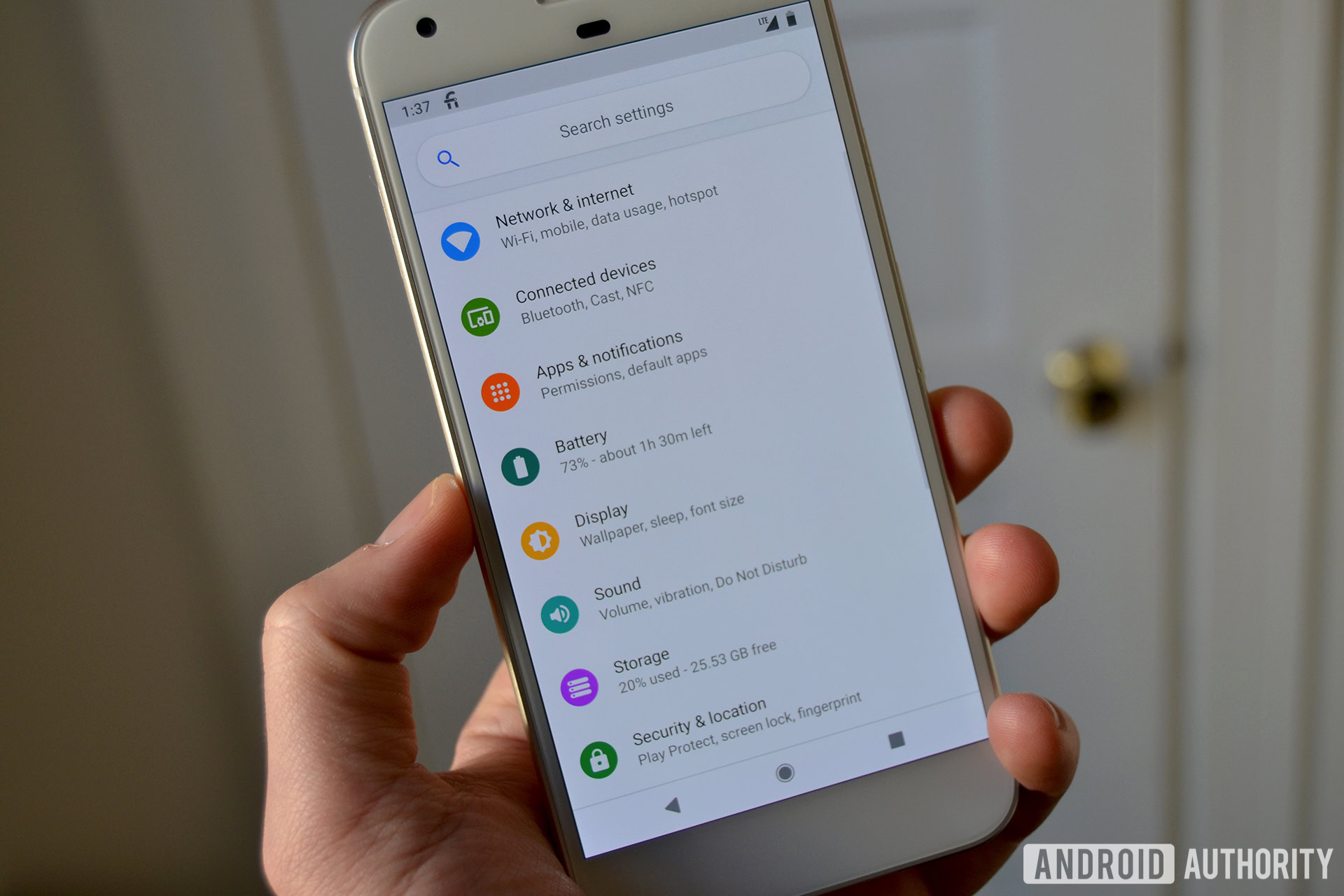
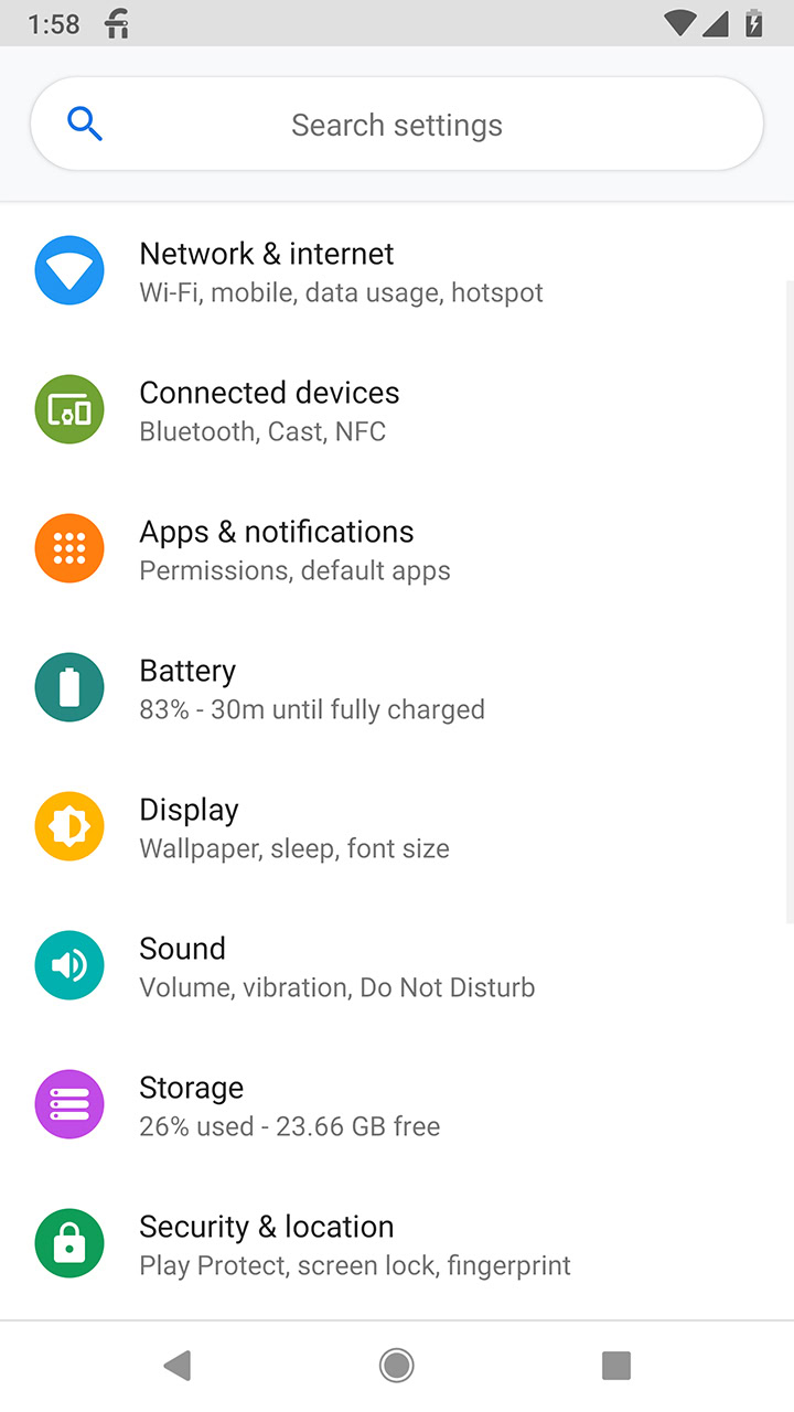
However, Google is adding a new coat of paint to the settings page in the future iteration of the operating system, Android P. Below is a screenshot of what it will look like:

As you can immediately tell, the monochrome icons are now quite colorful. The images themselves have also been slightly redesigned, with a circular background added to each one.

The search bar also got a facelift, with rounded corners now and no gradient shadow underneath. The “Search settings’ prompt is now centered, rather than being formatted to the left of the bar.
Other than that, things look to be pretty much the same here. The order, name, and placement of the settings options do not appear to be altered. Even the font remains the same.
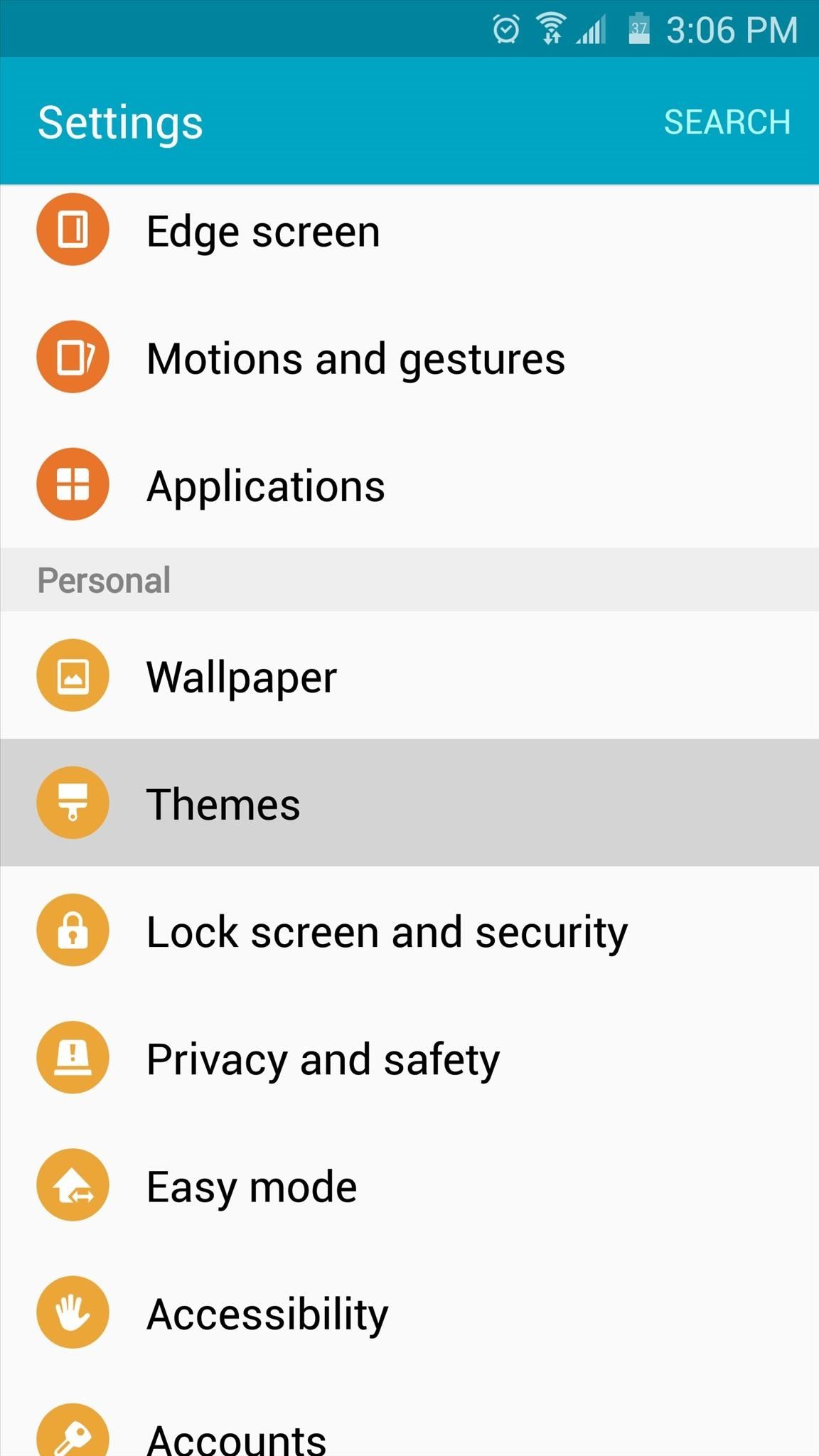
If the first thing you thought of when you saw the screenshot was TouchWiz, you’re not alone there. The icons make Android P look remarkably like the TouchWiz skin of the settings page:

What do you think? Are you glad to have a splash of color on the settings page, or do you think that it’s a little too close to TouchWiz? Let us know in the comments! Also be sure to check out our Diving into Android P series, where we highlight some of the new features as we stumble upon them.
Thank you for being part of our community. Read our Comment Policy before posting.