Affiliate links on Android Authority may earn us a commission. Learn more.
Android design guidelines: what they are and why you should follow them

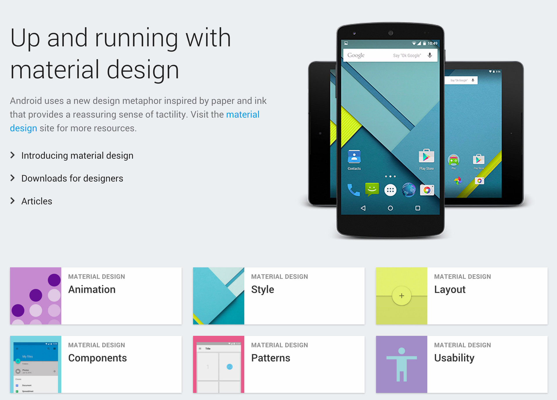
Stock Android has gone through a lot of aesthetic changes throughout the years, from random placements and colors to a whole design language that has a great deal of continuity. To keep this continuity, Google has a set of developer guidelines to make sure everything looks up to par.
What are the design guidelines for Material?
Google completely overhauled the user interface for Android in 5.0 Lollipop. The UI now has bright colors and “cards” that have shadows as well as new animations that make it seem like they are sliding into place. Google also introduced a third axis that gives developers a 3D space to work with. The Z axis, as well as lighting, is used for perspective to make the space look more 3D. All three axes can be modified within the 3D space to give depth as well. There are a bunch of other factors that go into the user interface including but not limited to:
- Animations must take into account weight and mass just like real life, as well as acceleration and deceleration. Make sure all the animations follow the same path so they do not confuse the user. Transitioning between two objects should have a clear, obvious path going between those objects.
- Limit the number of colors in your app to three from the 500 colors Google provides with one accent color. Opacity of text may also be used to signify importance of certain elements. Icons are inspired by actual physical paper copies of the material. Images should have meaning and should be delightful. Matching app colors with picture colors can add a nice clean effect. Do not use stock photography, it has no unique or creative insight, also have a clear point of focus. It may also be a good idea to create a story with an image, this makes it more interesting for the user. Use the best quality images when possible, using degraded images will make even the best apps look bad.
- The layout of the app should behave like an actual piece or pieces of paper, seams may be used and a floating button may be placed on the seam if that button is relevant to both sides of the paper. Pixel density is an important part when designing an app, to find the pixel density take the width or height in pixels and divide it by the width or height in inches. There are also density-independent pixels that will scale the UI elements regardless of pixel density. A dp is defined as dp = (width in pixels * 160) / screen density. Scalable pixels work the same as density-independent pixels but for fonts. All elements in the app align to a 8 dp square baseline grid for padding and text aligns to a 4 dp grid.
Google goes into mind-numbing detail about every single aspect of the UI here. It is important to follow as many guidelines as possible, this will insure the best experience for the user and provide the best continuity between apps and the operating system.
Android Design Support Library and why you should use it
The Android Design Support Library enables older devices to get a taste of the latest and greatest designs from the newest Android OS. Google provides code which allows developers to integrate the new user interface elements here. This code sample is the content view for a navigation drawer:
<android.support.v4.widget.DrawerLayout

xmlns:android="http://schemas.android.com/apk/res/android"

xmlns:app="http://schemas.android.com/apk/res-auto"

android:layout_width="match_parent"

android:layout_height="match_parent"

android:fitsSystemWindows="true">
<!-- your content layout -->
<android.support.design.widget.NavigationView
android:layout_width="wrap_content"
android:layout_height="match_parent"
android:layout_gravity="start"
app:headerLayout="@layout/drawer_header"
app:menu="@menu/drawer"/>
</android.support.v4.widget.DrawerLayout>
As long as the Android device is running Android 2.1 or above, this can be implemented into the application. The Android Design Support Library should be used whenever possible to ensure that an application can run on older versions of the operating system, unless the app is specifically designed for Android devices running 5.0 and above. To use the library, import the Gradle dependency shown below.
compile 'com.android.support:design:22.2.0'
Inserting this into the Gradle file will enable the use of the Android Design Support Library and allow the use of Material-like features on devices running a version before Android 5.0 Lollipop. This will give the app a more uniform look across most versions of Android.
Wrap-up
Google has gone into incredible detail when it comes to Material design. Material was built from the ground up and everything has been redone. Luckily, code samples and help are readily available for beginners or the faint of heart. All of this new styling requires Android 5.0 Lollipop or above, however, Google does offer the Android Design Support Library. Without too much work, this allows devices running at least Android 2.1 to be able to take advantage of Material-like aesthetics. This will make sure the app has continuity throughout different versions of Android.
Thank you for being part of our community. Read our Comment Policy before posting.