Affiliate links on Android Authority may earn us a commission. Learn more.

Exclusive: Pixel 9 Pro Fold could be the name of Google’s next foldable, not Fold 2
The new name for the device codenamed 'comet' might be more than a simple rebrand.
Kamila Wojciechowska
Exclusive: Google Pixel 9 series to get emergency satellite connectivity, new modem
Kamila Wojciechowska

Google One is losing a lot of its appeal, but Photos has me locked in
Rita El Khoury

Here are some new features of the Pixel Launcher in Android 15
Mishaal Rahman

My money for a super-premium camera phone with stock Android
Robert Triggs

Computing
In case you missed it
More news

Gary Sims11 hours ago
How do QR codes work? Everything you wanted to know
How to spot an AI generated image: 8 tips you should know
Calvin WankhedeApril 15, 2024

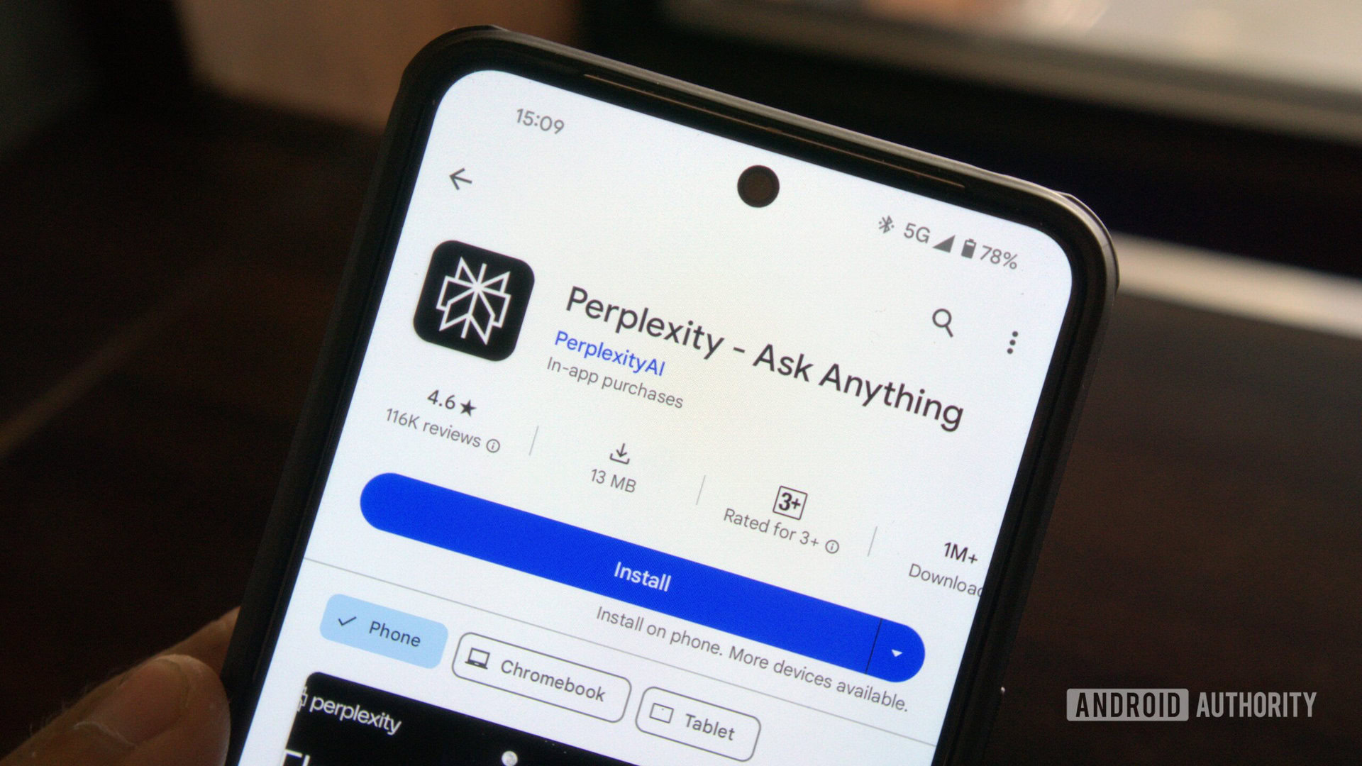
Perplexity AI: How does it stack up against ChatGPT?
Calvin WankhedeApril 12, 2024
How to install Android 15 on your Pixel phone right now
C. Scott BrownApril 11, 2024
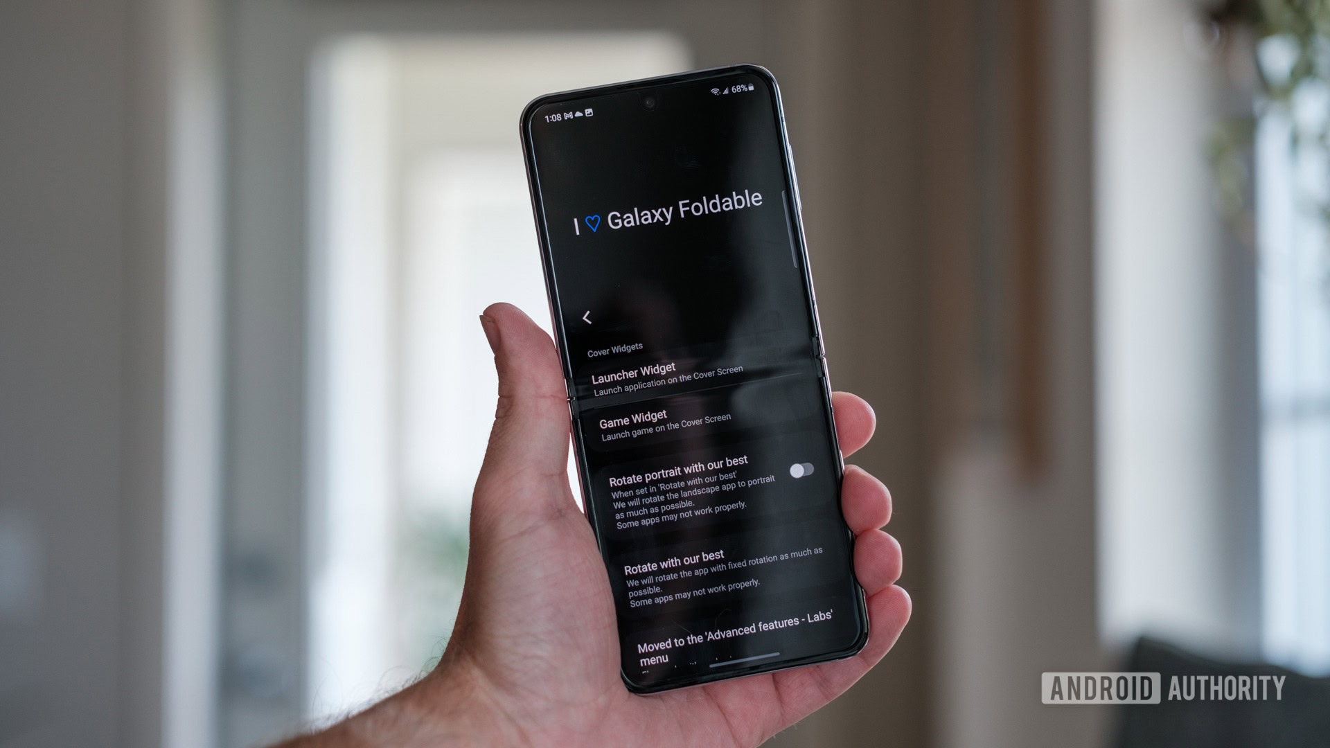
Samsung Good Lock guide: The must-have toolkit for your Galaxy phone
Joe HindyApril 11, 2024
Is ChatGPT not working for you? Here's how you can try to fix it
Calvin Wankhede9 hours ago

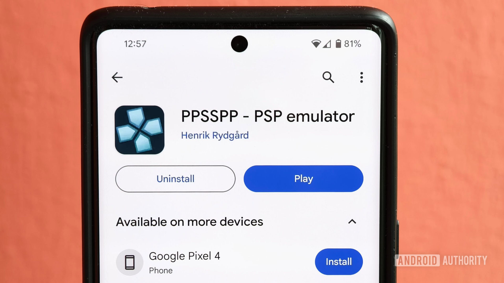
The PPSSPP emulator could come to the App Store this year (Update)
Hadlee Simons10 hours ago
How do QR codes work? Everything you wanted to know
Gary Sims11 hours ago

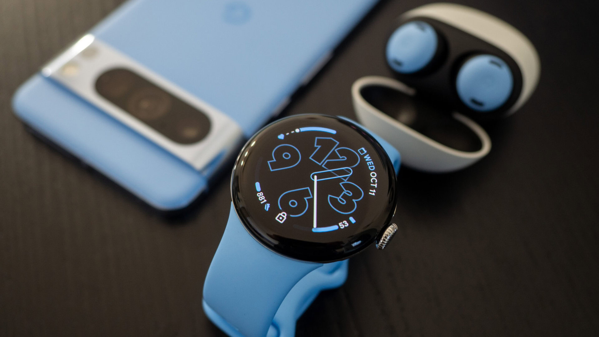
You’ll soon be able to sync app permissions between your phone and Wear OS watch
Aamir Siddiqui12 hours ago
Google is making a convenient change to Play Store purchases
Hadlee Simons12 hours ago

Leaked Xiaomi 14T Pro specs point to a OnePlus 12, Galaxy S24 rival
Hadlee Simons13 hours ago

The OnePlus offline sales ban could spread across India (Updated: Official statement)
Hadlee Simons14 hours ago

Verizon is giving away 6 months of home internet for $0 per month
Adamya Sharma14 hours ago

PS5 Pro rumors and leaks: What we know so far about Sony's next gaming console
C. Scott Brown22 hours ago

T-Mobile employees report being lured into scamming customers (Update: T-Mobile statement)
Ryan McNeal23 hours ago
