Affiliate links on Android Authority may earn us a commission. Learn more.
New Google app starts rolling out to Android users — some aren't happy

Google has revamped its Android app making a number of changes to its Google Now cards and functionality. These alterations don’t do much to alter the core experience, but include a few aesthetic and functional tweaks, not all of which are being well received.
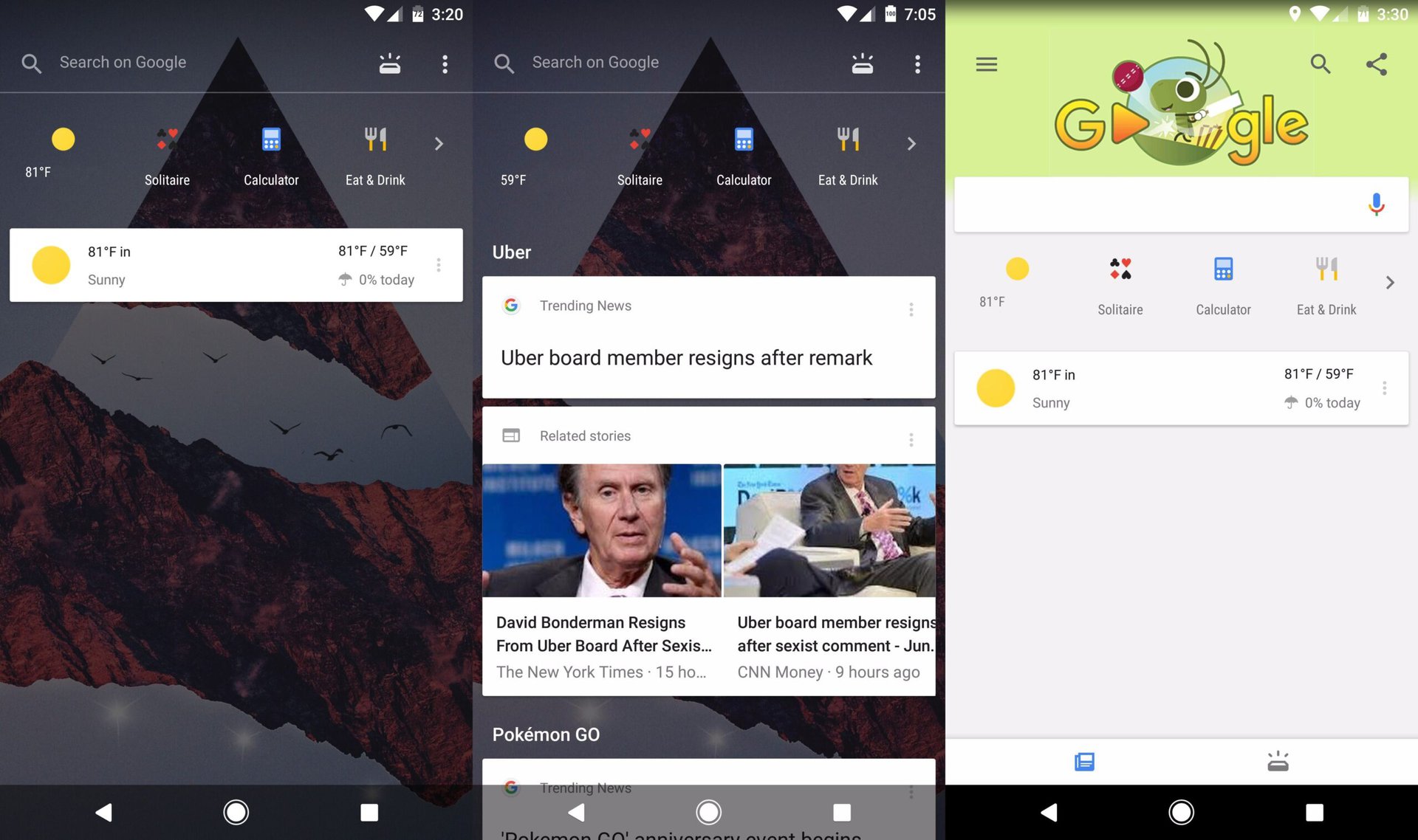
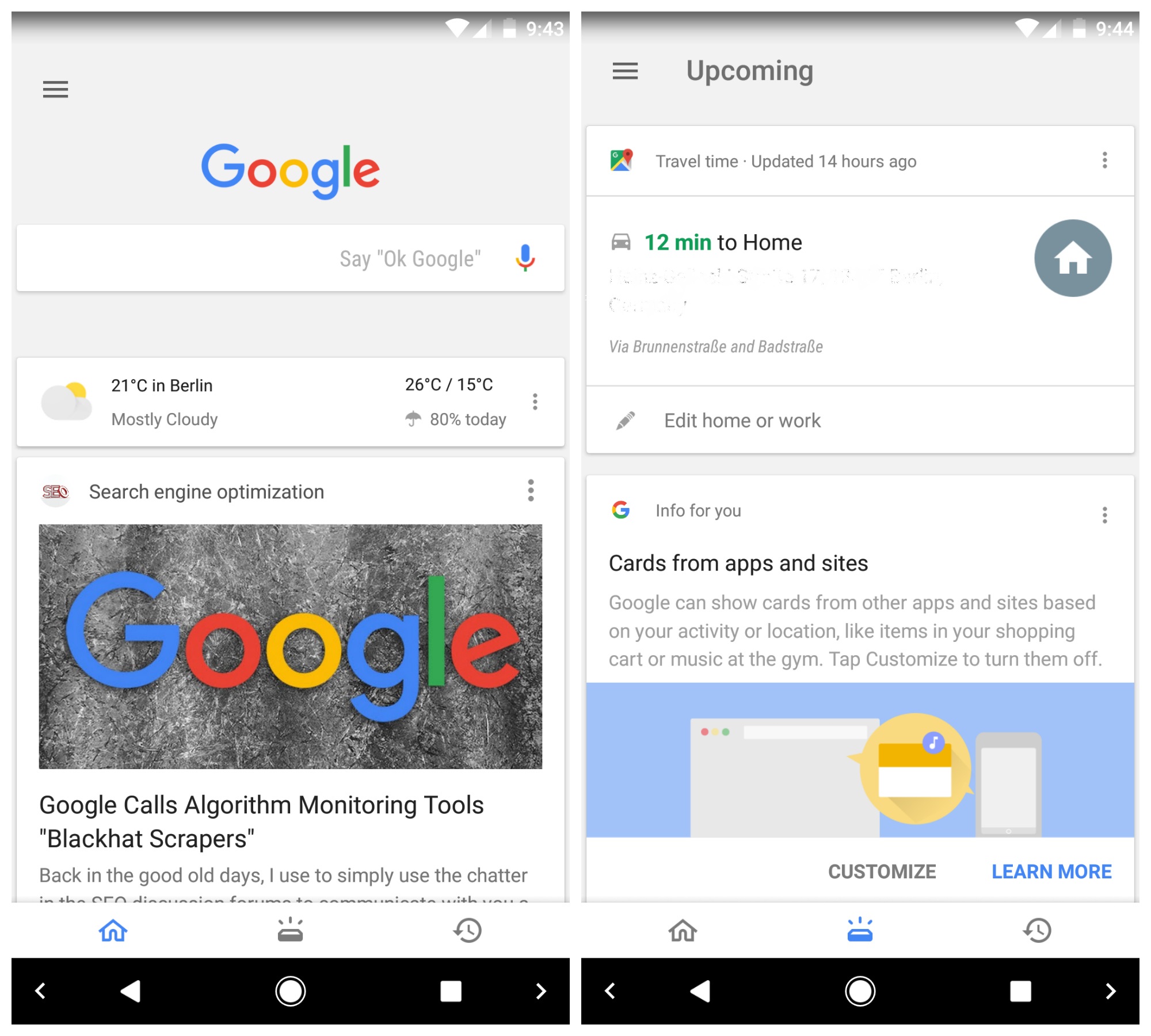
Immediately noticeable is the new design of the Google Feed panel found in the left-most home screen when using the Pixel Launcher. This is now semi-transparent, revealing the device wallpaper in the spaces around the Now Cards — a feature that was first spotted back in June. This arrives alongside a new tabbed format on the Google Now landing page (opened when you tap the Google App), which is now divided into three sections: “Home,” “Upcoming,” and “Recent.”

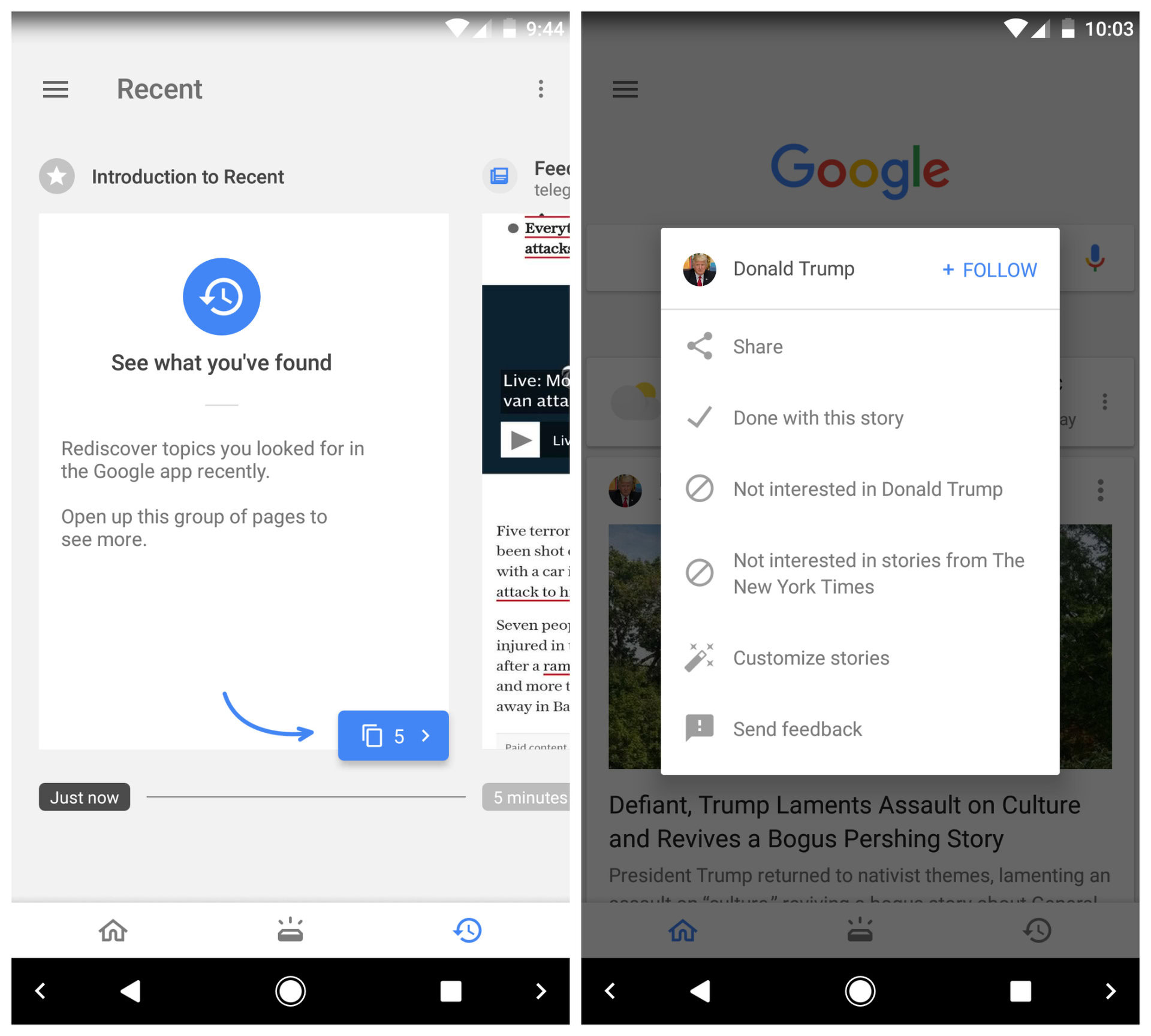
Home is the area where you’ll find the familiar card interface, while upcoming can be linked to your calendar and email accounts to bring you personalized information on what’s happening in your schedule. Recent, meanwhile, is the place where you’ll find your search history.
As you might have worked out, these changes mean that your upcoming events no longer appear above the news cards in the main (Home) feed, but instead are held exclusively in their own tab. It’s a change which is going to feel weird at first, but it could make for improved usability in the long run — isn’t it better to have the two distinct cards kept separate and laid out more clearly?

Another change which already seems to be causing disappointment among fans is that cards can no longer be swiped away. Instead, you need to tap the hamburger (three dots) menu and select “done with this story” (see above, right).
This, in all honesty, does seem like a bad move: Google has swapped a convenient one-tap gesture for a two tap gesture that requires a more precise press. It might seem like a small thing to casual users, but those who are used to regularly swiping cards ain’t gonna’ like it. And it’s not even because you can swipe between tabs, because you can’t.

Some people will have already been seeing this change for some weeks, while others might only have access to some of these latest features. Judging by the number of reports popping up, it seems like Google is rolling the update out on a larger scale now, so you should be up and running with the full feature set soon.
What are your thoughts on the most recent changes to the Google App? Let us know in the comments.